Small square tiles, dark grout, and not one drop of colour. Each capital is laid out like real mosaic work, tessera by tessera, on a field of black tile. The letters keep hard slab serifs so they survive at sign size. It is the look of a barbershop floor, or a station wall that outlived the station.
Two Colours, Thousands of Tiles
Strip a mosaic down to black and white and what survives is the grid. These capitals are slab serifs assembled from small square tesserae, each tile chipped slightly differently, while dark grout runs between them. The background is its own field of black tile, so the letters read as inlay rather than paint. Because the contrast is absolute, the alphabet holds up on a shopfront seen from across the street.
The Mosaic BW Font Keeps Its Grid
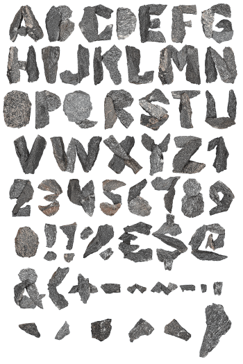
Tile size is the quiet decision here, of course. The Mosaic BW Font uses pieces small enough to round the bowl of a G, yet big enough to still look hand laid. Stems stay straight, serifs stay square, and the outline never blurs into the grout. A rougher stone-cut variant in the set swaps neat squares for irregular chips, which reads older. Naturally both share one skeleton, so mixing them causes no trouble.