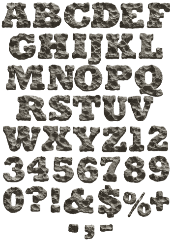
Gold tesserae bordered in deep cobalt, laid across a floor of pale chipped stone. The letters are broad slab serifs, the kind that survive being broken into tiles, and every character was set piece by piece. Silver and terracotta versions come along too. It looks like something uncovered rather than something designed on a screen.
Gold Tesserae on a Pale Stone Floor
Two colours carry this alphabet: warm gold for the letter body, deep cobalt for the keyline that holds it together. The tesserae are irregular, some squarer than others, and the gold ones shift from brass to honey as light moves across a stroke. Underneath sits a pale mosaic ground of chipped cream and grey, which keeps the gold from shouting. Since the outline is blue rather than black, the whole thing stays rich instead of heavy.
The Mosaic Font Borrows From Byzantium
Byzantine floors did this first, and the Mosaic Font knows it. Letterforms are broad slab serifs with thick stems, because that is the shape that survives being broken into tiles. Each character was laid separately, so an E and another E never share a tile pattern. The set also carries silver and terracotta variants for when gold feels like too much. Above all, the grout lines stay visible, which is what sells the material.