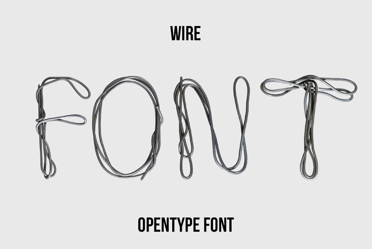
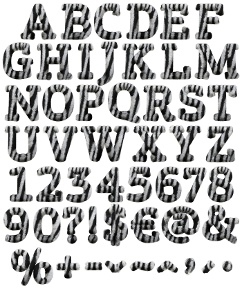
Wire Font bends thin steel cable into loose, looping letters that spill past their own outlines. Strokes stay fine and graphite-grey, so words read like quick sketches rather than solid type. Best used large and dark on a light background, for tech, music, gallery and editorial work.
Wire Font Bends One Long Cable Into Letters
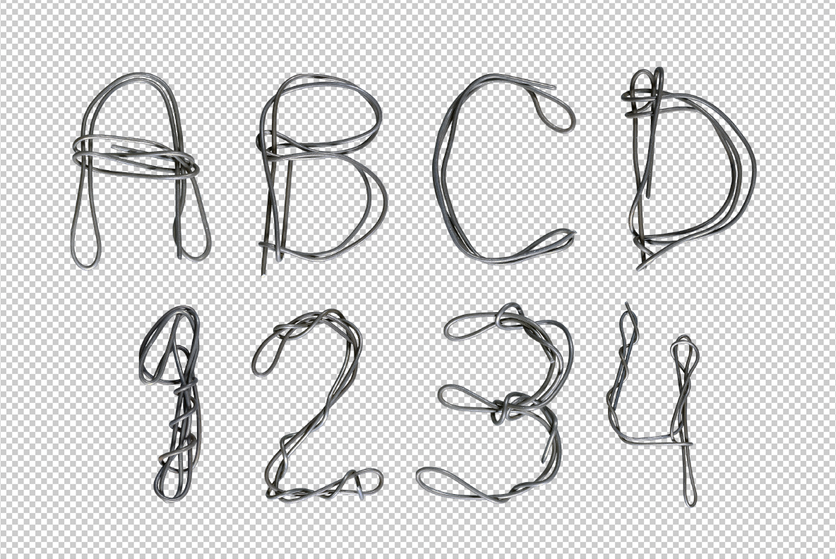
Every glyph looks like a single length of cable bent by hand, then dropped flat. The wire doubles back on itself, so loose loops spill outside the letter shape. Nothing here is tidy, and that is exactly the point. Strokes stay thin too, therefore the letters read as drawings rather than solid shapes. Meanwhile a soft steel sheen runs along each bend, which keeps the Wire Font unmistakably metal.
Loose, Springy and Slightly Out of Control
Counters rarely close properly, since the cable overshoots and crosses itself. That gives the alphabet a nervous, sketched energy, though the rhythm still holds. Colour is basically graphite, so it sits on any background without a fight. Caps, numerals and the usual punctuation are all bent from the same stock as well. At small sizes it turns almost handwritten, which is unusual for a metal alphabet.