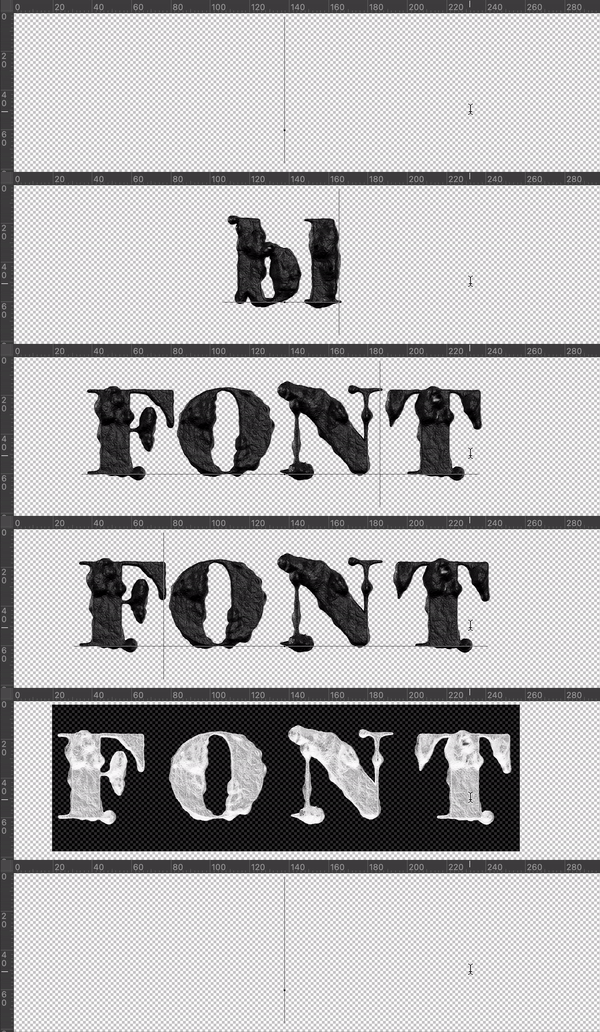
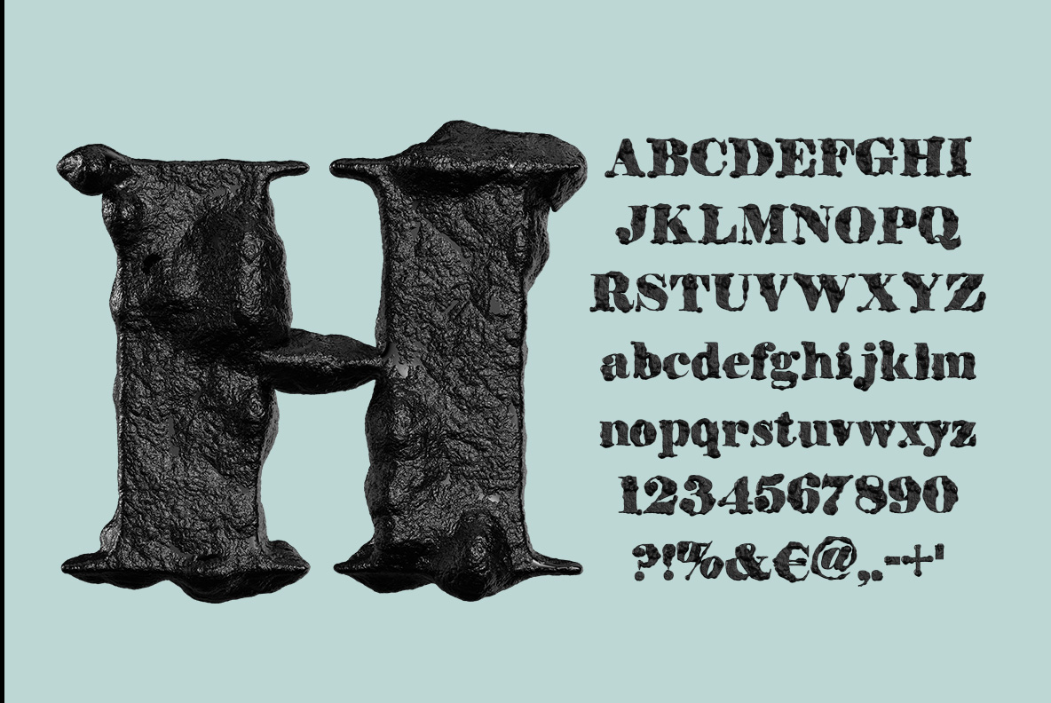
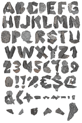
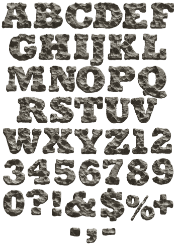
A saloon-poster serif that someone carved out of black volcanic rock. The faces are pitted, the serifs bulge, and only the ridges catch any light. Lowercase, figures and currency signs come along, so whole sentences stay readable. It suits horror titles, heavy record sleeves and anything that should look older and meaner than it is.
A Saloon Sign That Turned Into Rock
At first these capitals read as an 1880s saloon poster. Look closer, though, and the wood has become stone. Every stroke is pitted, blistered and flat black, so light only catches on the ridges. The serifs flare, then bulge, because the rock cooled before anyone tidied it. Naturally that wobble is the whole point, since a neat version would read as a plain shadow. Set it big, and of course you can count the blisters.
Why the Black Stone Font Keeps Its Lowercase
Most rough alphabets stop at capitals, so headlines work while sentences fall apart. The Black Stone Font also carries lowercase, figures, punctuation and currency signs. Of course the small letters look cruder, since less rock fits into less space. Even so, they hold together at poster size and likewise down on a book spine. Because the texture rarely repeats, twin letters in a word still differ.