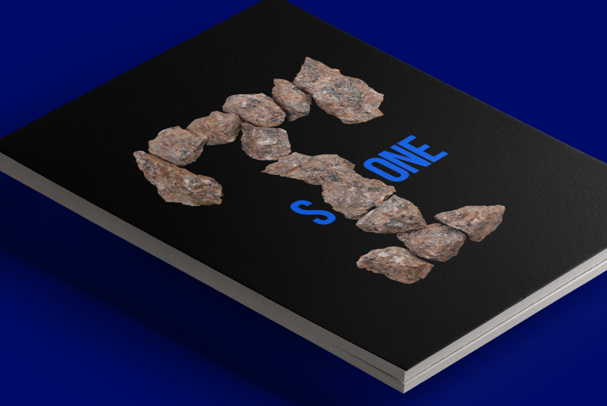
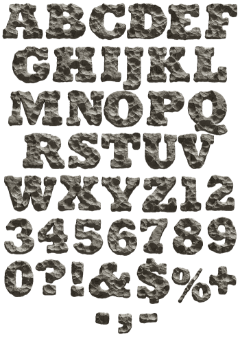
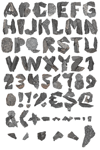
Capitals assembled from separate pinkish granite cobbles laid end to end, every face rough and chipped, with open gaps letting light through between the stones. The Granite Font stays lighter than its material suggests because of those gaps, yet the strokes are still wide enough to read. Figures and punctuation are built the same way.
Stones Laid, Not Carved
Nobody cut a letter out of rock here, though. Instead each capital is assembled from separate cobbles, laid end to end until the shape appears. The stone runs warm pinkish grey, flecked with black mica and white feldspar. Every face is rough and chipped too, since these are broken pieces rather than polished blocks. Because the stones differ, repeated letters never stack identically. Dust and small chips cling to the larger faces as well, which keeps the stones from looking washed.
Gaps Are Part of the Design
The spaces between the cobbles matter as much as the stones. Light gets through them, so the letters breathe instead of sitting as dead mass. That openness keeps the Granite Font lighter than its material suggests. Strokes stay wide enough to read, though, and the baseline holds firm. Besides, figures, currency signs and punctuation are built the same way. In addition, the shadows between the cobbles do half the drawing.