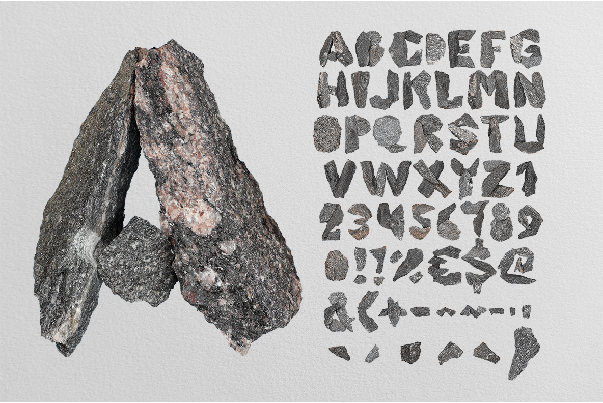
Black Granite Font breaks each letter out of dark speckled stone, so the edges stay jagged and no two glyphs match. White feldspar flecks scatter across the grey, and a few faces carry rusty patches from the quarry. Nothing was smoothed or polished, which is why the alphabet feels heavy even on a white page.
Broken, Not Carved
Nobody cut these letters to shape, of course. Each Black Granite Font glyph looks split off a larger block, so the outline wanders and the corners come away rough. The faces stay flat and matte, while the broken edges catch a harder light. Besides, sharp chips and small hollows survive on the surface, exactly as they would on a quarry floor. Because every letter fractured differently, a word made from them never falls into a pattern.
Speckle, Flecks and a Little Rust
Naturally, up close the stone does the talking. Salt-and-pepper grain covers every face, and pale feldspar crystals flash white against near-black grey. Some letters also carry warm rust staining, which stops the set reading as flat grey. Nothing here got polished, and that matte finish is what keeps it believable. Since the texture is already busy, the shapes stay blunt and wide.