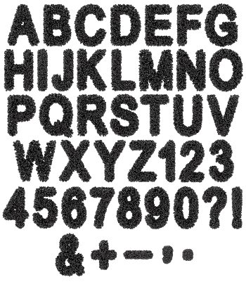
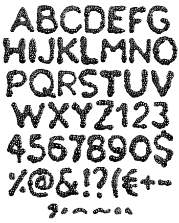
No solid strokes anywhere. Every letter is a raft of clear bubbles pressed together, big domes across the wide areas and fine froth in the corners. A broad condensed sans holds the Bubble Foam Font together, so short headlines still read. Caps, numerals, currency and punctuation included. Put it on black or a saturated colour and every dome pops.
The Bubble Foam Font Has No Solid Strokes
Every letter is a raft of bubbles pressed together until the edges hold a shape. Large clear domes take the wide areas, while fine froth packs into corners where a dome will not fit. Each bubble also carries its own highlight, which is why the letters glitter instead of glowing. Look closely at the percent sign and you can actually count them. So nothing about it reads as a texture simply laid over a letter.
It Only Works Against Dark
White foam on white paper disappears, so this one comes with a condition attached. Put black, navy or a saturated colour behind it, and suddenly every dome pops. Underneath, a broad condensed sans quietly holds the shapes together. Caps, numerals, currency and basic punctuation are all built the same way. Short headlines survive, while long paragraphs turn into visual noise. Give it size too, since the froth needs room to be legible.