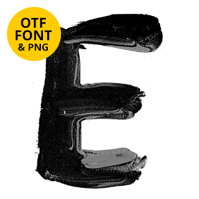
Thick black paint dragged across each letter with a flat brush, bristle ridges and all, then left to run off the bottom edge. Stroke Edge Font keeps a crisp sans outline while the surface stays raw. Uppercase, numbers and punctuation, plus separate PNG letters. Good for streetwear, gig posters, horror covers and anything that should look freshly painted.
Stroke Edge Font Keeps Its Silhouette
Painted fonts usually go soft at the edges, whereas this one refuses. The outer shape stays a clean bold sans, and it holds even where the paint runs thick. Inside, though, the brush did whatever it liked. Bristle streaks rake across the faces, while ridges of wet paint catch the light. So the letter reads sharp from a distance, yet messy up close.
The Drips Are the Point
Heavy black beads hang off the bottom of almost every stroke. Some stretch into a thread, and others end in a fat teardrop. Because the drips fall below the baseline, lines of text get an uneven bottom edge. That is deliberate, since a tidy version would lose the whole effect. Naturally it looks best with generous leading. Besides, a drip landing in the next line rarely helps.