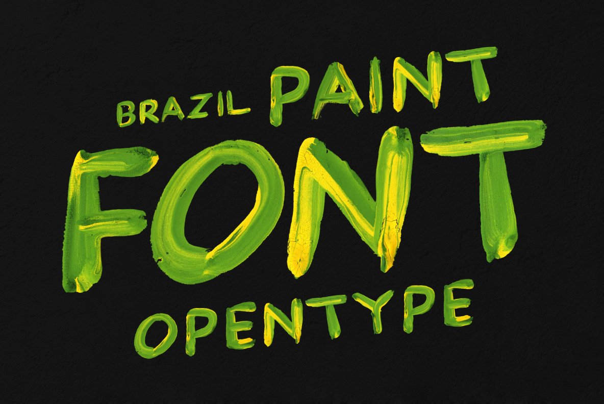
One brush, dipped in green and then yellow, and never rinsed between letters. Yellow runs down the middle of every stroke while green piles up along the edges. The bristle tracks and ragged ends are all still there. It suits carnival flyers, sports headlines and record sleeves, especially when the background is dark.
One Brush, Two Colours, No Second Try
First somebody dipped a brush in green, then straight into yellow, and never rinsed it. Every stroke therefore carries both colours at once. Yellow rides the middle, while green piles up along the edges and the bristles leave tracks. Of course the ends stay ragged, since nobody went back to tidy them. Besides, look at the terminals and you can see where the brush lifted. In short, that single loaded brush is the entire idea.
What the Brazil Paint Font Looks Like Up Close
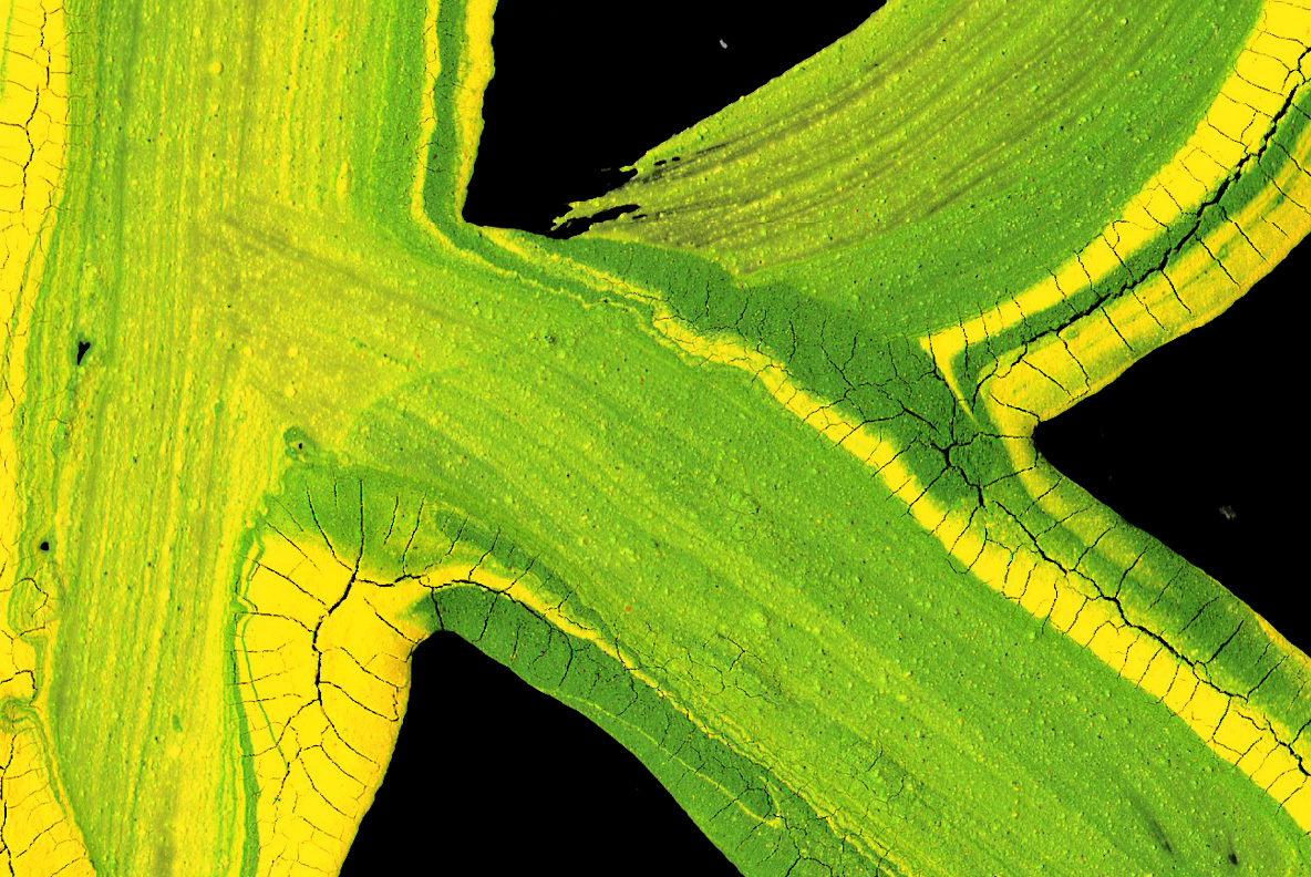
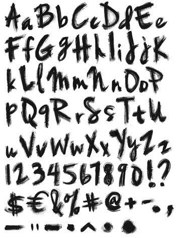
In fact the paint sits thick enough to throw a small shadow of its own. Naturally the strokes run uneven, so an M leans slightly and an S thins mid-curve. Likewise the figures, punctuation and currency signs are painted in one pass. Because each glyph took a single stroke, repeated letters inside a word still differ. So set a word large, and you can count the bristle marks.