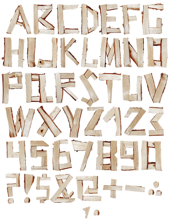
Wooden OpenType Font builds a slanted, calligraphic alphabet out of split branches, so every stroke carries dark bark on one edge and pale planed wood on the other. Sawn round ends stand in for dots and full stops. Made for signage, packaging, book covers and any brand that wants to look like it came out of a forest.
Wooden OpenType Font Splits the Log Down the Middle
Each stroke here is a piece of split wood. One side keeps its rough bark, then the other shows a pale planed face. Because of that, a single letter flips between dark and light along its length. Sawn round ends turn up as dots, full stops and the odd counter too. The whole alphabet leans, since the pieces are laid out like brush strokes rather than blocks. So the Wooden OpenType Font actually moves, which is rare for anything built from timber.
Bark, Sapwood and a Very Slanted Rhythm
Colour sits between chestnut and pale honey, while the bark goes almost black at the edges. Meanwhile the tapered ends give every letter a proper calligraphic entry and exit. Caps, numerals, currency signs and punctuation are all built the same way as well. Nothing repeats exactly, though the slant and the weight stay consistent throughout. On a pale ground the wood glows, whereas on black it turns dramatic instead.