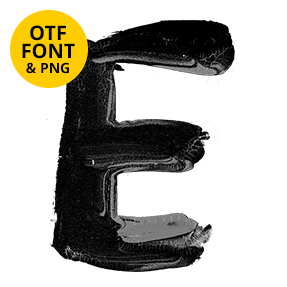
Tall narrow capitals painted by hand in flat matte black — bristle lines through the thick parts, dry skips across the middle and baselines that wobble just enough to look real. It suits art shows, zines, streetwear, record sleeves and any brand that would rather look hand-made than typeset.
Painted by hand, bristles and all
You can see the brush in every stroke. Bristle lines run down the thick parts, while dry patches skip across the paper. Some ends taper to a hair, and others stop flat where the brush lifted. Because the ink is flat matte black, nothing looks glossy or wet. So it reads as paint that has already dried, not paint still moving. Even the parentheses on the cover are single sweeps.
Tall, narrow capitals with a wobble
The letterforms themselves, of course, are tall and narrow. Strokes stay close to even width, though the baselines wobble slightly from letter to letter. That drift is what stops a headline looking typeset. Counters in the O and the P stay open too, so words hold up at small sizes. Punctuation and the ampersand, meanwhile, swing much looser than the capitals.