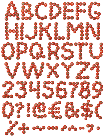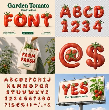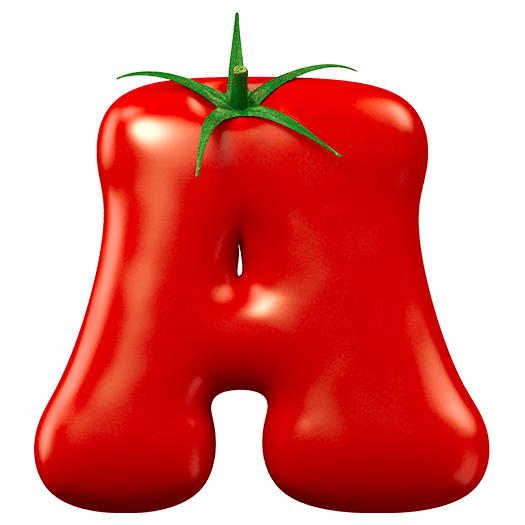
Dark, almost wine-red tomato skin with a hard shine, shaped into rounded letters, each wearing a small green star of a stalk at one shoulder. Tomato Red Font is richer and moodier than the usual bright tomato. Uppercase, numbers and punctuation, plus separate PNG letters. Built for sauce labels, pizzeria menus and food packaging.
Tomato Red Font Goes Dark, Not Bright
Most tomato fonts reach for pillarbox red, whereas this one sits closer to wine. The skin is deep and slightly brown in the shadows, so the letters read ripe rather than cartoonish. Highlights land hard along the top of each stroke, since the surface is genuinely glossy. Because the colour is dense, white text laid over it still holds up. So the whole alphabet feels heavier than its neighbours.
The Stalk Does the Work
Every glyph carries a small green calyx perched on one shoulder, and that single detail sells the illusion. It also breaks the silhouette, so the letters never look like plain blobs. Meanwhile the green is the only other colour in the set, which keeps the palette tight. Look closely, and the little sepals curl differently on each letter. So repeated letters never quite match.