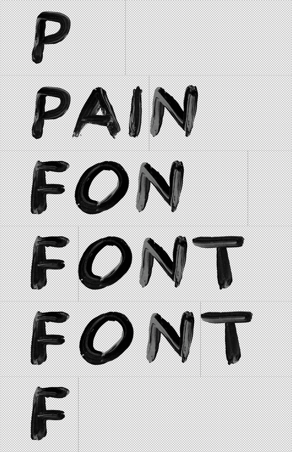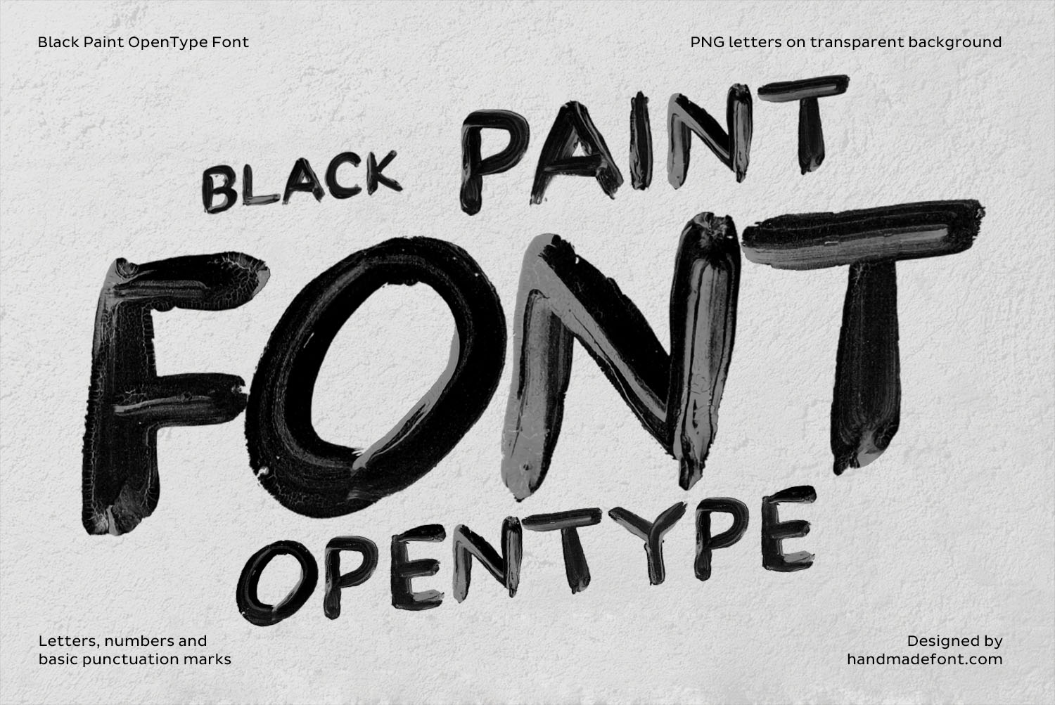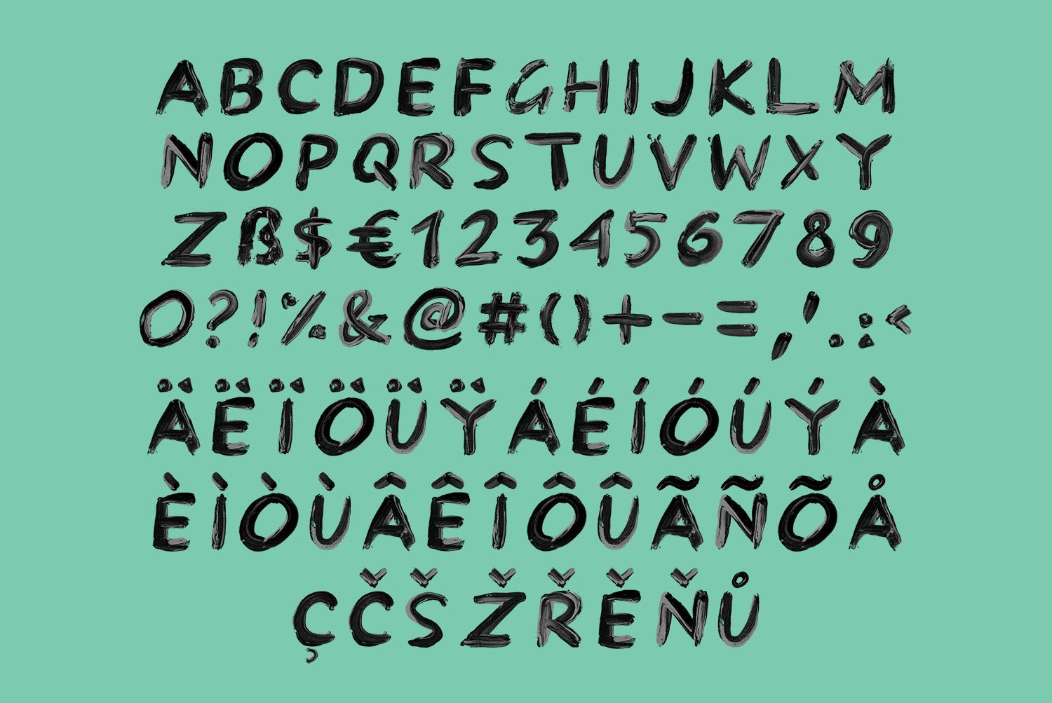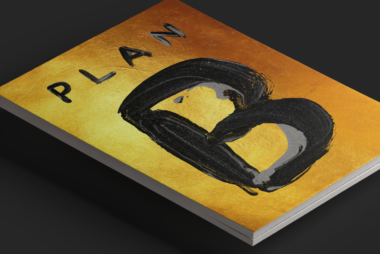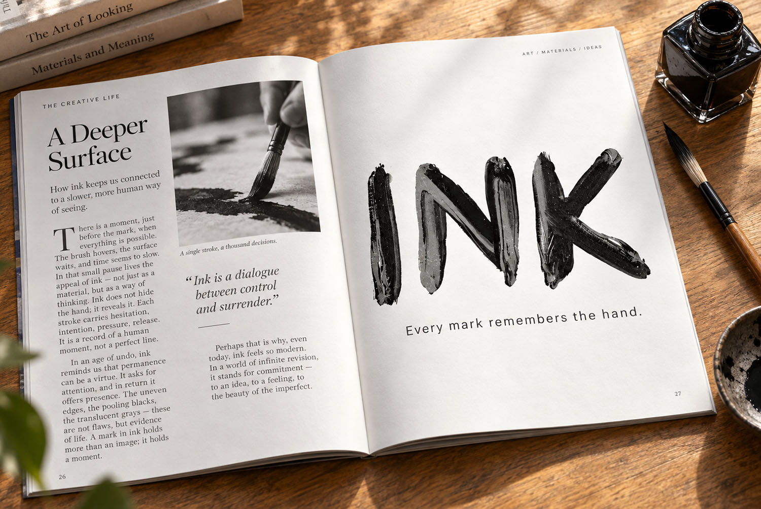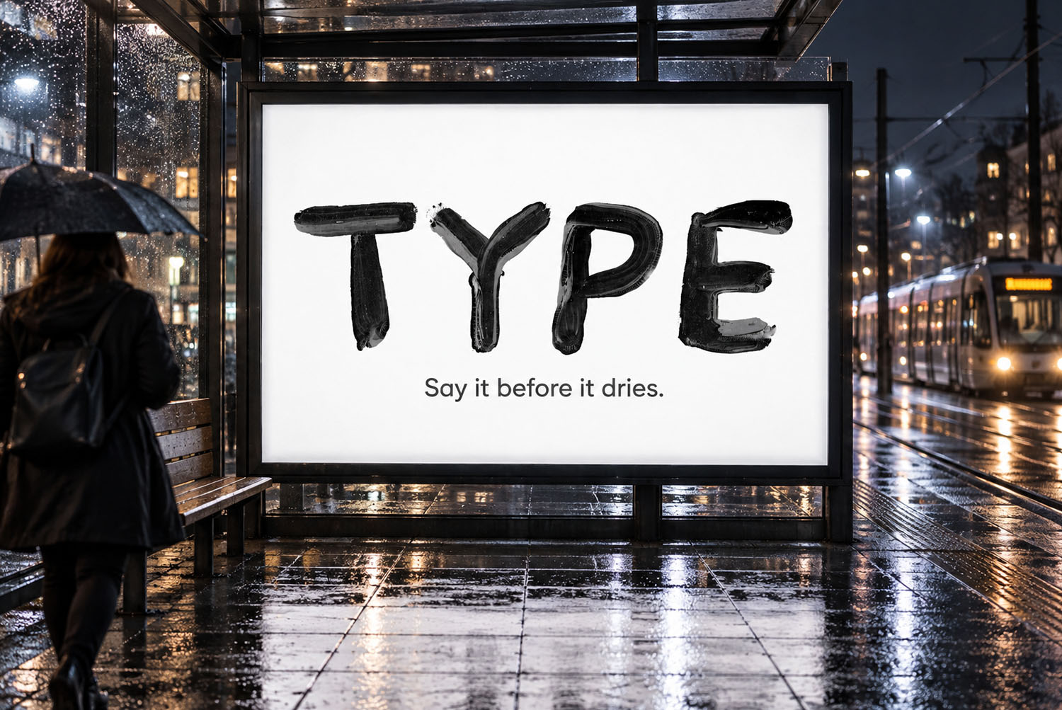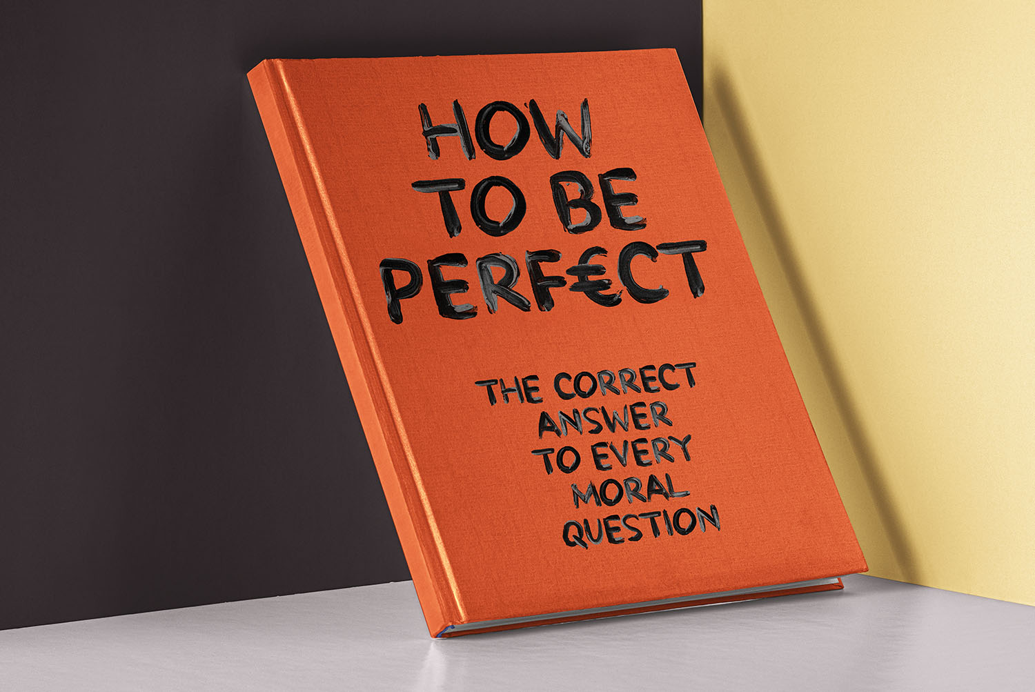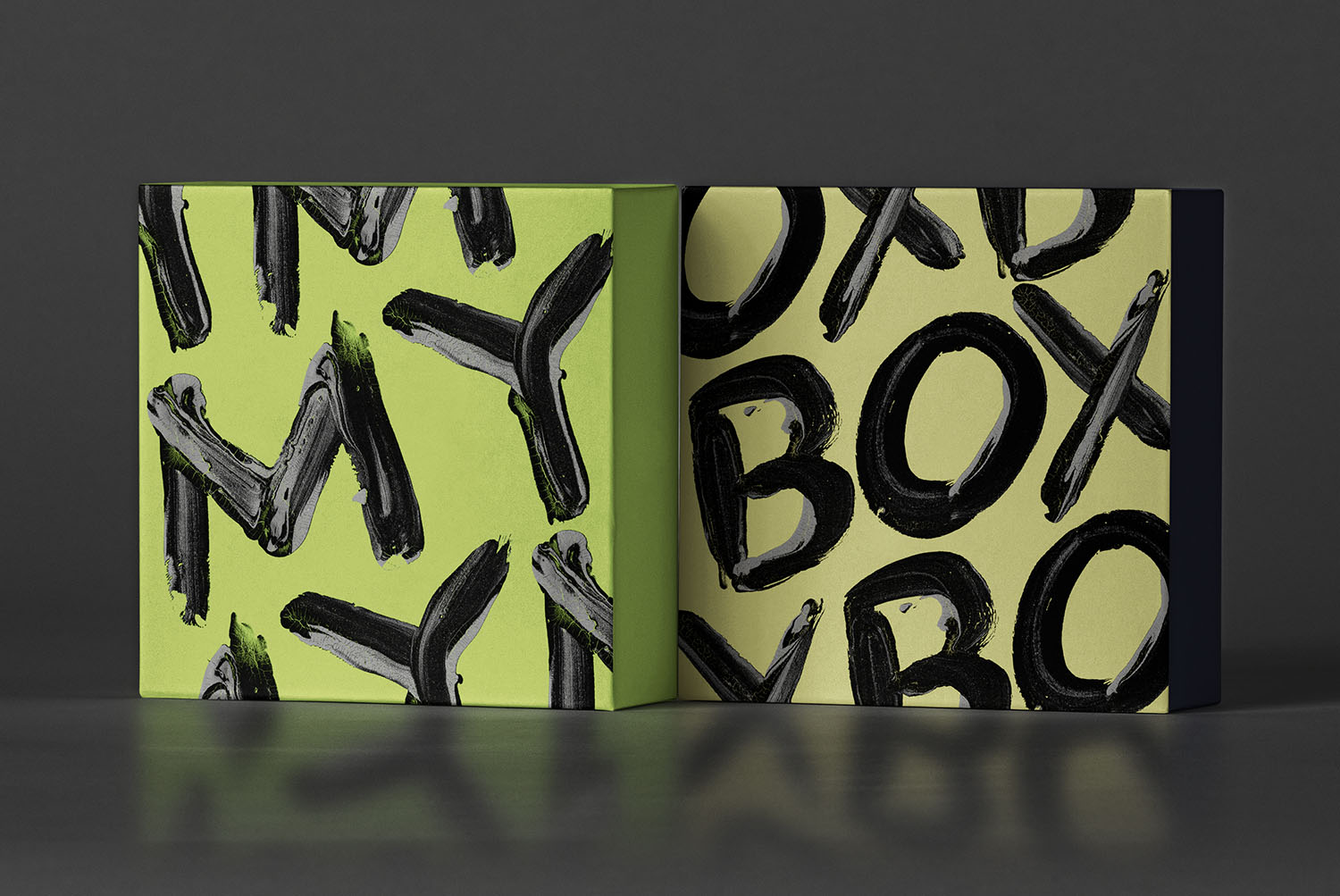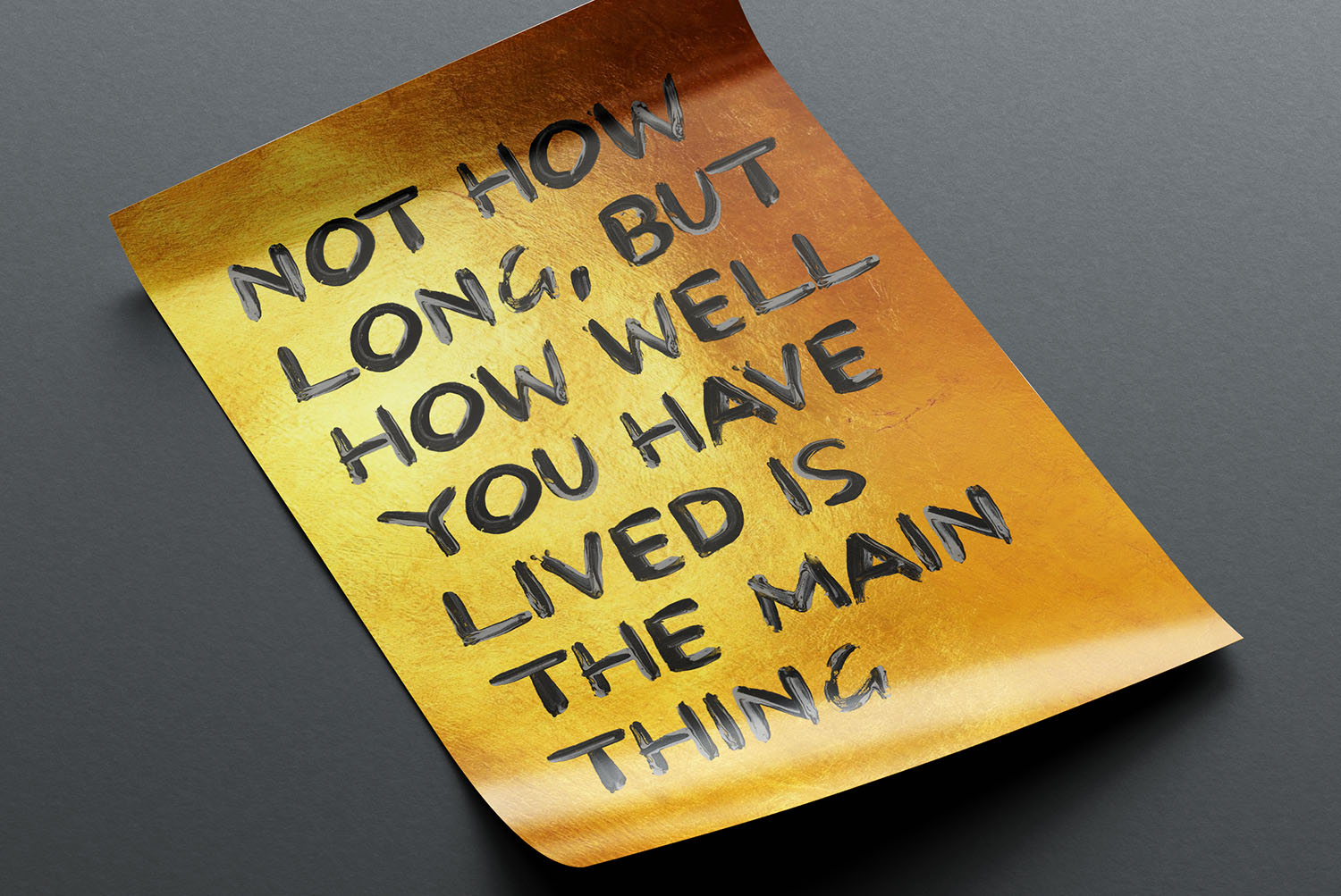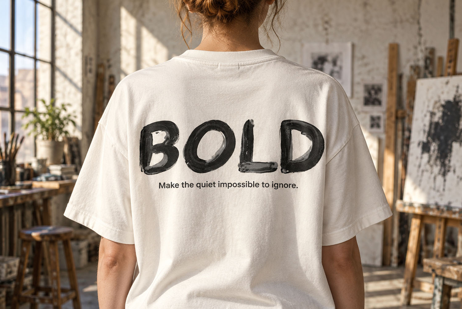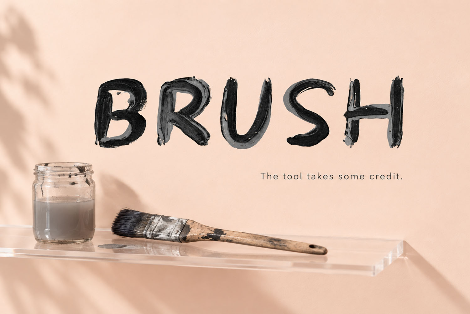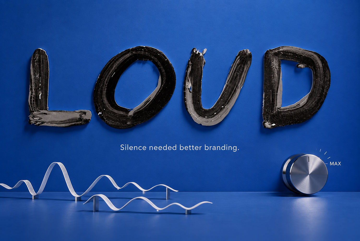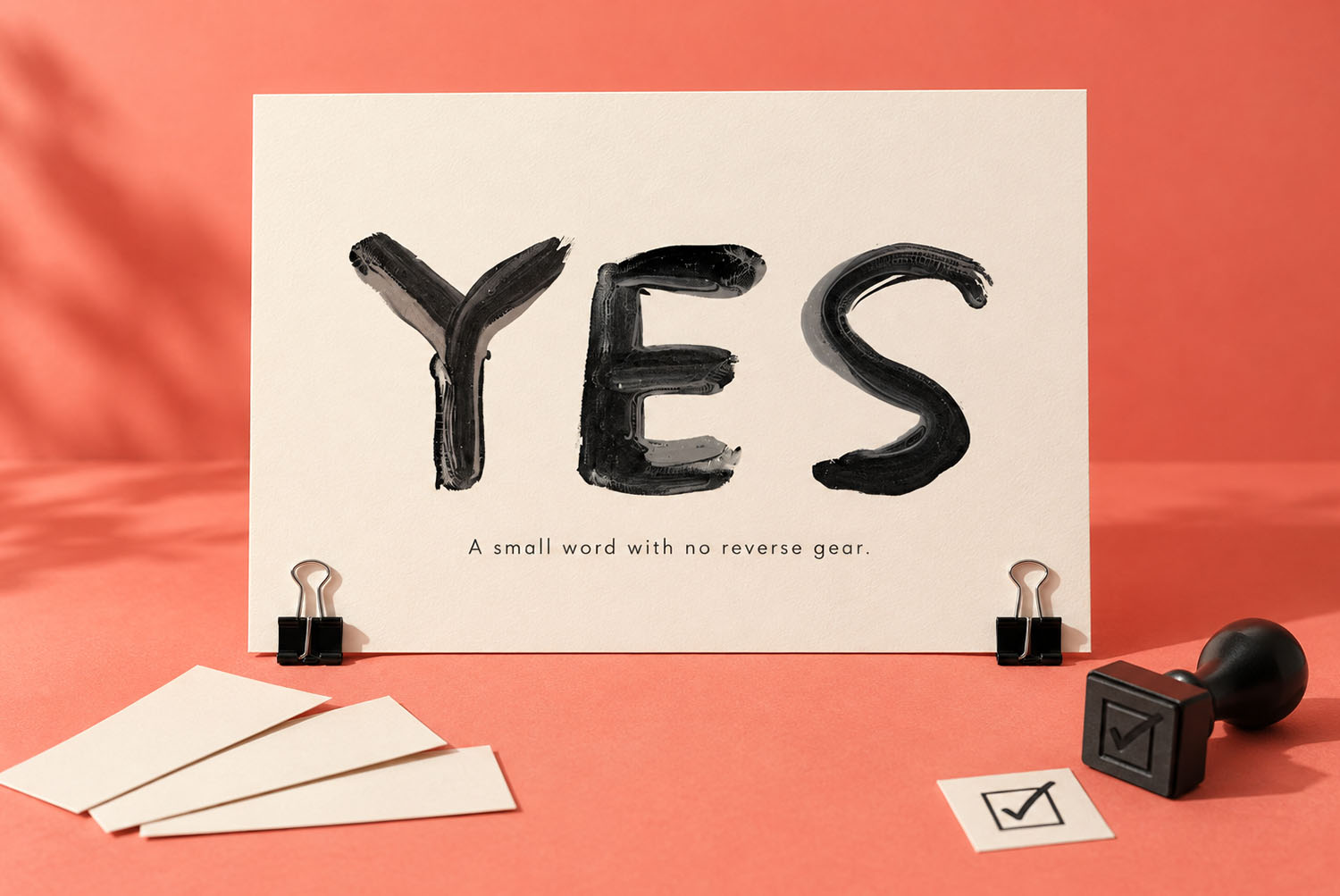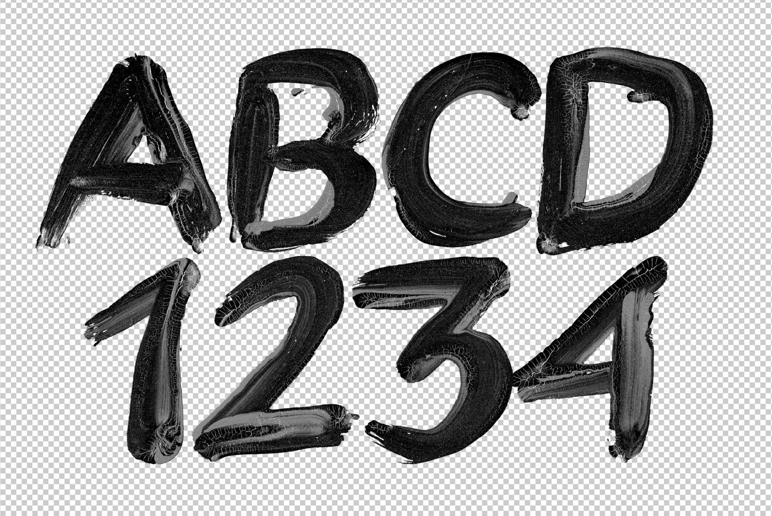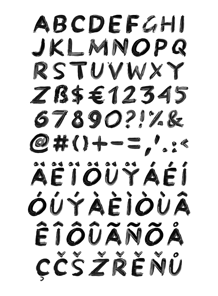

Black Paint Font builds every capital with a flat brush and thick black paint. Strokes swell under pressure, thin out as the paint runs low, and keep the bristle streaks along the edges. Ends land blunt, counters stay uneven, and the accents run long. It comes as an OTF you type with, plus transparent PNG letters at high resolution.
Black Paint Font Was Painted, Not Drawn
Each capital comes off a flat brush loaded with thick black paint. So the strokes swell where the brush pressed down, then thin out as the paint runs low.
Edges stay ragged, since the bristles leave their own streaks along every turn. Ends land blunt and rounded, because the brush lifts instead of tapering. Letters also lean a hair off vertical, which keeps a line from looking ruled.
Gloss, Streaks and the Odd Gap
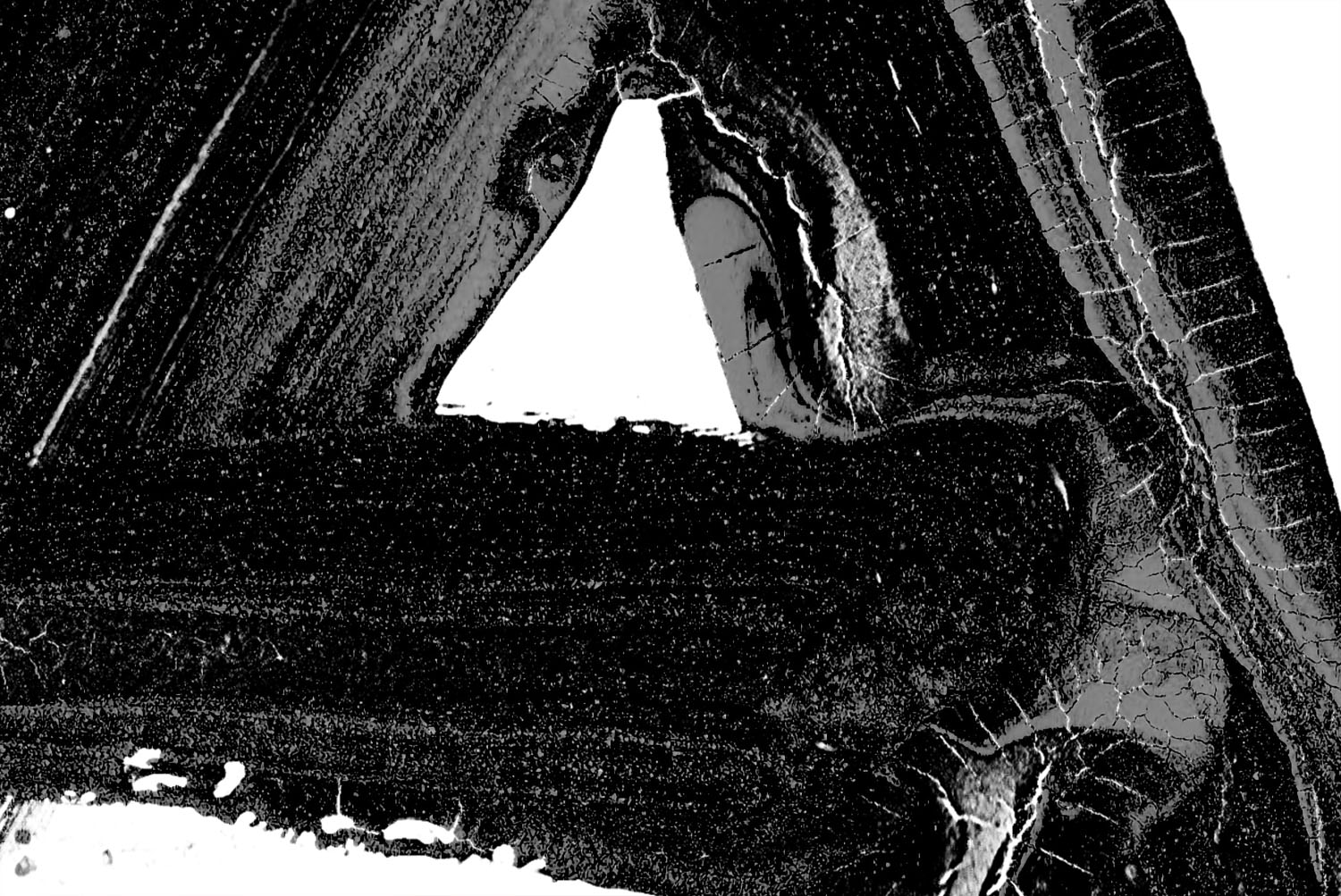
In the mockups the black still reads wet, with highlights riding the ridges of paint. Inside the heavier strokes you can see pale gaps where the bristles split.
A few counters close up, while others hold open by a millimetre. Nothing repeats, so a double letter never looks pasted. Because of that, a word takes its rhythm from the paint rather than from the spacing.