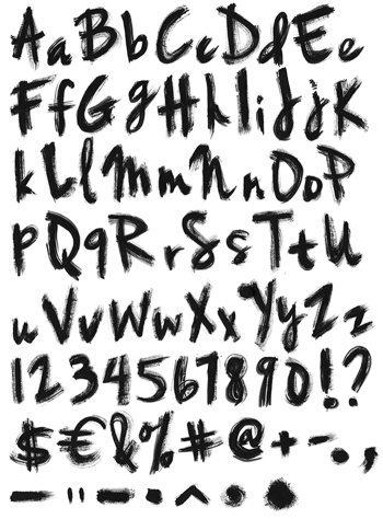
Crimson, cobalt and white dragged across the page in single sweeps, then squared off into letters. The bristles left their tracks in every stroke, so you can see where the brush ran dry and where it was still loaded. The shapes underneath are geometric and angular, which stops the whole thing dissolving into mess.
Three Colours, One Sweep
Load a wide brush with crimson, cobalt and white at once, then pull it in one go. That is how every stroke here was made, because the three colours never fully mix and stay visible as separate tracks. Bristle lines run the length of each sweep, while the ends fray where the paint gave out. Since the brush was wide, the strokes stay flat and ribbon-like rather than round.
The Paintbrush Font Keeps Its Corners
Most brush alphabets go loose and calligraphic. The Paintbrush Font does the opposite, since it squares every stroke into an angular geometric frame. Verticals stay vertical, corners meet at clean angles, and the letterform reads as constructed rather than written. That tension is the whole appeal, though it takes a moment to notice. Above all the palette holds across the alphabet, so a full word never turns muddy. Naturally the white lifts the other two.