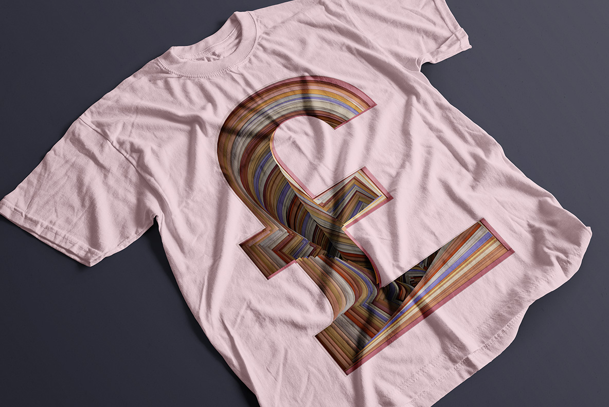
Hundreds of thin paper sheets stacked on edge and cut into letters. You see the layers side-on, striped in dusty pink, cream, brown, slate and rust, the way a book looks from the spine. The strokes glow slightly where the edges catch light. Quiet, warm and far more tactile than it has any right to be.
A Letter Cut From a Stack
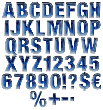
Stack a few hundred sheets of coloured paper, then cut a letter out of the block. That is the trick here, and of course the striped edges give it away. Bands of dusty pink, cream, brown, slate and rust run through every stroke, notably at slightly different angles. Because the paper edges catch light, the inside of each letter glows a little against its own shadow. So the forms read as solid objects rather than printed shapes.
The Paper Craft Font Runs Warm
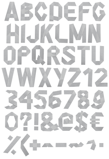
Warmth, obviously, is what the Paper Craft Font trades on. The palette avoids primaries entirely and sits in muted neutrals, which means it never fights a photograph placed beside it. Stripes run diagonally on some letters and almost vertically on others, so nothing looks stamped. Above all the skeleton underneath is a plain geometric sans, and that restraint is why the texture works. Naturally the counters stay clean.