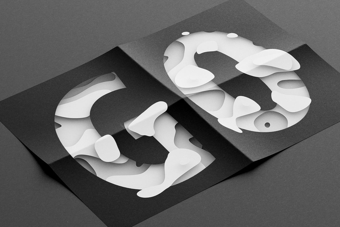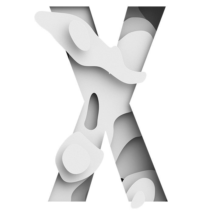

White paper cut back in layers until each letter ripples. The surface rises and falls in rounded ridges, with soft shadows pooling in the hollows and nothing but shades of white doing the work. It looks carved rather than printed. Quiet enough for a museum catalogue, strange enough that people stop and look at it twice.
White on White, Cut in Layers
Every letter looks cut back through several sheets of white paper, of course. Rounded ridges rise and fall across each stroke, while soft shadows collect in the hollows between them. There is no colour at all, so the whole effect depends on light. Because the paper has visible tooth, it reads as stock rather than as a smooth surface. Naturally the ripples never repeat from one glyph to the next.
The Paper Waves Font Works Without Colour
Working in one colour is harder than it sounds, yet the Paper Waves Font manages it. The underlying shapes are wide and confident, which gives the ridges room to run without closing the counters. Detail concentrates at the joints, where the layers overlap most. Above all the shadows stay soft rather than hard, since a harsh edge would turn the paper into plastic. Some letters carry more ripples than others, though.