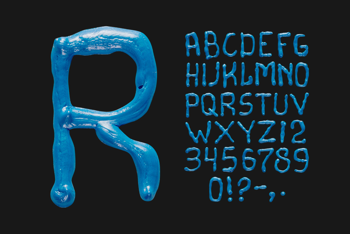
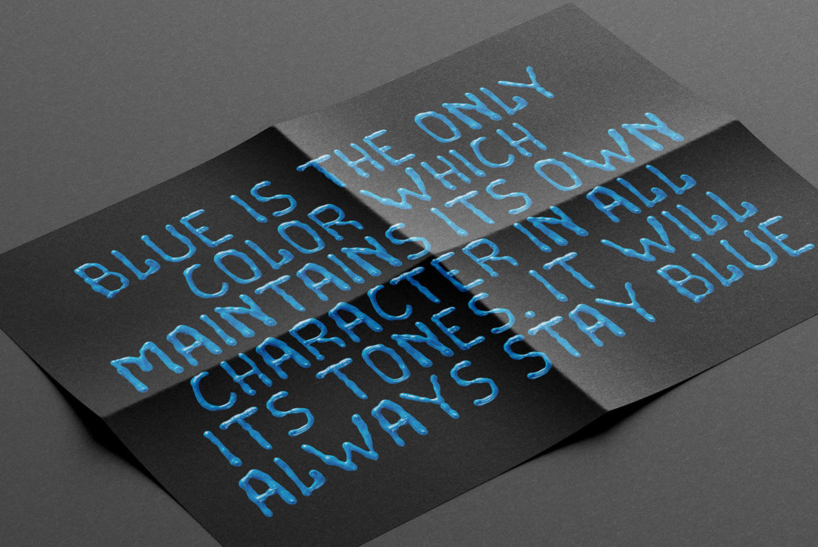
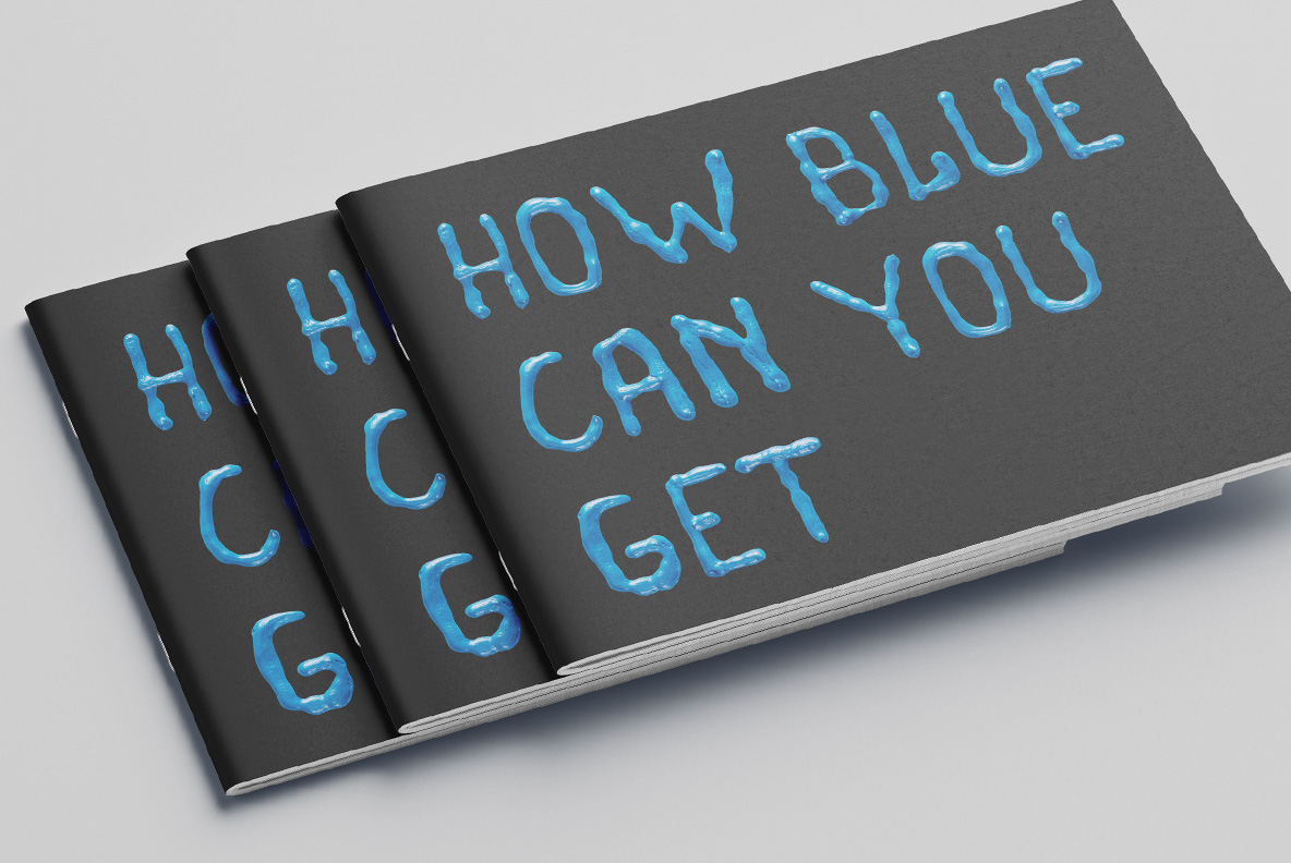
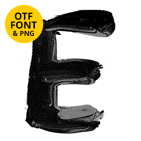
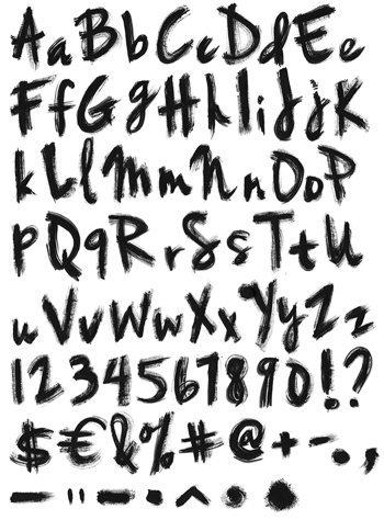
Cobalt oil paint pushed across a surface in thin, uneven strokes. Pale streaks show where the pigment thinned out and the white underneath came through, and the edges stay ragged rather than smooth. These are capitals, drawn with a loose wrist and a heavy hand. The whole alphabet still looks wet, which is exactly what you want from it.
Cobalt, Still Wet
Blue behaves differently from yellow in oil, because it goes further before it runs out. Strokes here are thinner and more uneven, with pale streaks where the pigment thinned and the surface showed through. Ends are ragged rather than rounded, so the letters keep a scraped, restless quality. Since somebody worked the paint while it was still wet, small ridges catch light along the middle of each stroke instead of the top.
The Oil Blue Font Keeps Its Streaks
Unlike its yellow sibling, the Oil Blue Font sets in capitals. The forms are wide, upright and almost geometric underneath all the mess, which is what keeps a headline stable. Stems vary in width from top to bottom, though, so no letter reads as a tracing. A few letters show a hook where the brush lifted early. Above all the palette holds one cobalt, so a long line never turns patchy.