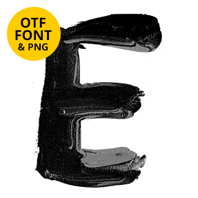
Thick black paint, brushed on too heavily and left to run. Strokes show the bristle streaks, edges tear where the brush ran dry, and drips hang off every letter with a bead at the tip. A glossier poured version rides along in the same set. Loud, wet and slightly threatening, which is usually the point.
The Melted Black Paint Font Never Dried
Somebody loaded a brush too heavily and walked away. That is the story the Melted Black Paint Font tells, and it tells it convincingly. Thick strokes are pulled fast, edges tear where the bristles ran out, and long drips slide off the bottom of every letter. Some drips have already pooled, while others hang mid-fall with a bead at the tip. Because the runs differ per glyph, a set word never looks stencilled.
Two Textures in One Alphabet
There are really two alphabets here. One is matte and brushy, with visible bristle streaks and torn edges, while the other is glossy and swollen, closer to poured enamel than to paint on a wall. They share the same condensed skeleton, so you can swap a letter from one into the other and nobody flinches. Naturally the glossy set throws harder highlights, which reads as wet and recent rather than old and flaking.