Potato Font. Farm-Fresh Potato Alphabet

49.00$ 34.30$

The Potato Font shapes every letter from real, whole potatoes, bumps, eyes, and dirt-flecked skin included. It’s rustic, funny, and completely unpretentious, the kind of alphabet that turns a menu or a farmers’ market sign into something people actually stop and read. Great for food branding, farm-to-table packaging, or any project that could use a little dirt-under-the-nails charm. Comes as a color OpenType font plus PNG letters.

Don't forget about our exclusive deal!
  5 Fonts-30% OFF   🔥   10 Fonts-50% OFF  

Read more about licensing

Typography Grown Straight From the Ground

Every letter in the Potato Font started life as an actual potato, photographed whole, then arranged and retouched until the alphabet held together as type. You can see the real skin: the eyes, the dirt marks, the uneven bumps that no two potatoes share. It’s closer to what you’d find in a root cellar than a sanitized food font, and that’s exactly the point. Tight tracking gives words a stacked, sculptural weight, while looser spacing lets each letter read as its own small vegetable portrait.

Animated GIF of the Potato Font spelling out the word POTATO letter by letter

Built as a Color OpenType, Delivered as PNG Too

The Potato Font installs as a working color OpenType, so the potato texture and coloring show up the moment you type, no layering required. Alongside the font file you get every letter, number, and basic punctuation mark as a separate high-resolution PNG on a transparent background, ready to drop into a poster or package mockup without opening a design program. Both formats share the same source photography, so a headline set in the font and a hero letter from the PNG set always match.

Potato Font title card reading POTATO FONT in potato-shaped letters with an OTF Font and PNG badge
Potato Font large letter F next to a full alphabet and number chart on white background
Potato Font letters spelling YES displayed on a billboard mounted on a brick wall in a garden
Potato Font phrase I Just Really Like Potatoes formed from potato-shaped letters on sage green background
Potato Font numbers 2 and 3 shaped like real potatoes on black background
Potato Font letters spelling RAW displayed on a billboard mounted on a brick wall
Potato Font letters spelling LOVE printed on a white t-shirt mockup
Potato Font phrase She's My Sweet Potatoes on a black paper poster mockup
Potato Font letter S shaped like a potato in a framed poster leaning against a wall
Potato Font letters A, B, C, D and numbers 1, 2, 3, 4 on transparent background

Where This Font Actually Works

This is a font for brands that don’t take themselves too seriously: farm stands, root vegetable packaging, restaurant menus, farmers’ market signage, or a food truck that wants people to smile before they order. It reads clearly even at a distance, so it holds up on shelf labels and outdoor signs as well as it does on a playful social post. If a project needs more options in the same spirit, the Food Fonts collection gathers other typefaces built the same way, real ingredients, photographed and turned into type.

A Second Vegetable Worth a Look

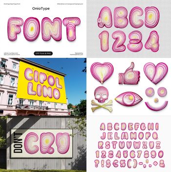
Potatoes aren’t the only vegetable turned into an alphabet here. The OnioType Font slices red onions into a bright, ringed display alphabet built the same handmade way, purple, white, and yellow layers instead of golden potato skin. Reach for OnioType when a project needs a punchier pop of color than the earthy Potato Font provides.

Updating
  • No products in the cart.