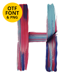
Leaning capitals painted in one thick pass of metallic gold, with bristle tracks running the length of every stroke and edges breaking up where the brush ran dry. The Gold Paint Stroke Font keeps an irregular hand-painted rhythm, so whole words look brushed rather than set. Figures and punctuation share the same wet finish.
A Loaded Brush, One Pass
Indeed, this is paint rather than metal. Each capital comes from a single thick pass of a loaded brush, so the gold sits proud of the surface. Bristle tracks also run the length of every stroke, and the edges break up where the brush ran dry. Highlights slide along those ridges too, which is what makes the pigment read as metallic. Because no two passes are identical, repeated letters differ every time. Thicker areas pool and catch more light too, exactly as wet paint does.
Leaning Strokes With Real Weight
The hand behind it, of course, leans forward and moves fast. Strokes swell through the middle then taper at the ends, exactly as a brush unloads. Since the rhythm stays irregular, whole words look painted rather than set. Ends lift off the baseline in places too, which keeps a line alive. In addition, figures, currency signs and punctuation carry the same wet finish.