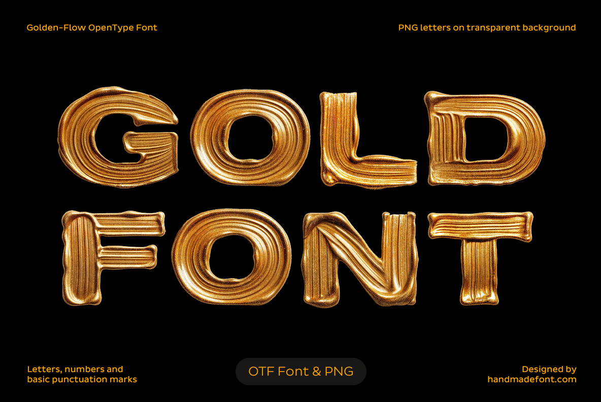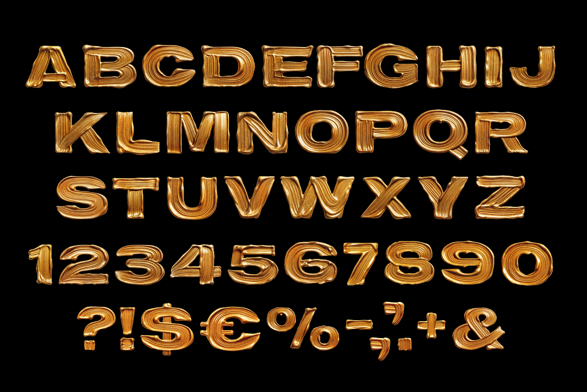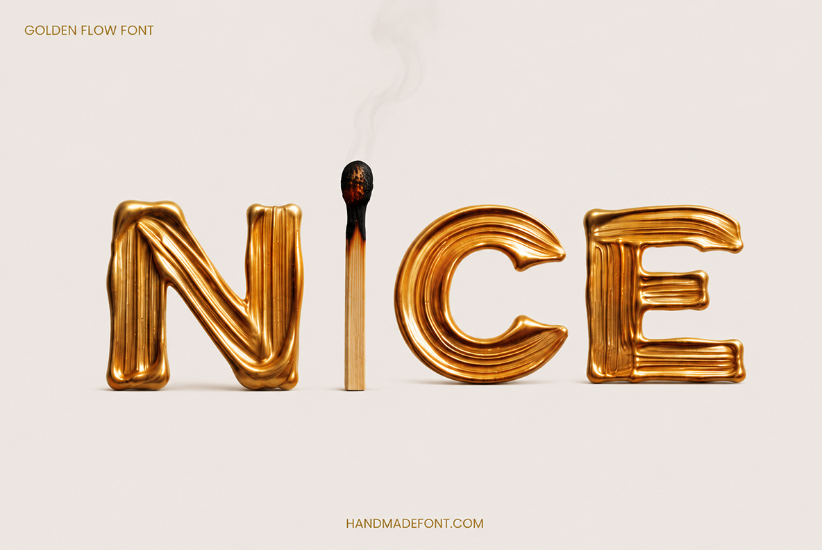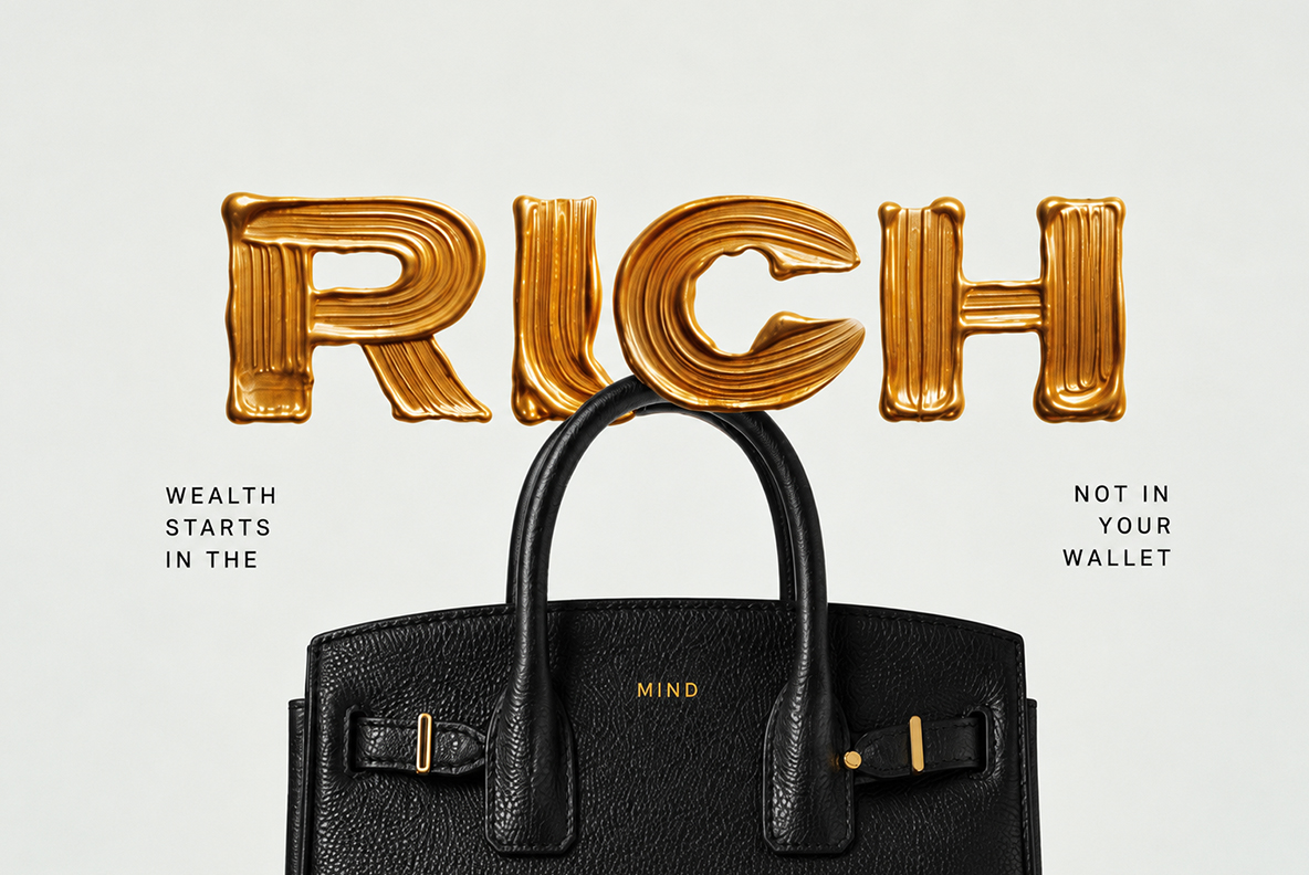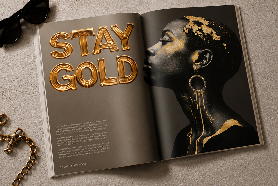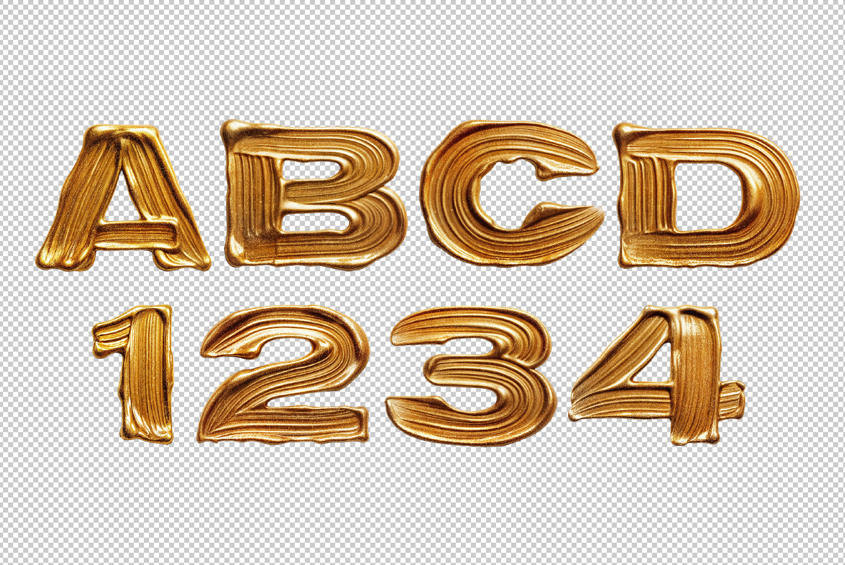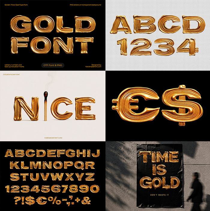
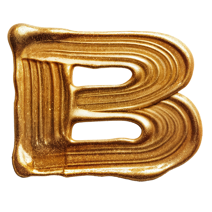
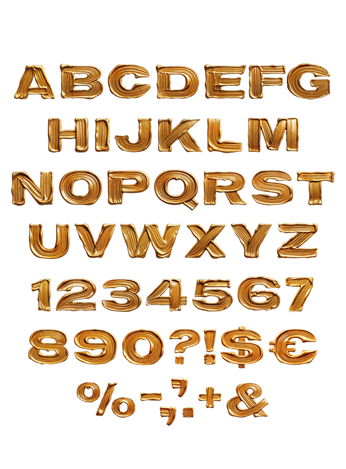
Thick gold squeezed from a tube and looped inward, so every letter is built from raised concentric ridges. The Golden Flow Font finishes satin rather than mirror, which keeps it legible on black. Mockups run from night billboards to a biker tee and a magazine spread. Supplied as an OTF plus transparent PNG letters.
Gold Squeezed Straight From the Tube
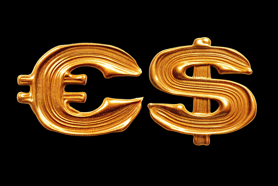
Imagine thick gold squeezed from a tube, looped inward and then left to set. Every letter is built from concentric raised ridges that follow the stroke around. Ends finish in soft rounded blobs, so nothing looks cut or trimmed. The metal reads satin rather than mirror, which keeps highlights long and calm. Underlying shapes are a plain bold sans, and that restraint is deliberate. Even the euro and dollar signs got the same treatment.
Ridges Are What Make It Read
Those grooves do the real work, because they catch light along every curve. So a word looks solid from across a street, not only up close. Also the ridges add texture without any pattern or outline. Meanwhile the satin finish stops the gold behaving like a mirror and reflecting your background. It therefore holds together where a polished chrome face would fall apart.