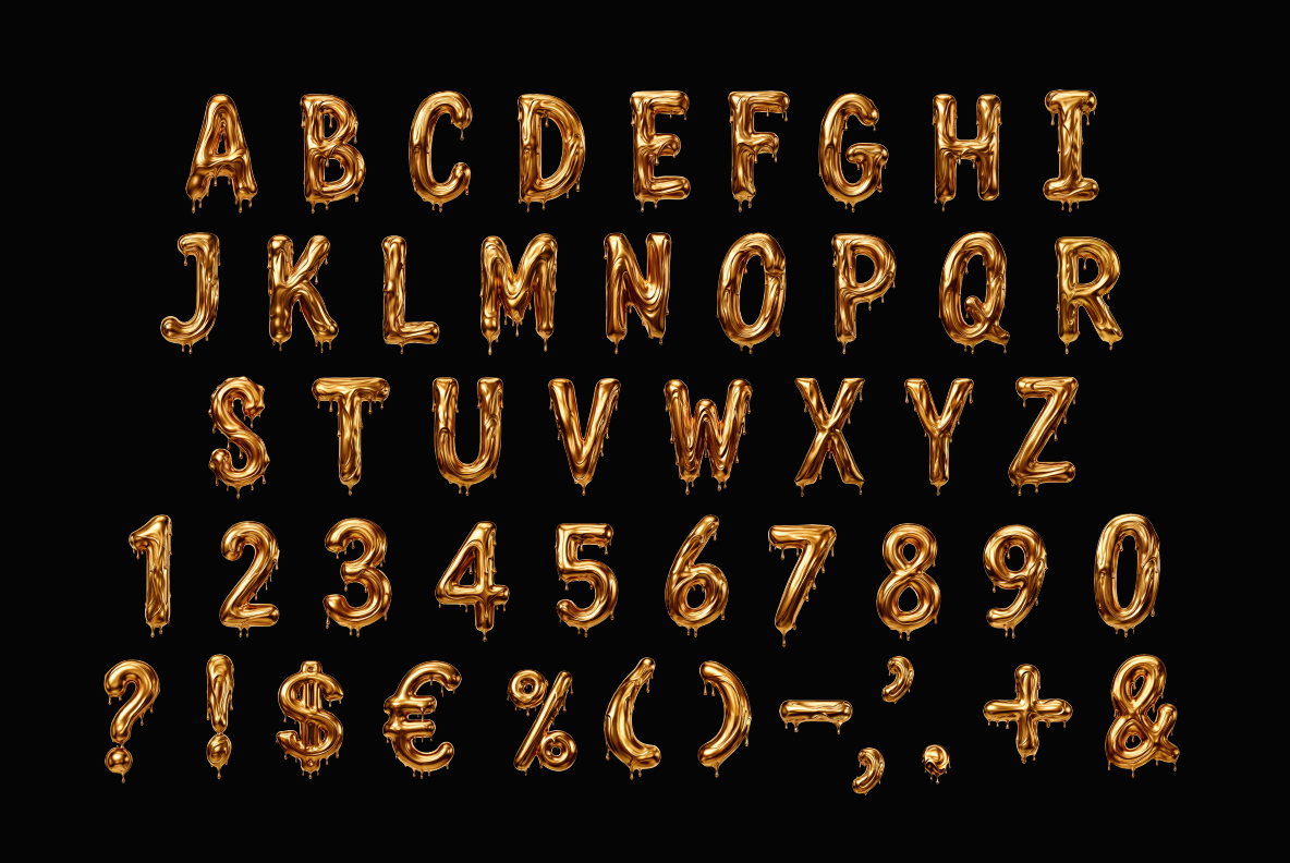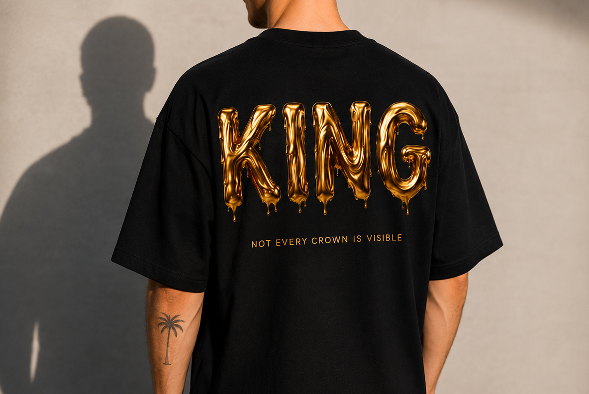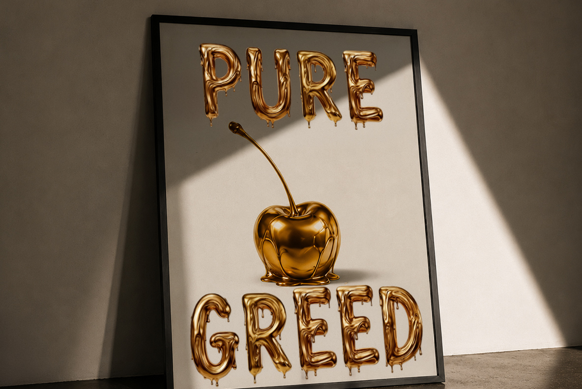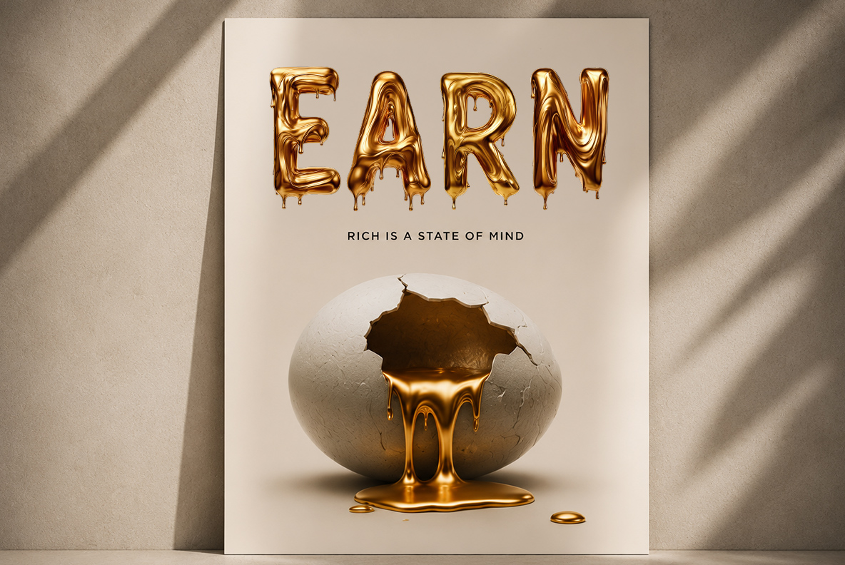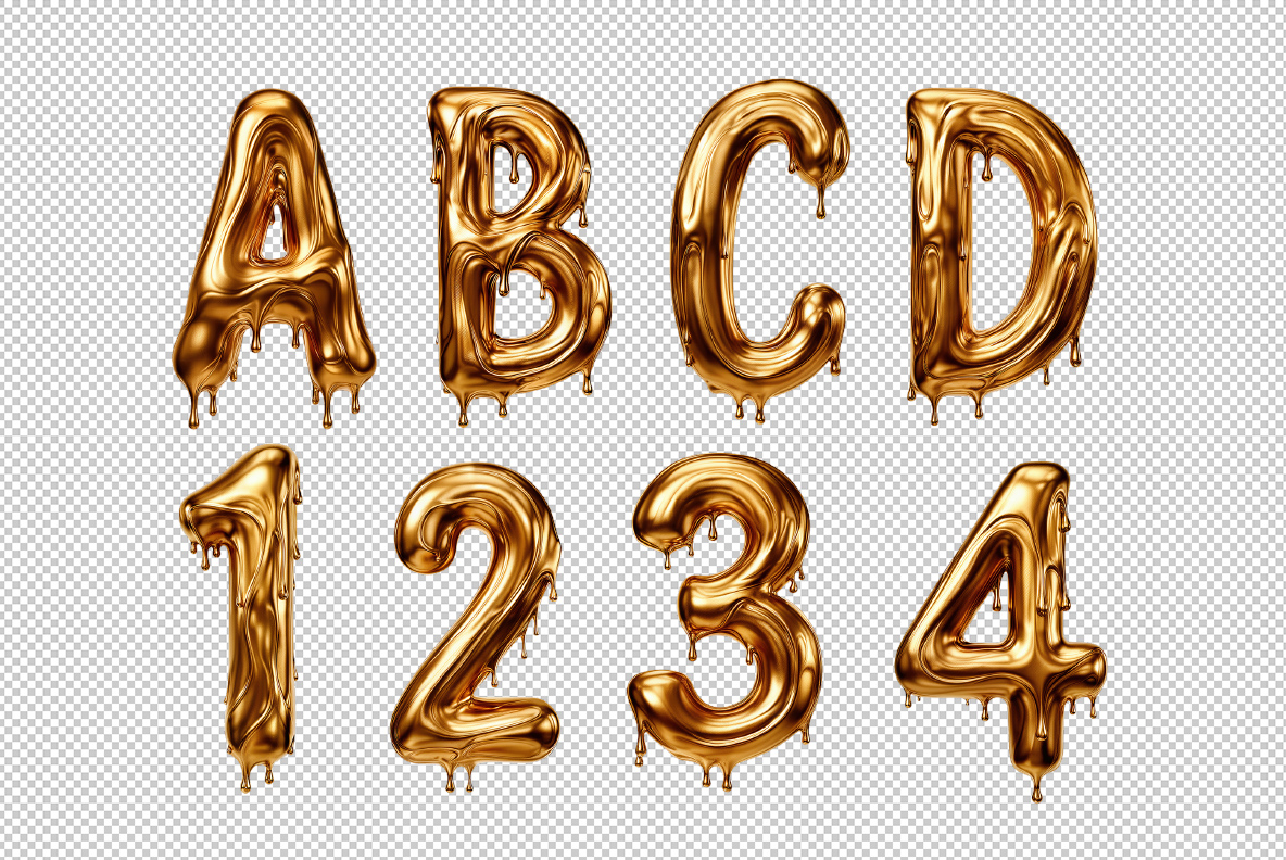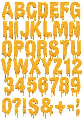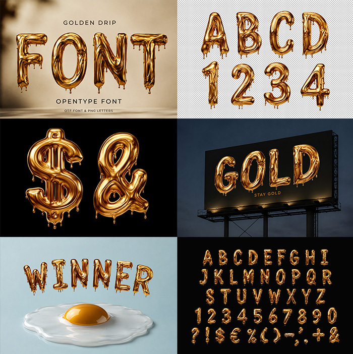

Golden Drip Font pours thick mirror gold into wide rounded capitals, then leaves a row of fat drops hanging off every lower edge. Highlights run down the fronts while the hollows stay dark, so the metal looks heavy rather than printed. It covers A to Z, figures, currency signs and punctuation, and one short word fills a poster on its own.
Golden Drip Font Froze the Gold Halfway Down
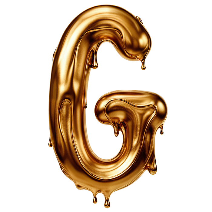
Nobody waited for this gold to set. Each capital swells like metal that just stopped pouring. A row of fat drops then hangs off the lower edges. Those drops differ in length from letter to letter, so a word never repeats itself. Meanwhile the surface behaves like a mirror. Warm highlights run down the fronts, while darker reflections gather in the hollows. Because of that polish, the Golden Drip Font reads heavy rather than painted on.
Round Shoulders Hiding Under the Shine
Strip the shine away, and a wide rounded capital holds everything together. Strokes stay thick and even, while the counters in A, B and O shrink to small soft holes. That roundness keeps the drips legible, since a sharp serif would only fight them. Naturally the set runs uppercase only. Besides the letters, you get figures, currency signs and a short run of punctuation. Even the ampersand and the dollar sign carry drops of their own.