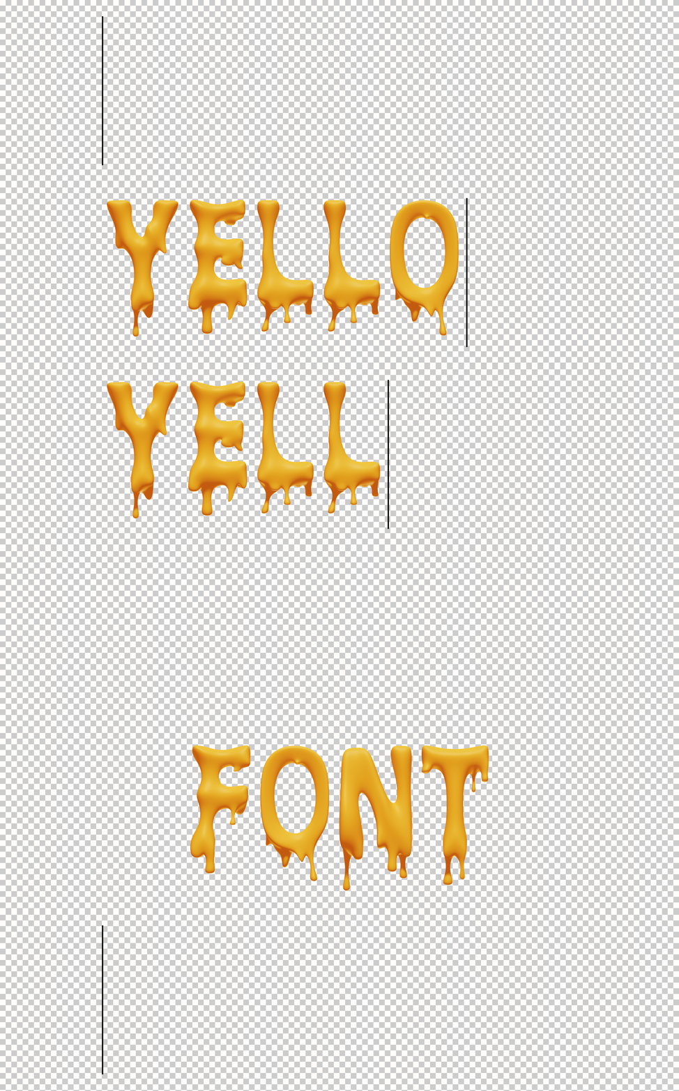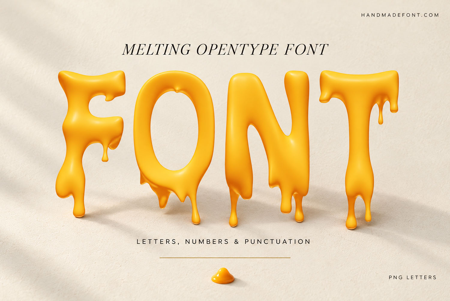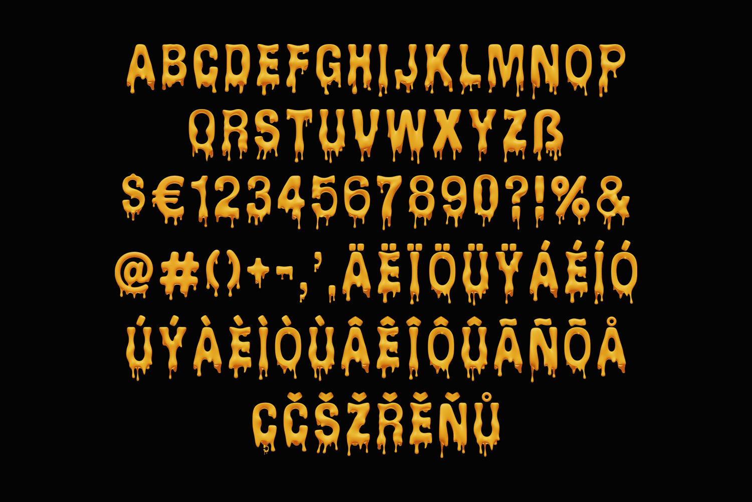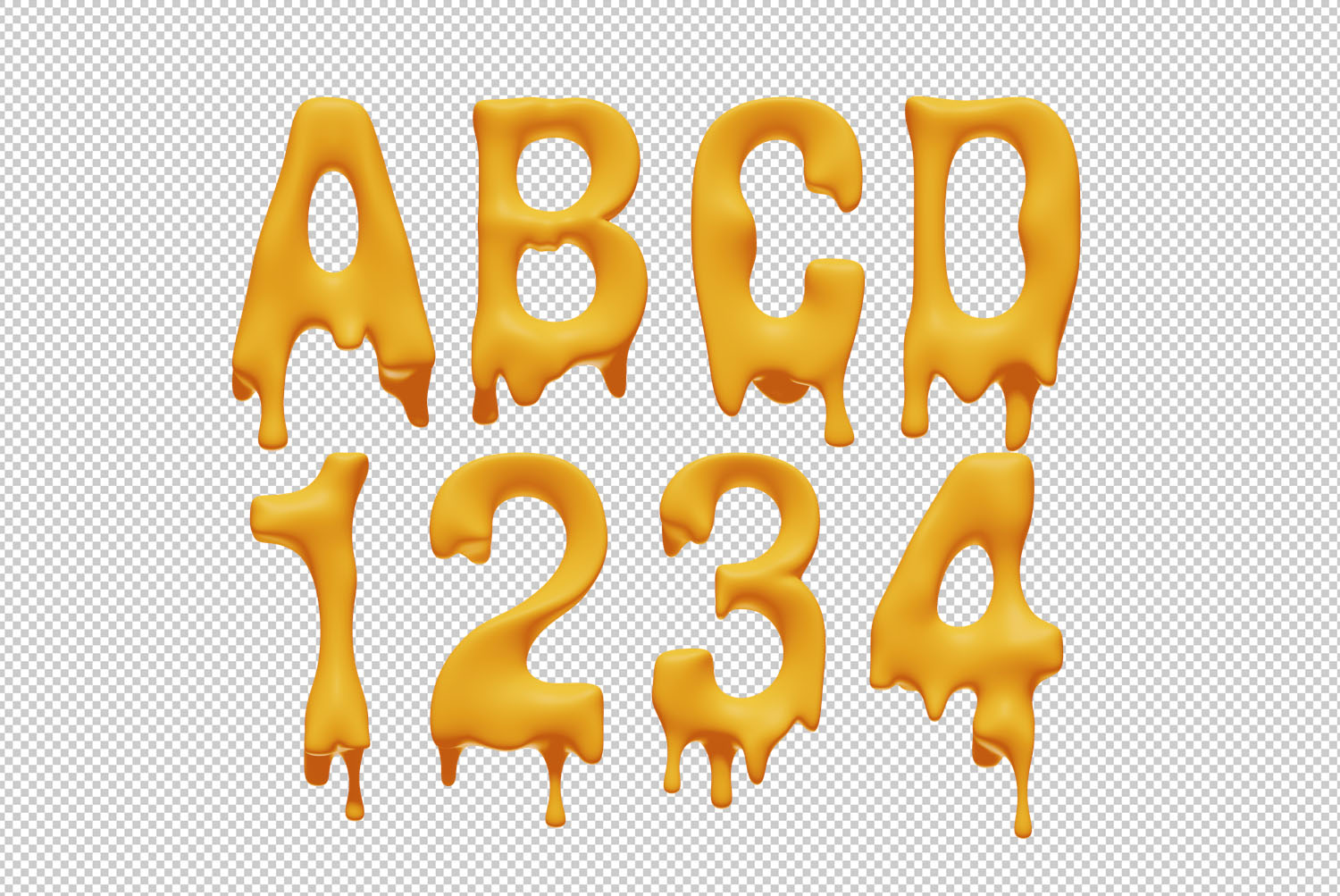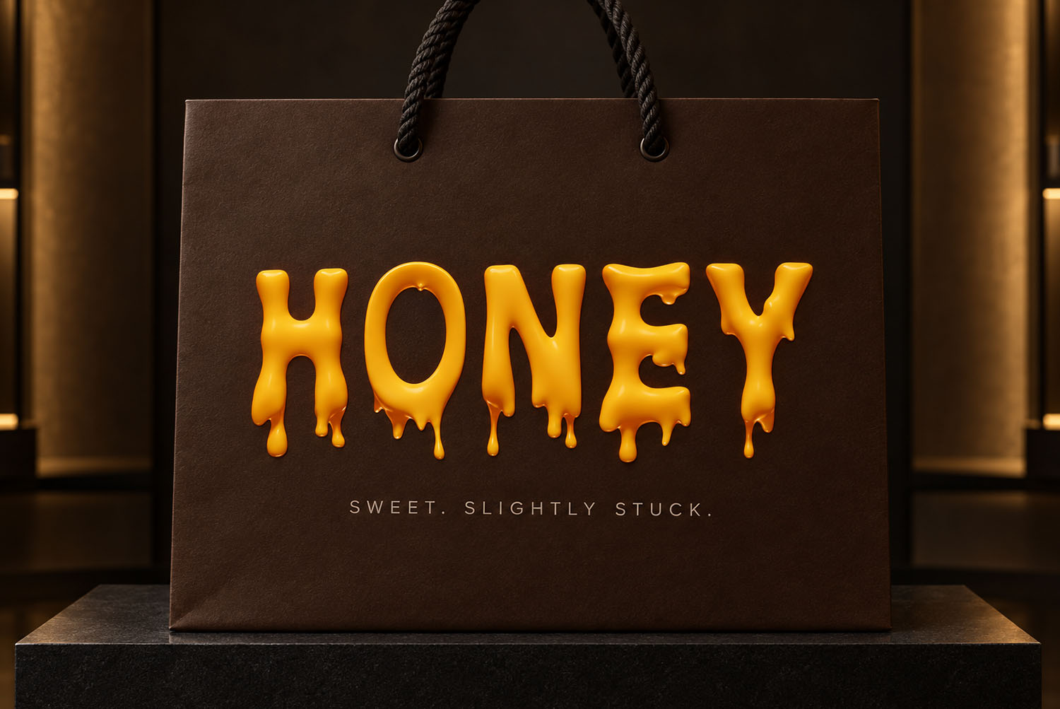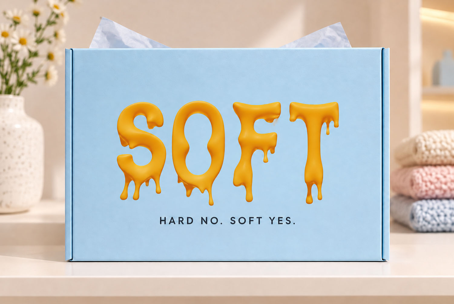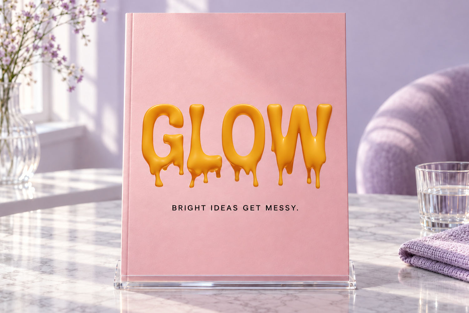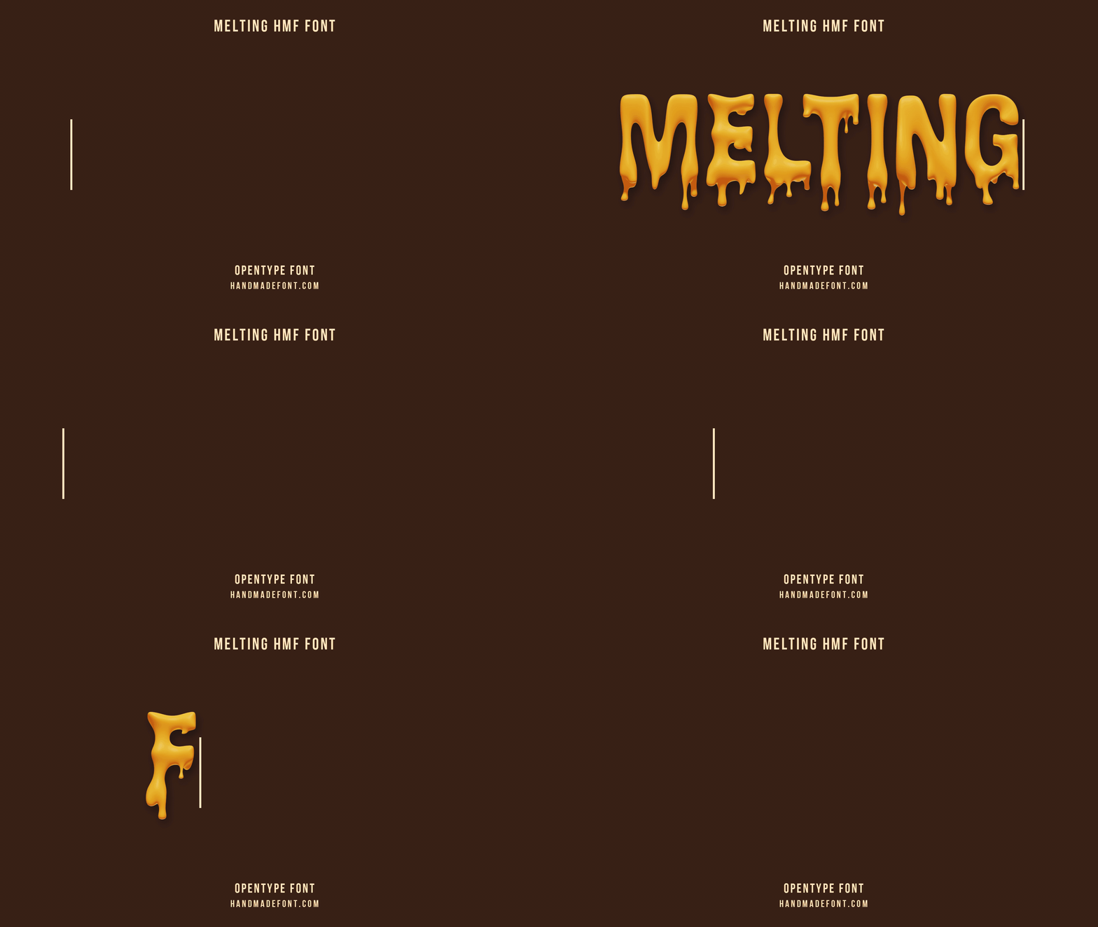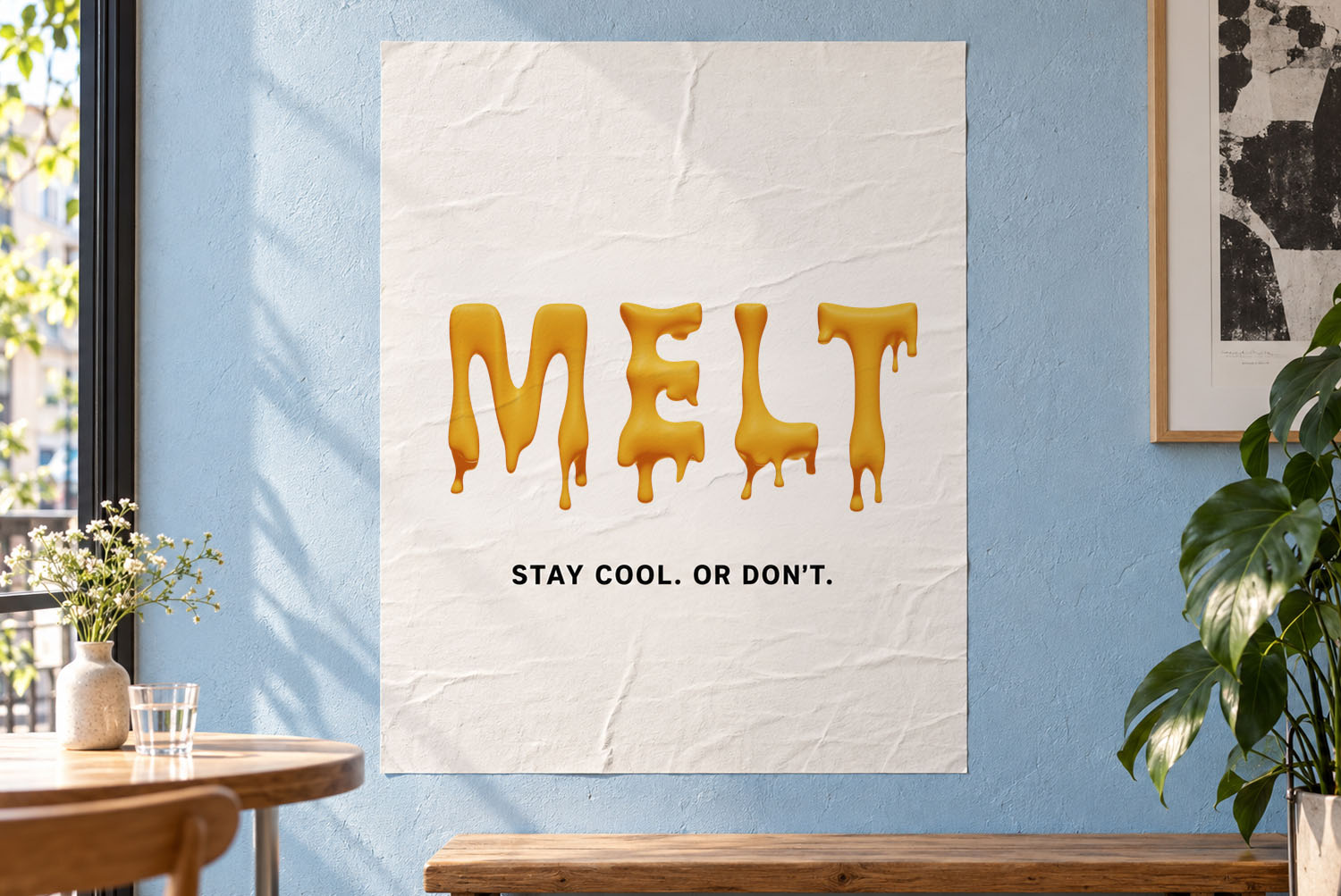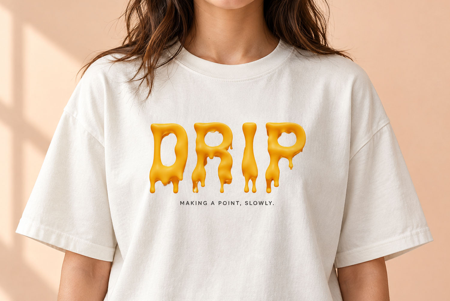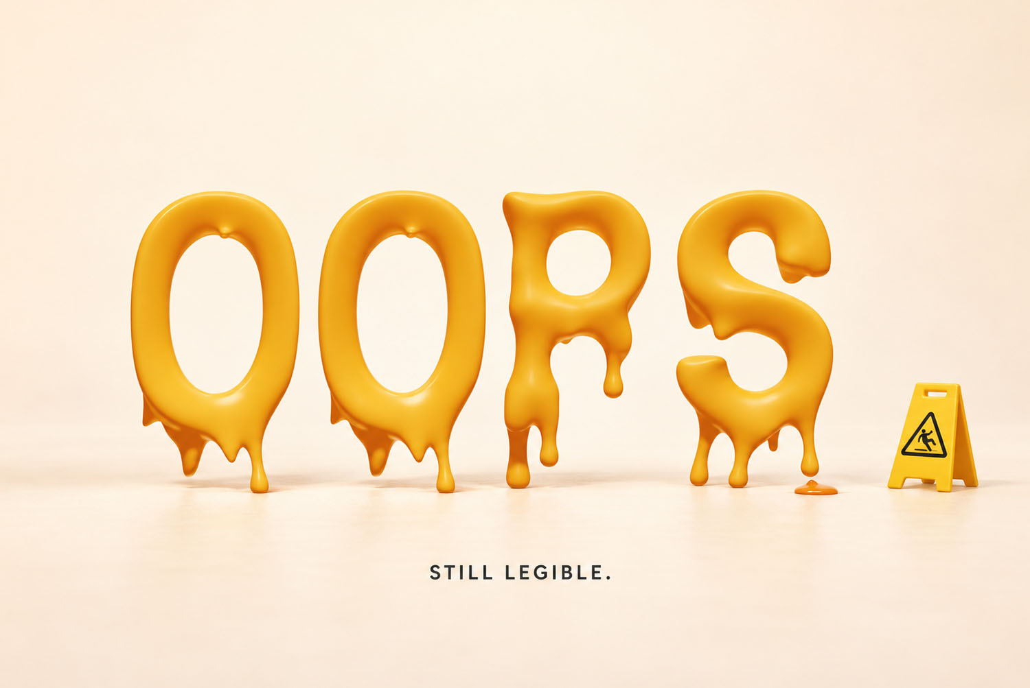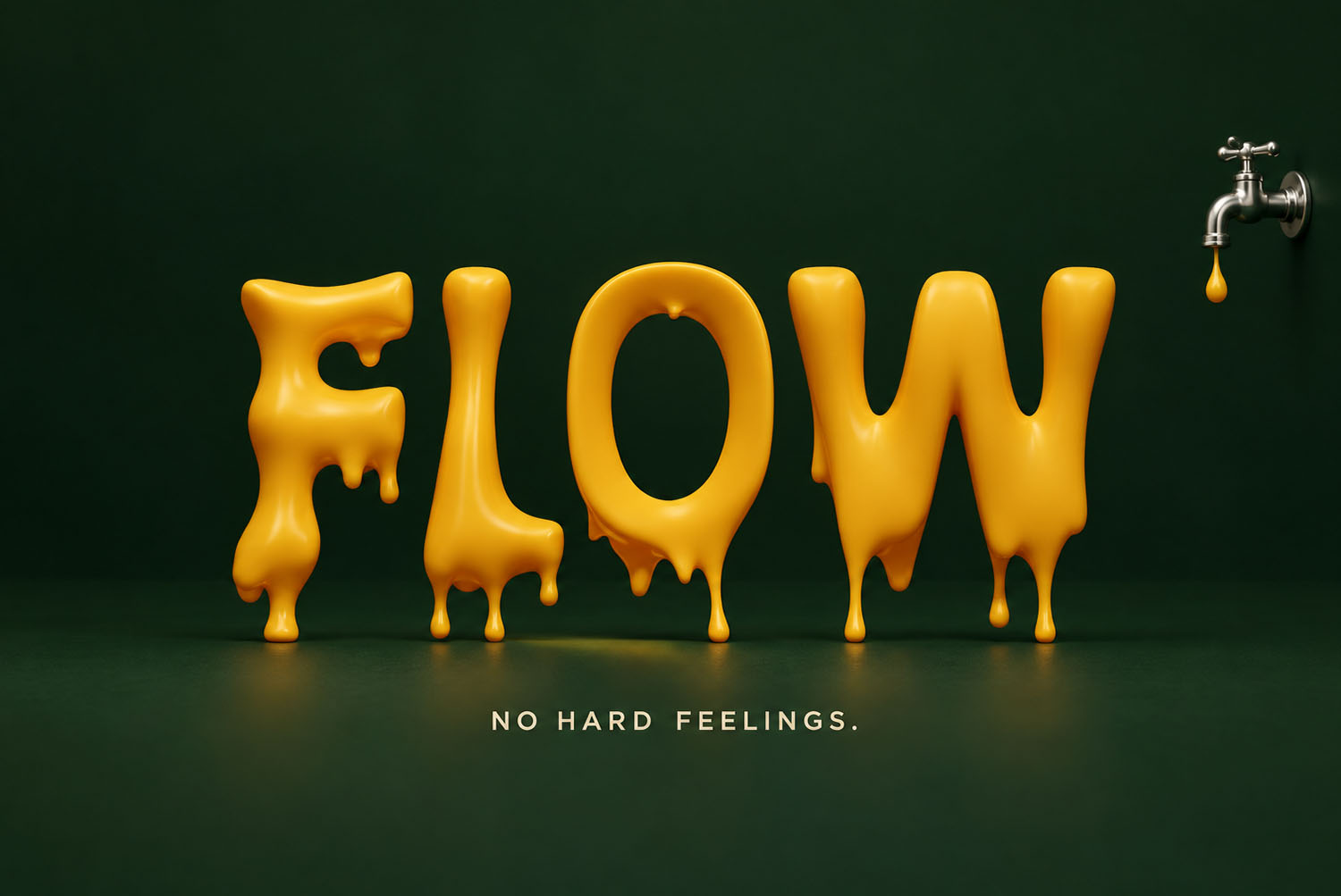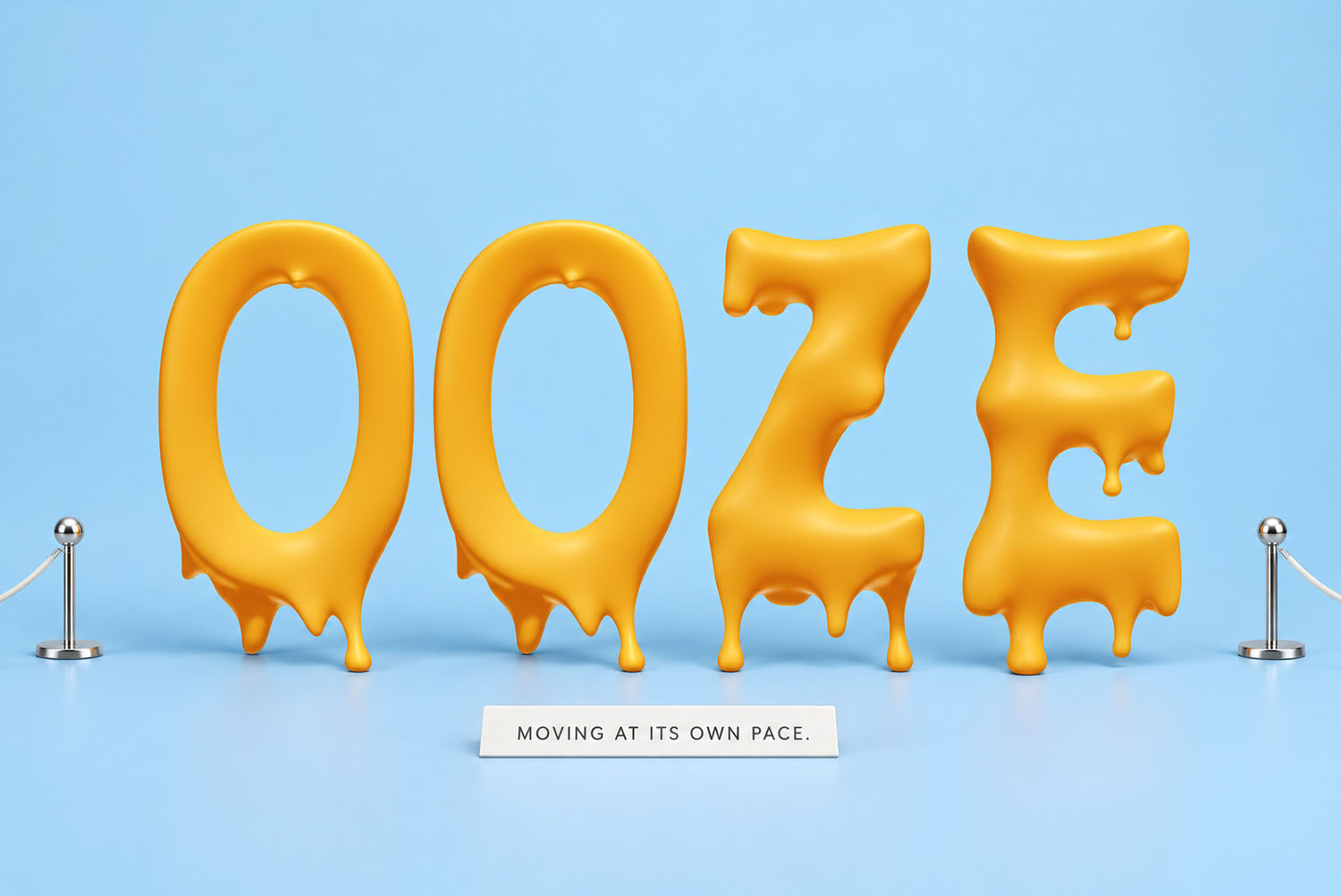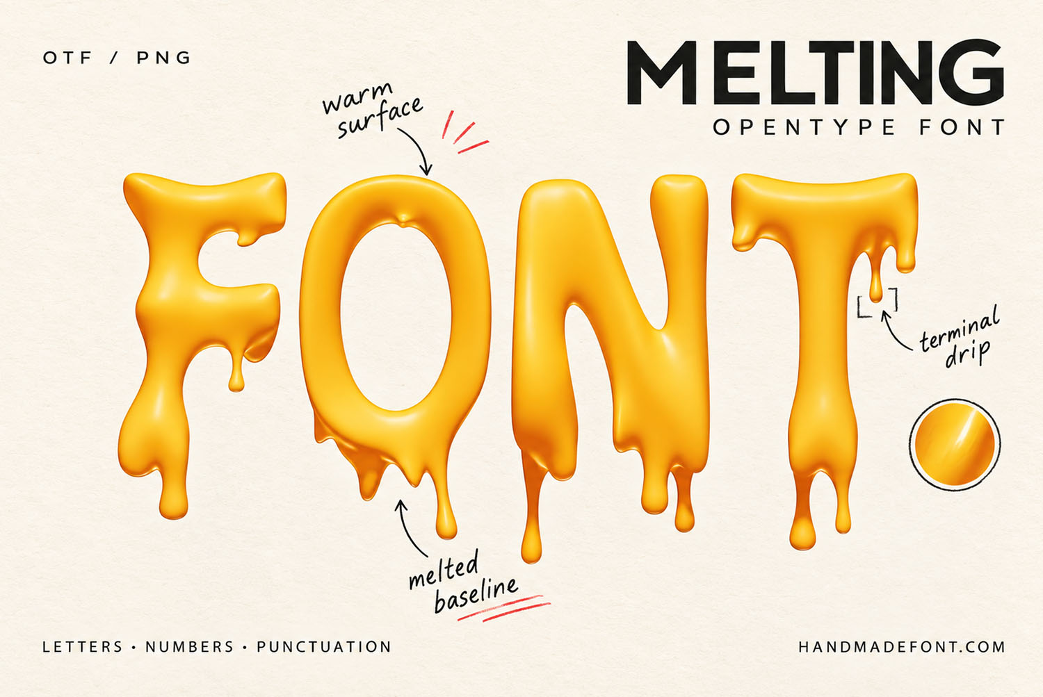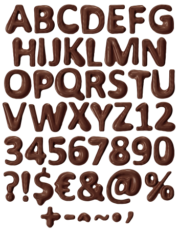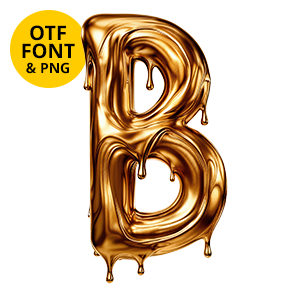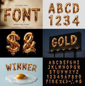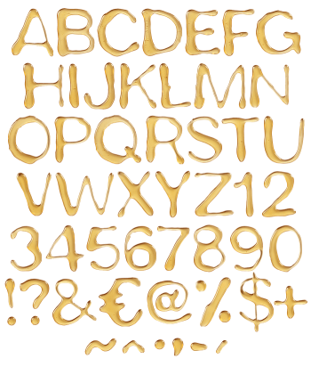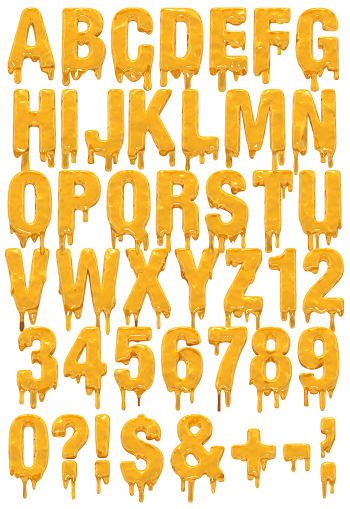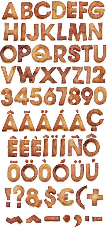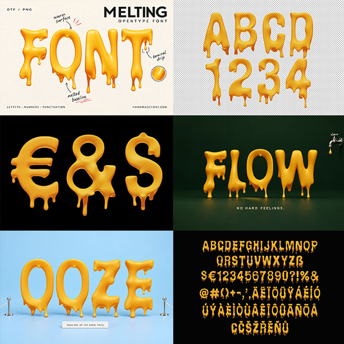
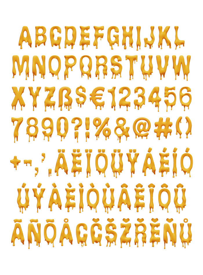

Melting Font shows chunky yellow capitals caught halfway through melting, with soft rounded tops and drips that end in heavy little beads. The satin finish sits between mustard, butter and honey, so it suits food packaging, summer campaigns and playful headlines. Type it as an OTF font or place the transparent PNG letters by hand.
The Melting Font Has Already Started to Slide
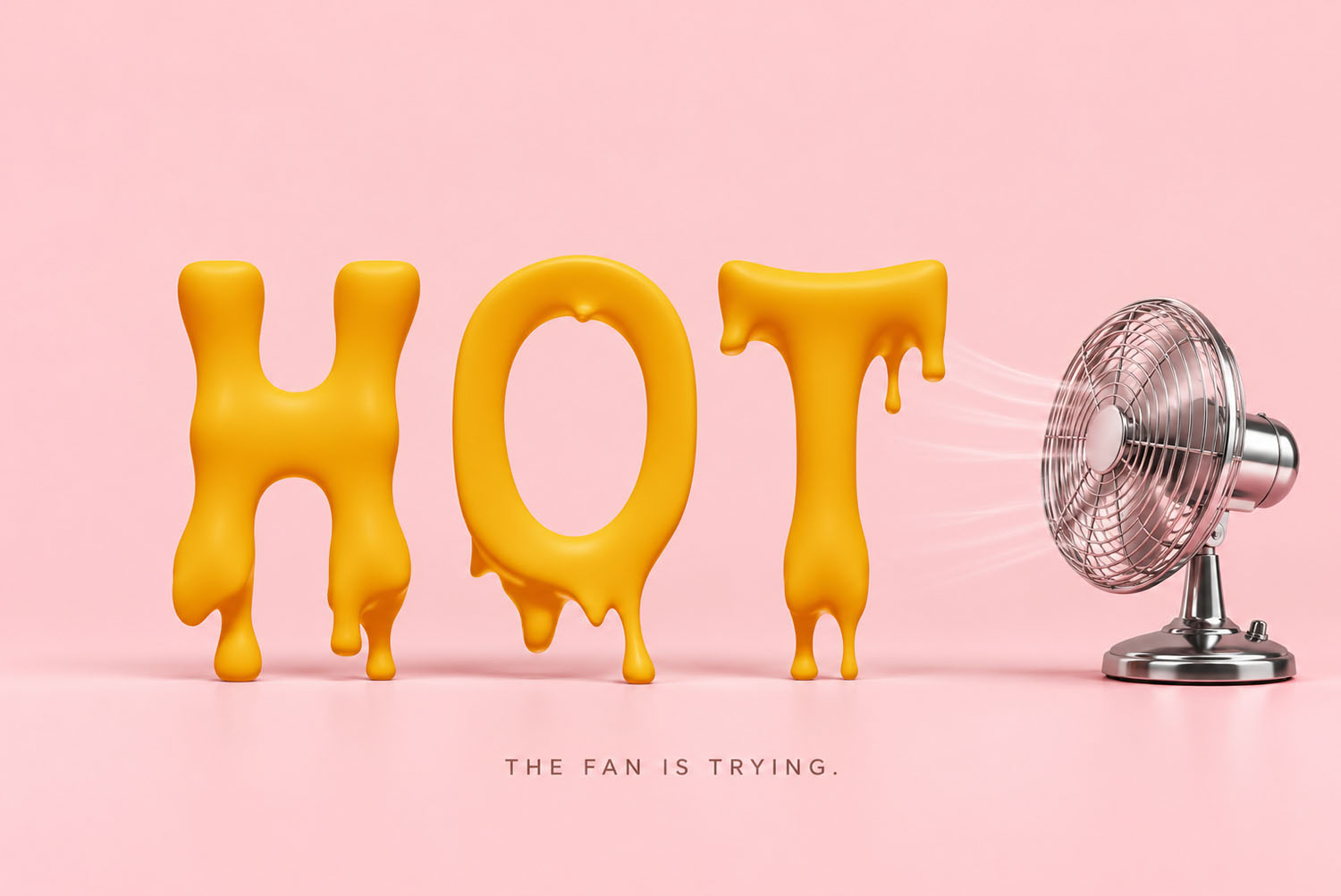
These capitals look as if someone left them on a sunny windowsill an hour ago. The tops still hold their shape, while the lower edges have gone soft and begun to run. So every word reads like a snapshot taken halfway through a meltdown.
Meanwhile, the colour sits somewhere between mustard, butter and warm honey. Since the finish is satin, light spreads across each stroke in a soft glow instead of a hard flash.
Each Drip Ends in a Bead
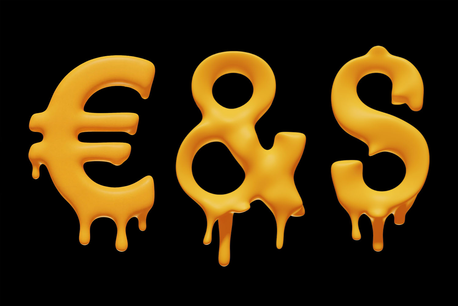
If you look along the baseline, no drip trails off into a thin thread. Instead, every one swells into a small round bead, as thick liquid does just before it falls. Some are short, others reach well below the letter, so the rhythm never repeats exactly.
The shapes themselves stay chunky and rounded, therefore even a melting R or S remains easy to read. Naturally, that balance keeps the Melting Font playful without turning into a mess.