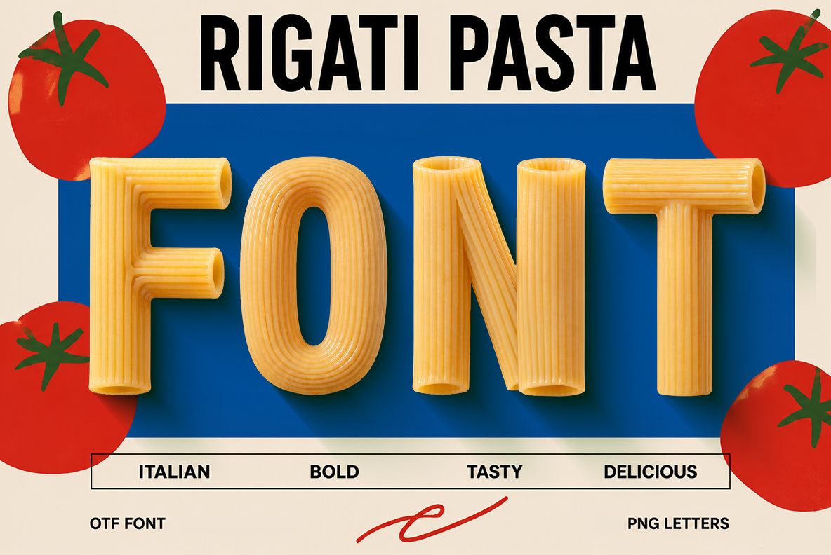
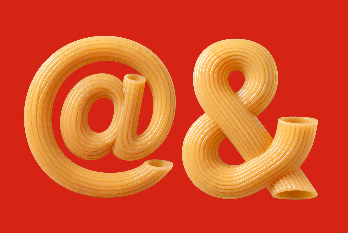
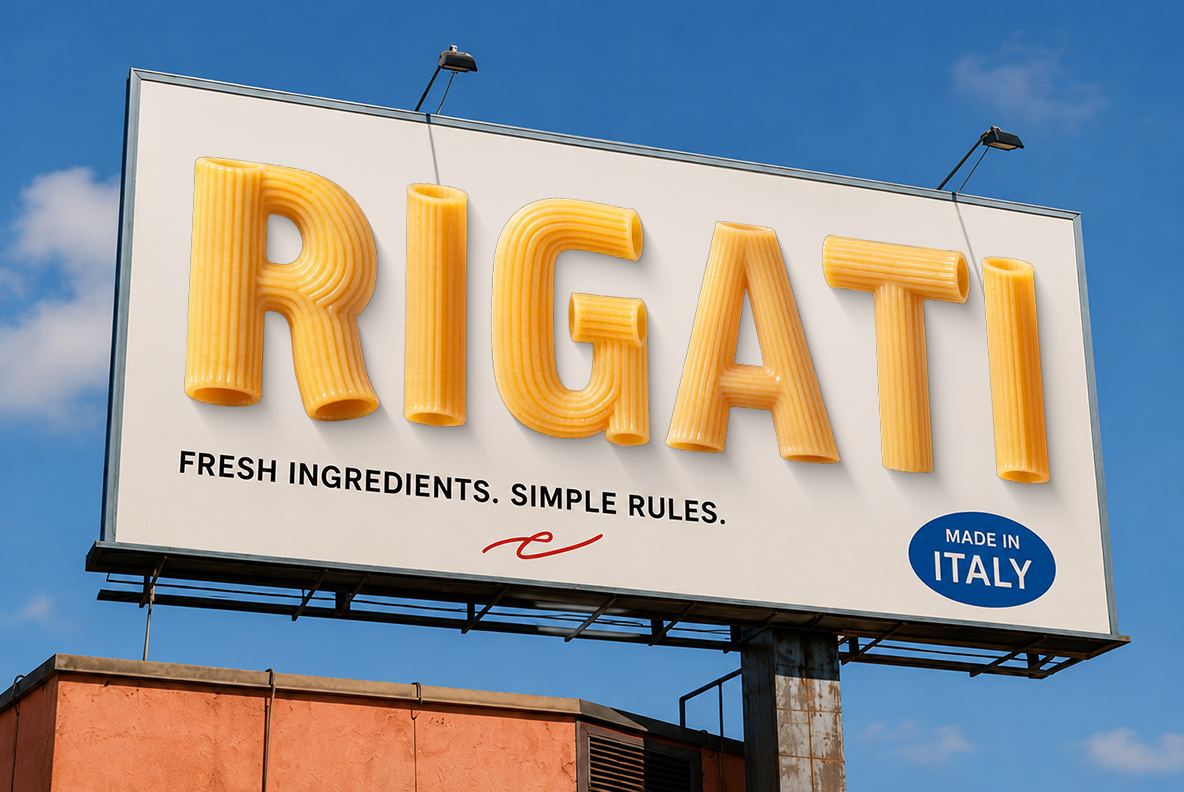
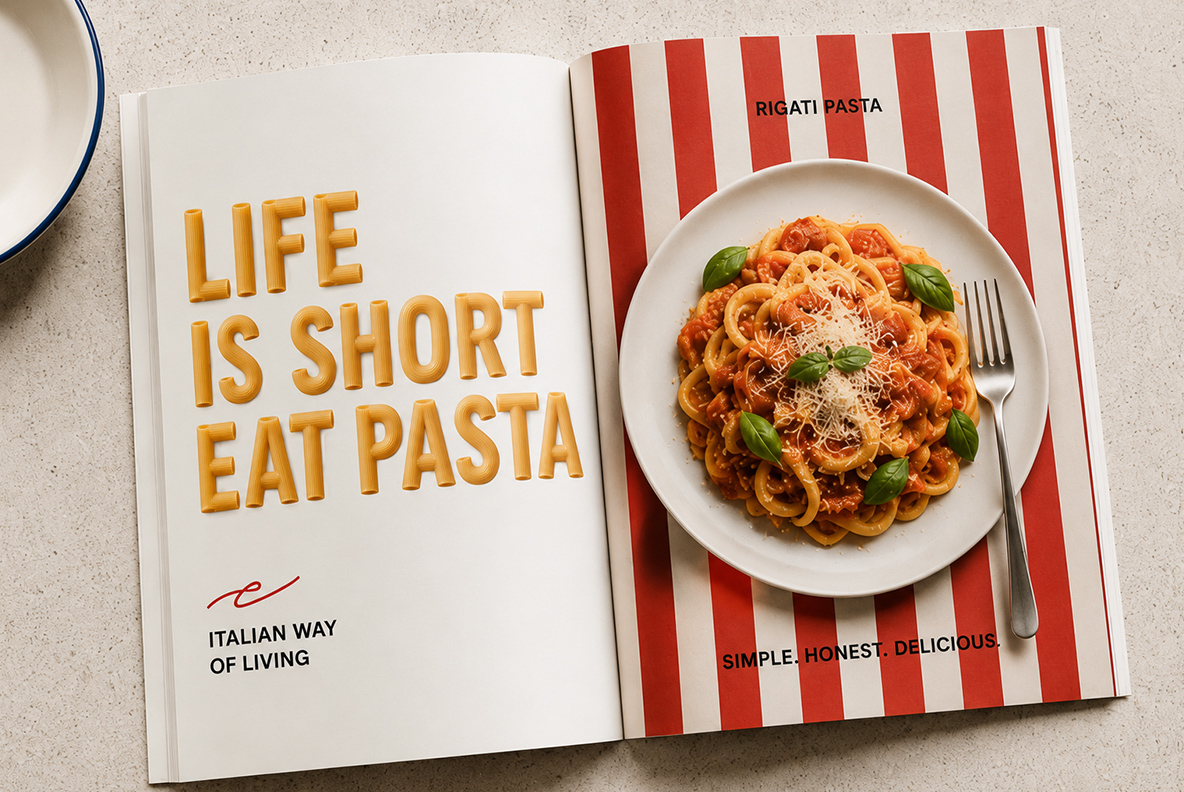
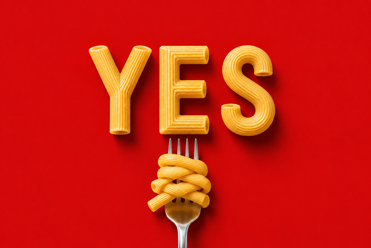
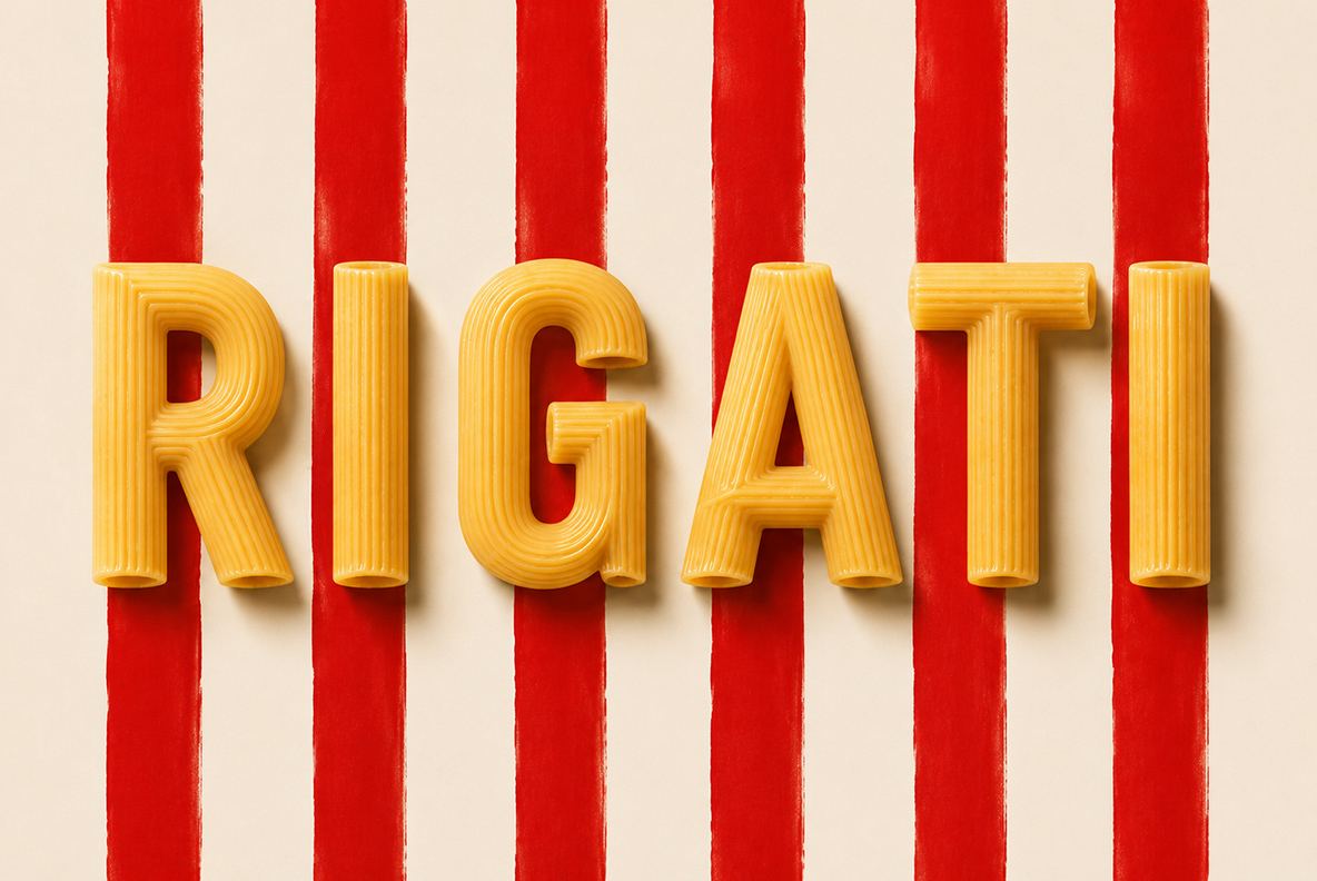
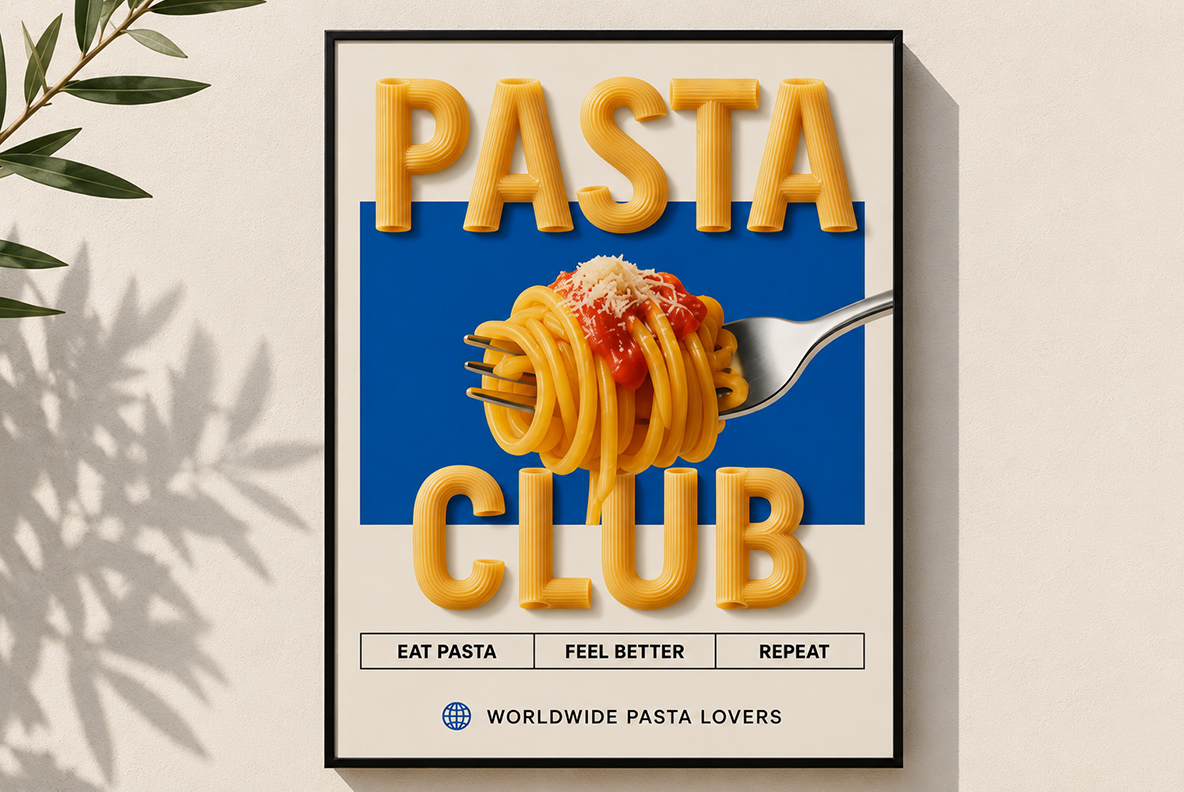
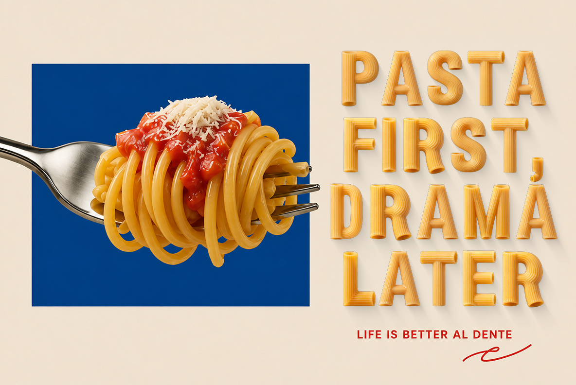
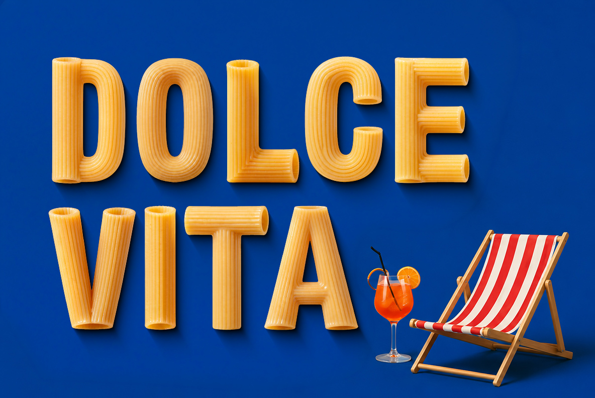
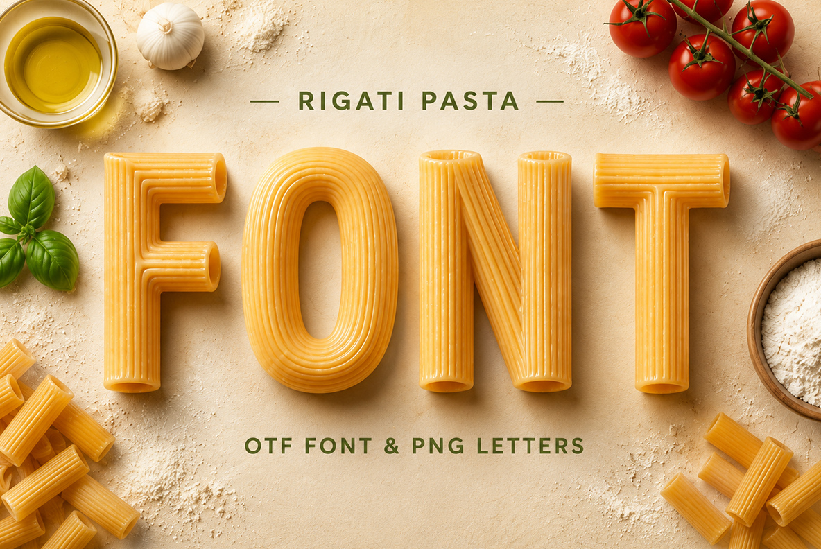
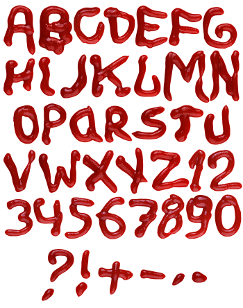
Bold capitals extruded from dry rigatoni: fine ridges along every stroke and open tube mouths wherever a stem ends. The colour stays pale semolina gold, with no sauce and no steam, so it reads clean on a poster. It suits restaurants, delis, food trucks, cookbooks and packaging.
Dry rigatoni, cut and stacked into capitals
Every stroke here is simply a length of rigatoni. The tubes are cut straight, so open mouths appear wherever a stem ends. Look at the R, for instance, and you will find three of them. Because the pasta is dry rather than cooked, the colour stays pale semolina gold. No sauce, no steam, and nothing sticky. That restraint, then, is what makes it work on a poster.
Ridges that do the shading on their own
Meanwhile the ridges run along the length of each tube. They catch light in fine parallel lines, so the letters gain depth without any outline. Where a stroke turns, the ridges bend with it, and the joint still reads cleanly. Shadows land underneath rather than behind, besides, which keeps the whole word grounded. Nothing is smoothed away to make the shapes easier. Even at small sizes, though, those grooves survive.