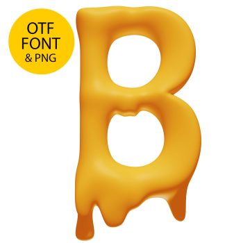
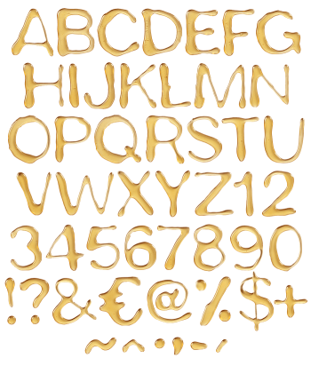
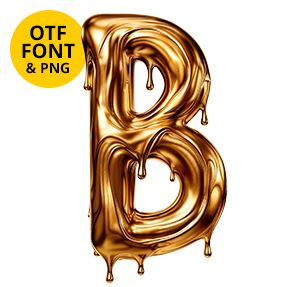
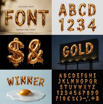
Dense mustard gold with a hard shine along every top edge, poured rather than painted. The drips leave the baseline in long thin strands, tapering to a point instead of beading up. Nothing here is transparent, which is what separates it from the lighter honey work. Heavy, glossy and very loud on a dark background.
Thick, Opaque and Still Moving
This gold does not let light through. Every stroke is a dense mustard mass, and a hard specular streak runs along the top edge the way thick syrup catches a single lamp. Drips leave the baseline as long thin strands, and some reach half a letter height before they taper out. Because the surface is so glossy, the highlights stay sharp instead of diffusing. So the alphabet reads heavy rather than delicate.
The Molten Font Hangs in Long Strands
Letterforms sit underneath all that weight, and they are stubbornly plain. The Molten Font runs on a condensed grotesque skeleton with flat terminals, which is what keeps a full line legible while everything sags. Counters stay open. Stems hold their width. Naturally the pour differs on every character, so a repeated letter never duplicates its drips. Above all, the colour stays one flat gold, so it survives being printed rather than only screened.