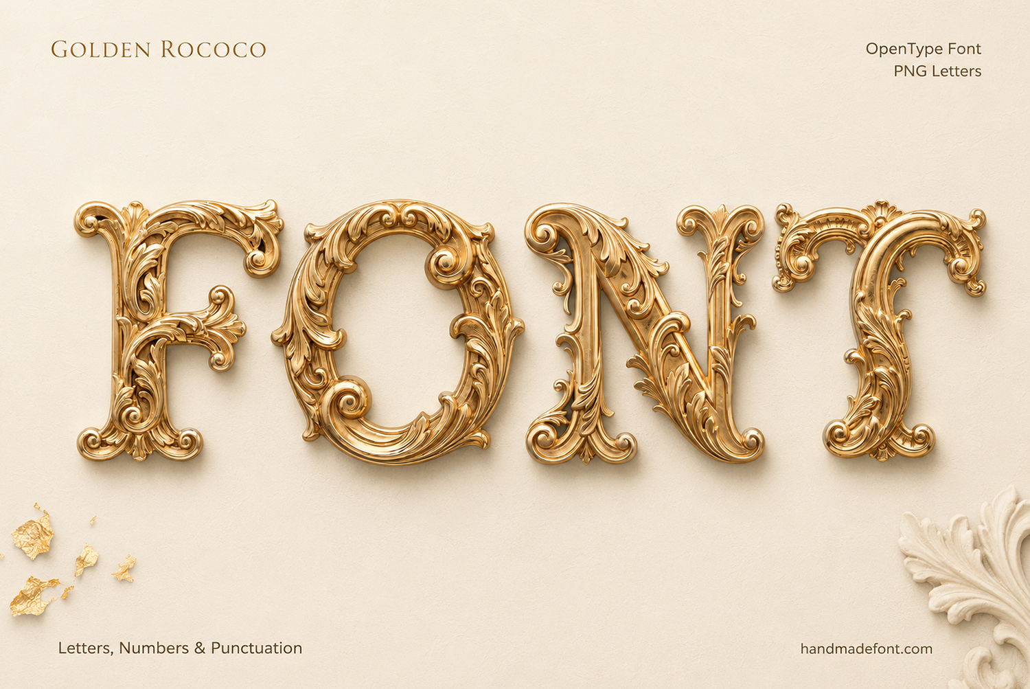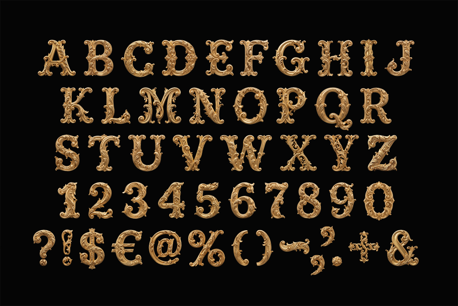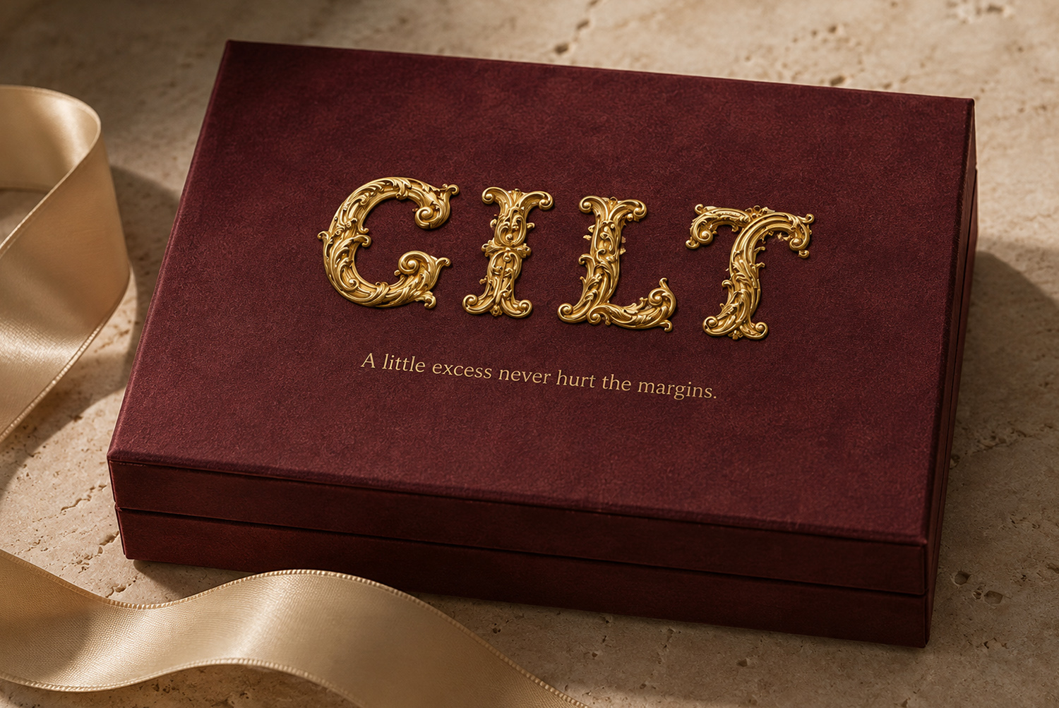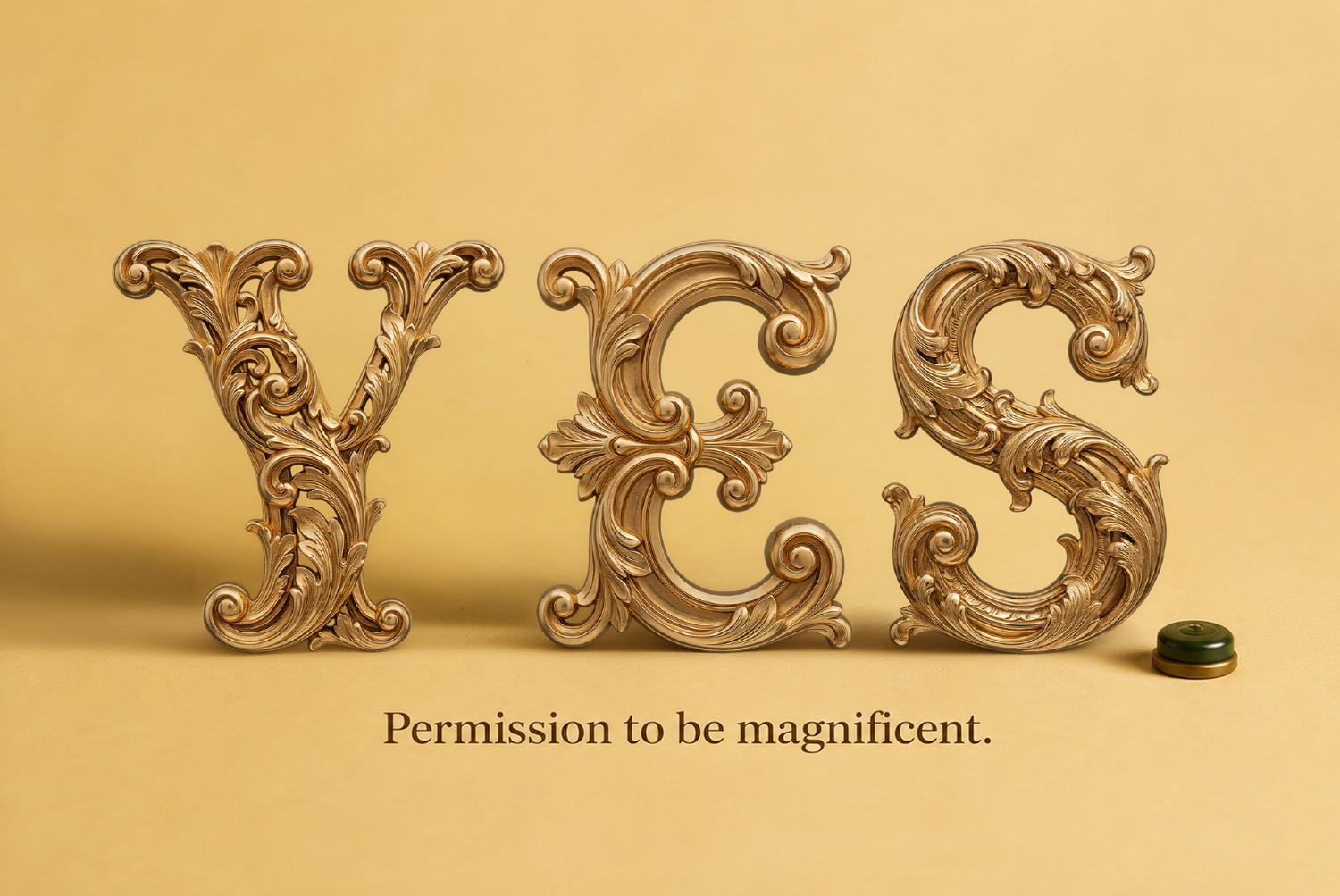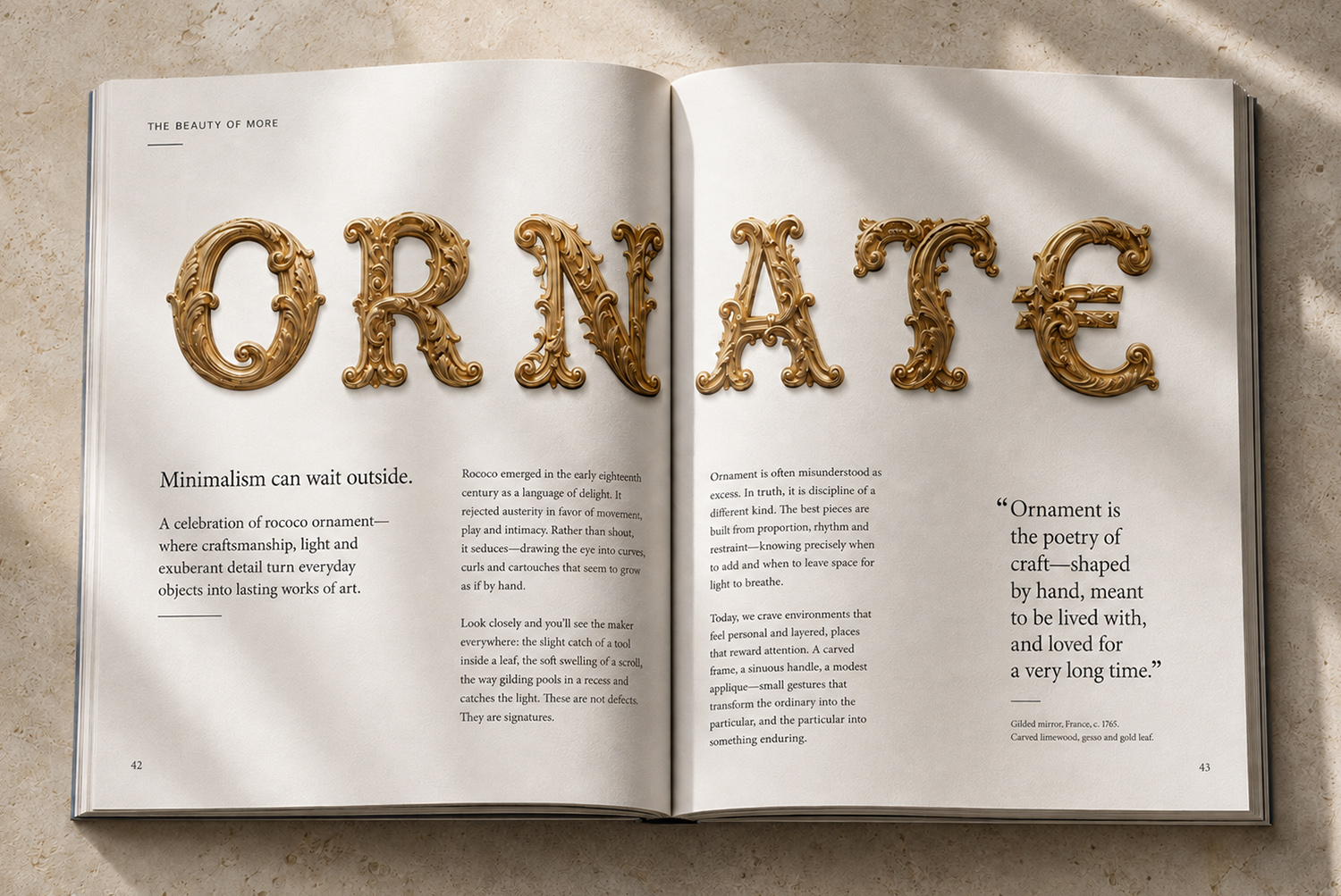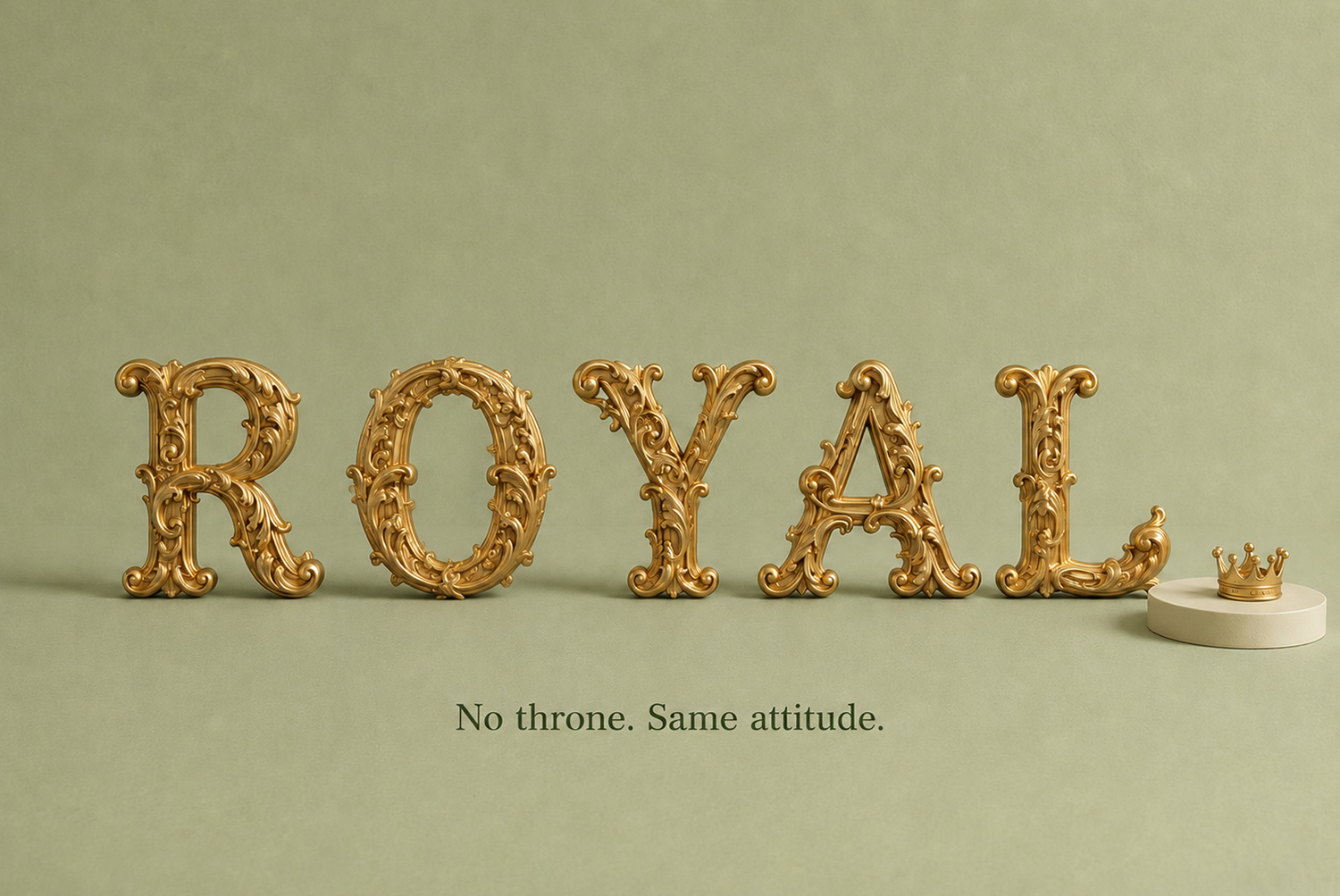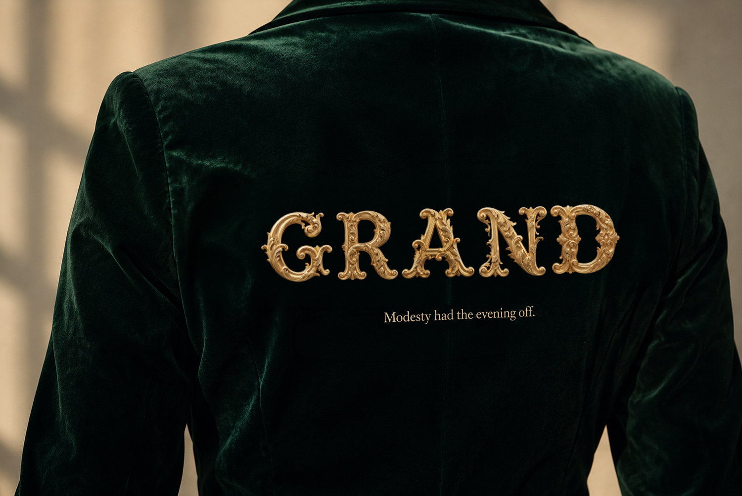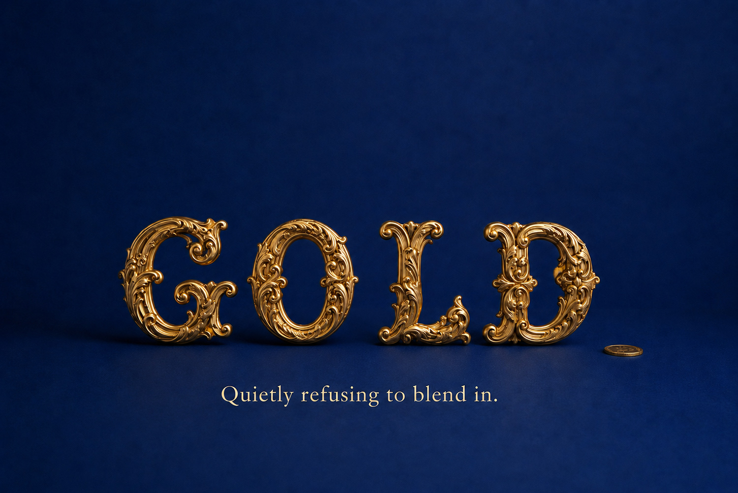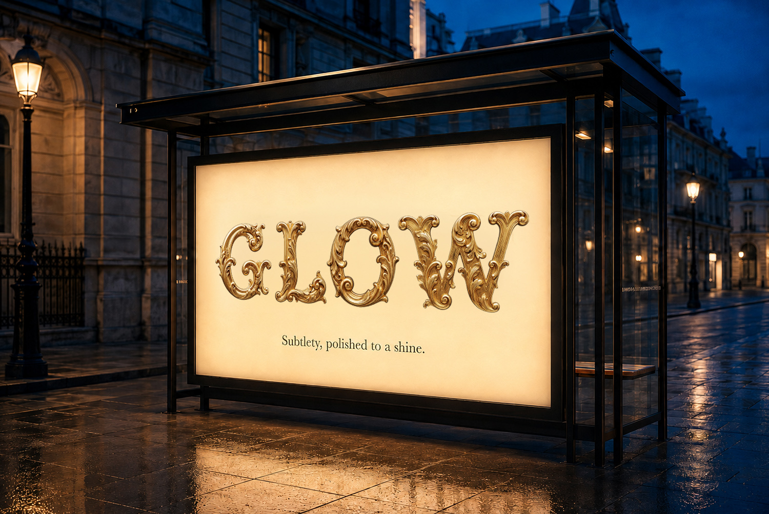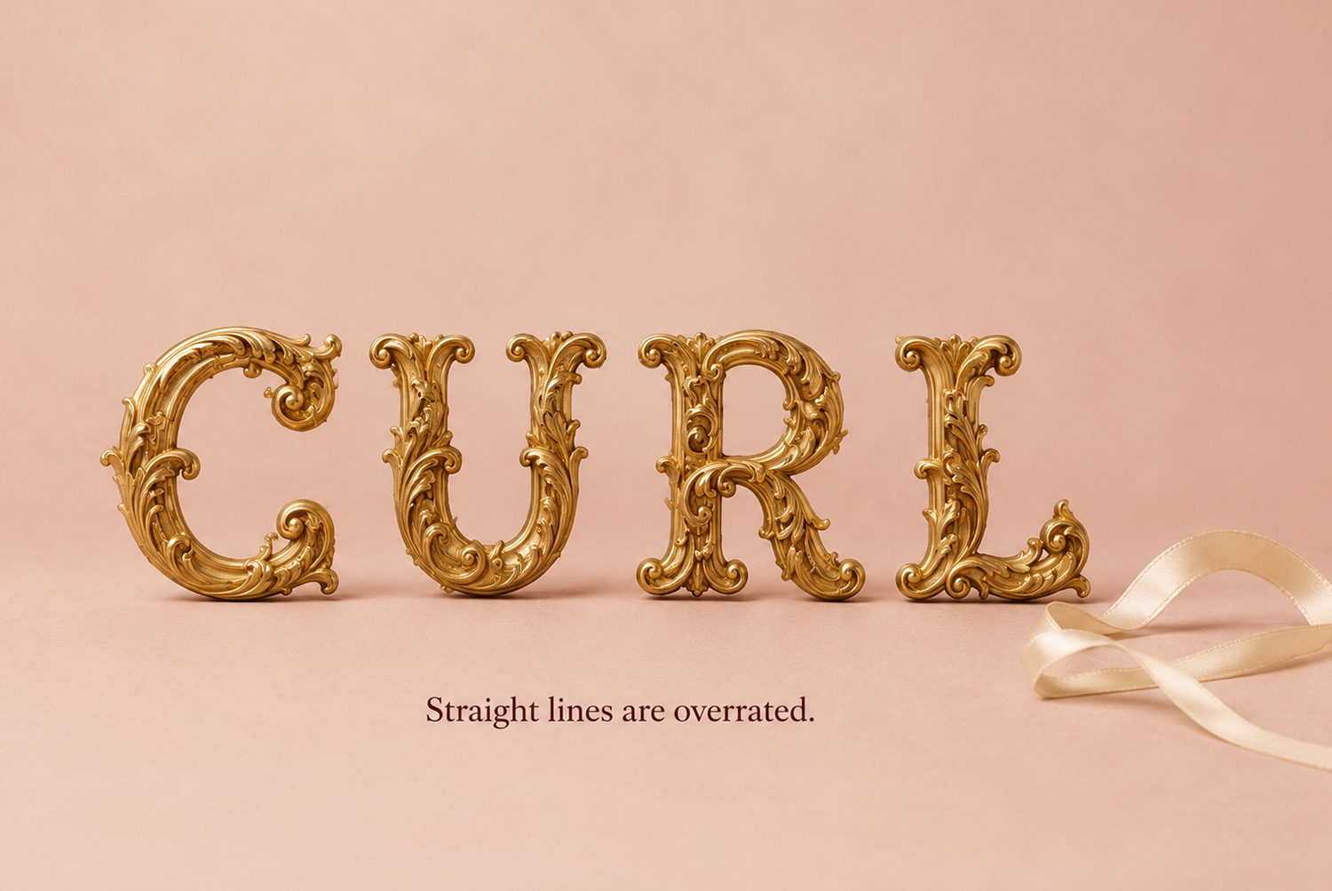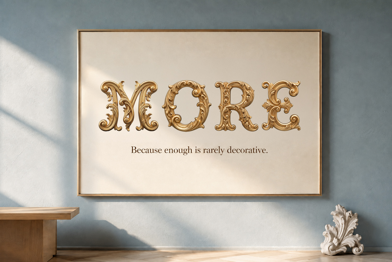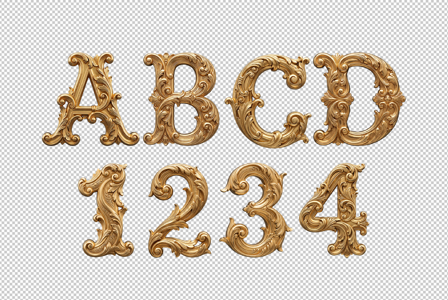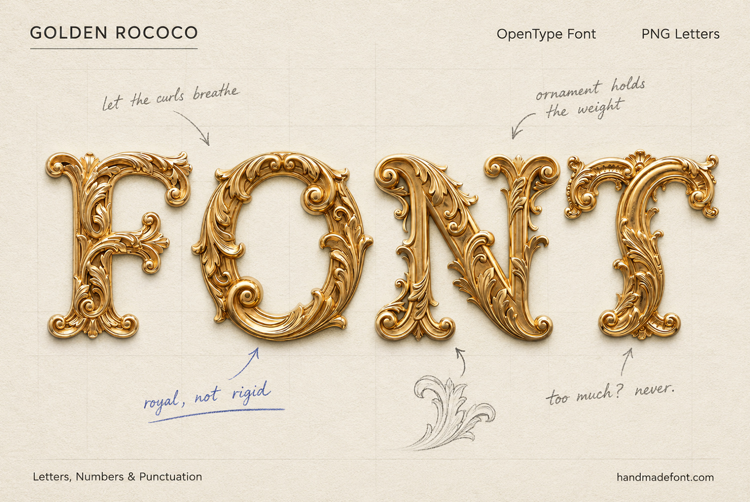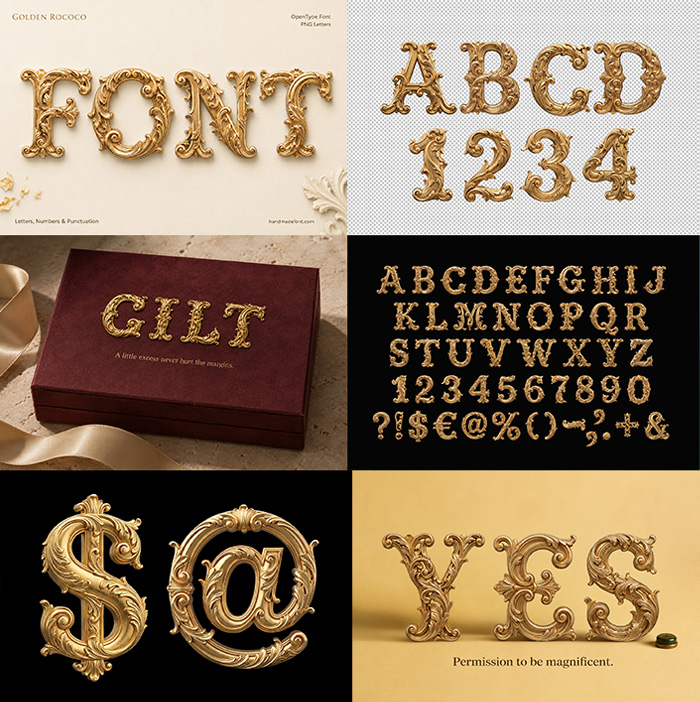
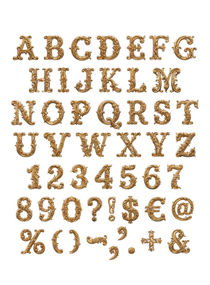
Gilded rococo carving turned into a working alphabet: acanthus scrolls, shells and curls that form the strokes rather than decorate them. The Golden Rococo Font is loud on purpose, so one word at large size usually does the job. Mockups run from velvet tailoring to a lit bus shelter. Supplied as an OTF plus transparent PNG letters.
Carved Curls Doing the Job of Strokes
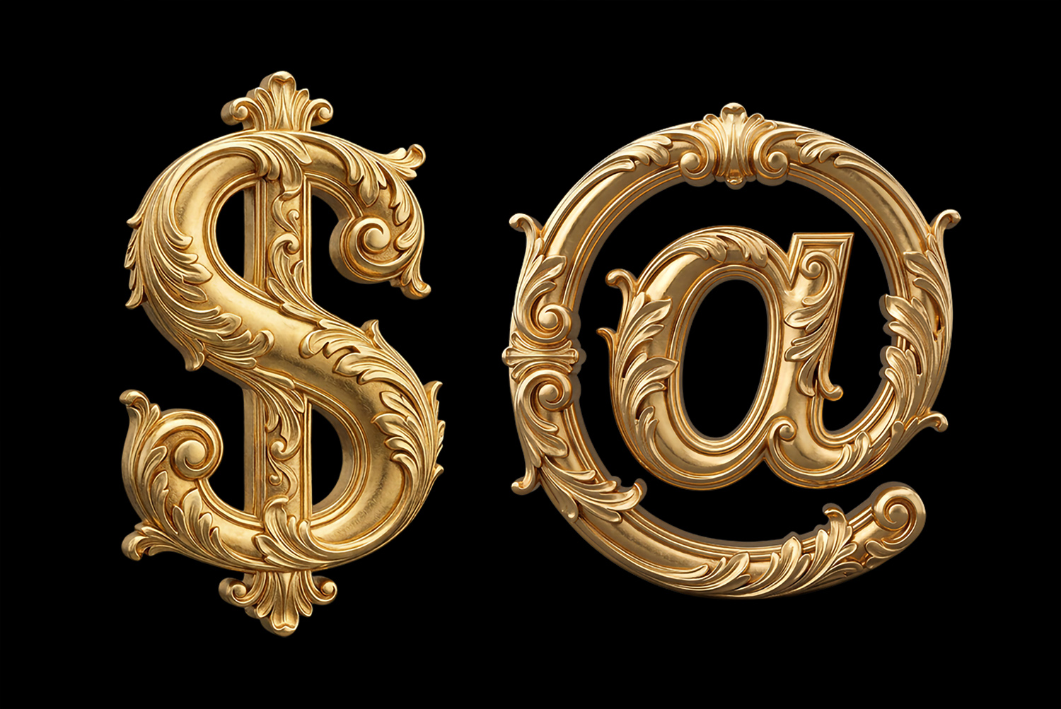
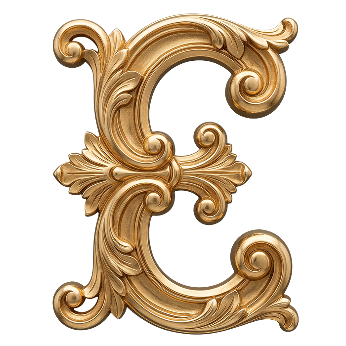
Look at the E and you will notice the ornament is not sitting on the letter. Acanthus leaves, shells and tight scrolls actually form the strokes themselves. Gaps open right through the middle, so light travels between the curls. Polished yellow gold then catches highlights along every ridge before dropping into deep shadow. Even the counters in O and D fill up with carved foliage. Nothing is flat here, which is rather the whole argument.
One Word Is Usually Enough
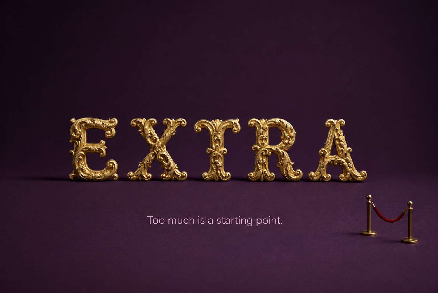
Restraint is not on offer, so plan around that instead of fighting it. One word at large size does more than a full sentence ever will. Because every glyph is busy, the spacing needs air and a calm background. Also a plain grotesk for the small print keeps a page from collapsing. Meanwhile the Golden Rococo Font mockups all follow that rule, and each one holds together.