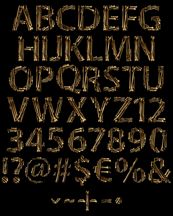
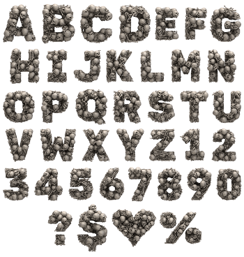
Chicken Bones Font builds every letter from small picked-clean bones, laid end to end until the shape holds. Drumsticks and wing pieces do the strokes, so the joints bulge and the middles stay thin. The colour is pale cream with a warmer tint at the knuckles, and the gaps between pieces are left open.
The Chicken Bones Font Starts After Dinner
Somebody clearly finished a meal before designing this. Each stroke is one small bone, dropped into place until a letter appears. Because the pieces come in slightly different lengths, the joints land in odd spots and the rhythm wobbles. Naturally that wobble is what makes the alphabet look found rather than drawn. Nothing lines up neatly, and of course nothing should.
Thin, Pale and Slightly Uneasy
The strokes of the Chicken Bones Font stay narrow throughout, so whole words read light instead of heavy. Colour runs from bone cream to a warmer pink where the knuckles swell, while the shadows underneath stay soft. Since the pieces do not quite touch, small gaps break every letter apart. That looseness also keeps it creepy without going anywhere near cartoon horror. Set a headline in it and the empty space does half the work, since the letters stay so open.