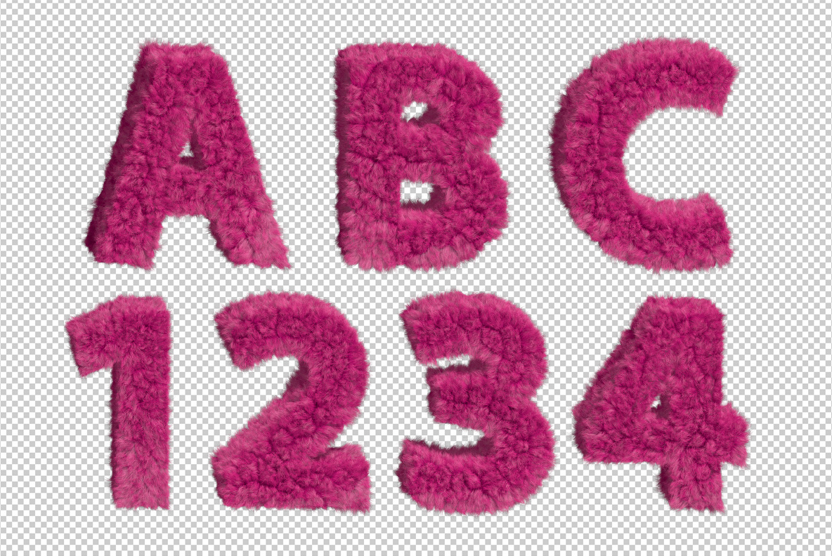
Hot magenta fur, clipped short and packed dense, then shaped into letters. The pile lies in different directions across each stroke, so the light breaks up instead of running smoothly. Nothing about it is subtle. It is the kind of alphabet that makes a shop window work from across the street, and it knows exactly that.
Dense, Short and Very Pink
This is fur cut short and packed tight, rather than the long silky kind. The pile runs in different directions across each stroke, so the magenta breaks into darker roots and brighter tips. Edges stay fuzzy, since individual hairs stray past the outline. Because the colour is a true hot pink rather than a pastel, it reads at distance without any help from a background. Naturally the shadows under the pile do the modelling.
How the Pink Fur Font Holds Its Shape
Fur usually destroys a letterform, yet the Pink Fur Font survives it. The skeleton is a heavy rounded sans with fat strokes and generous counters, which gives the pile somewhere to sit. Thin details, of course, would have vanished entirely. Above all the outline stays recognisable even when the hairs blur it, so a headline holds together at small sizes too. Since every glyph was groomed separately, no two share a parting.