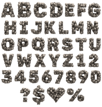
Capitals stacked from polished cartoon gold bones, knuckles at either end, crossing and leaning against each other so the letters look piled rather than drawn. The Golden Bones Font leaves gaps between the pieces, which keeps each shape readable instead of a solid lump. Figures and punctuation are stacked the same way.
Treasure and Trouble in One Alphabet
The joke lands before you read a word, of course. Each capital is likewise stacked from polished gold bones, the cartoon kind with a knuckle at either end. The metal runs deep amber too, mirror-bright on the curves and almost black in the hollows. Pieces cross and lean against each other too, so the letters look piled rather than drawn. Because the stacking varies, repeated letters never sit the same way. Smaller pieces fill the tight corners too, which keeps every joint believable.
Stacked, Crossed and Deliberately Uneven
Gaps between the bones, in fact, keep the shapes readable. Light passes through them as well, which stops each glyph turning into a solid gold lump. The bones vary in length too, since a uniform set would look mechanical. Above all, the silhouette of the Golden Bones Font still reads as a letter at a glance. Besides, figures, currency signs and punctuation are stacked the same way.