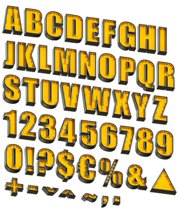
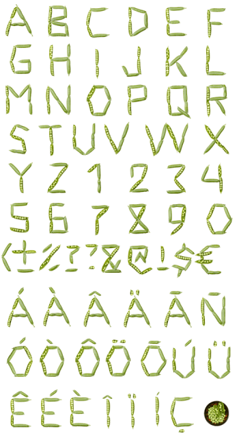
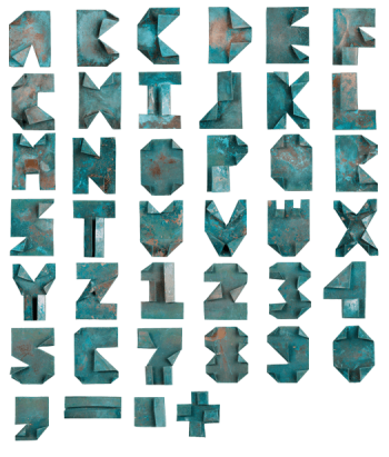
The Steak Font is typography for the carnivore at heart—letters crafted from juicy, sizzling cuts of steak. Each letter looks like it’s fresh off the grill, dripping with flavor and texture. It’s bold, meaty, and unapologetically indulgent. Perfect for designs that demand attention with a delicious twist, it’s typography you can almost taste!
For Designs That Grill the Competition – Steak Font, Served Hot!
Tasty. That’s the word, isn’t it? I never thought I’d be using it to describe typography, of all things, but here we are. This is the world now. We’ve moved on from serif vs sans-serif debates to fonts literally made out of grilled meat. The Steak Font, they’re calling it. And no, I’m not joking, though I kind of wish I were. I mean, I’m a fan of steak—who isn’t? But seeing letters shaped from sizzling slabs of beef is a little unnerving. The alphabet, but carnivorous. It’s like someone combined design with a backyard BBQ, and not necessarily in the way you’d want.
So, imagine this: You’re a graphic designer, stressed out, deadlines looming, and the best idea you can come up with involves meticulously crafting every letter out of grilled meat. It’s typography that’s meant to be, what, edible? I can’t decide if it’s a stroke of creative genius or just a very specific craving during the design process. Were they hungry? Did they skip lunch? Is this a secret marketing ploy by the beef industry? Who knows? But now, we’ve got a high-definition OpenType font that looks like your summer cookout got a little too creative with the invitations.


