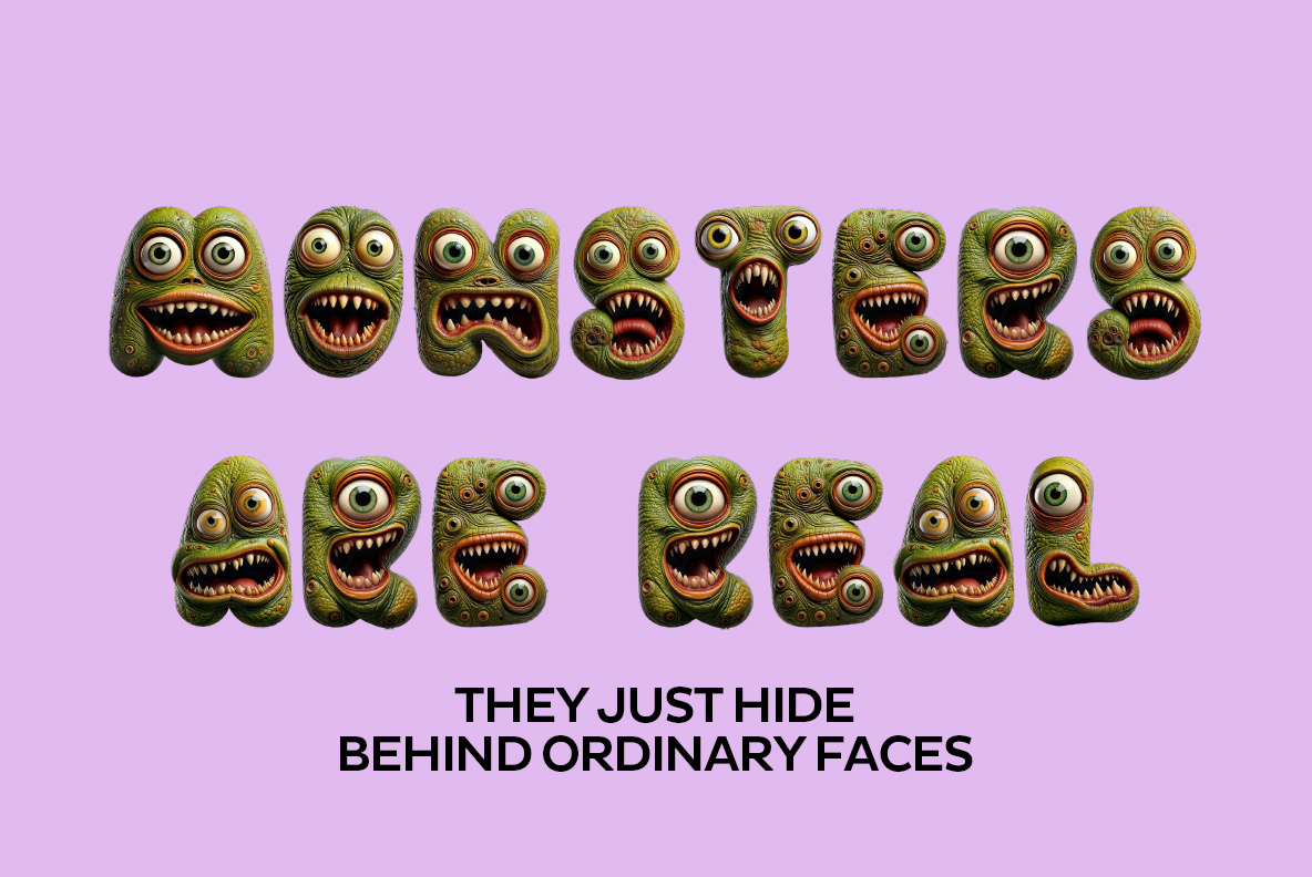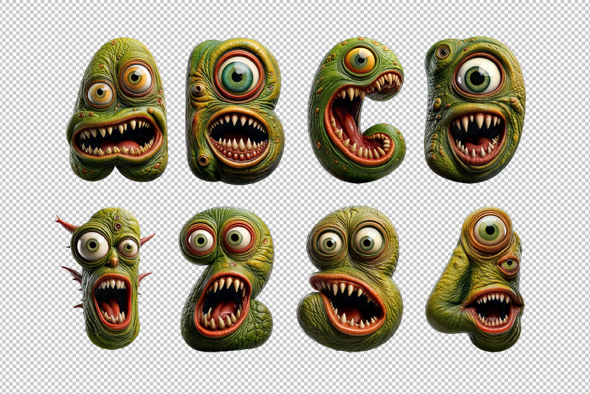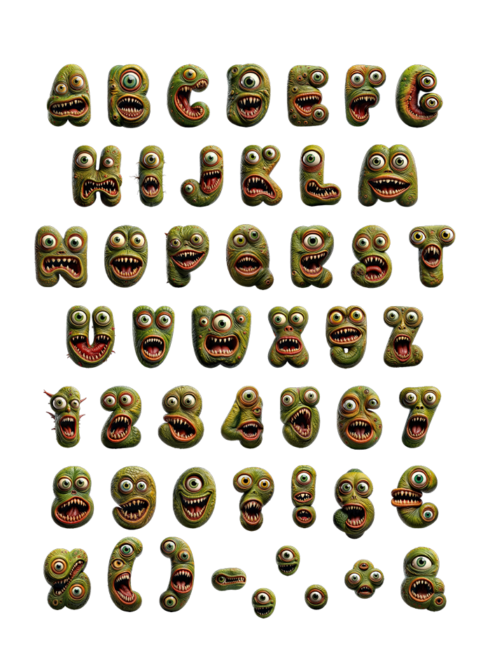
Each character is its own creature: bulging eyes where the counters should be, a mouth of crooked teeth filling the rest, warty olive skin over everything. Under all that sits a fat rounded frame, which is the only reason short words keep their silhouette. Numerals and punctuation got faces too. Built for Halloween, game titles and very loud sale banners.
Every Letter in the Scary Monster Font Is Staring at You
There is no clean letterform here merely wearing a monster texture. The glyph itself is simply the creature. Eyes bulge out of the counters, while a mouth full of crooked teeth fills whatever space is left. Warty olive skin covers the rest, damp enough to look genuinely unpleasant. Because each character got its own face, no two expressions repeat across a word. So read a headline in it and something is always looking back.
Somehow It Still Reads
Push past the eyeballs and there is a fat rounded skeleton doing the actual work. Short words hold their silhouette even when every counter is occupied. Numerals, punctuation and a few symbols also arrived with faces of their own. The question mark grew a jaw, which is either charming or a problem. Novelty faces usually collapse after ten letters, yet this one keeps going. Scale it down to a logo mark and the faces still register.