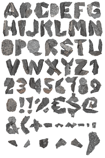
Somebody poured these letters and then mistreated them. Broken Concrete Font casts every glyph as a solid block, then knocks the corners off, exposing pebbles and grit wherever the surface has broken away. Cracks open into dark shadow. It suits architecture studios, demolition firms, gyms and skate brands, and it types from a plain OTF with transparent PNG letters.
Broken Concrete Font Was Cast, Then Dropped
Somebody poured these letters and then mistreated them. Every glyph in the Broken Concrete Font is a solid block of set concrete, so the strokes carry real weight and a flat matte face. Because the mix was coarse, pebbles and grit show wherever the surface has broken away. Cracks run through the thicker parts, then open into dark shadow. Meanwhile the colour sits warm, closer to sand than to grey cement. Naturally the corners have taken the worst of it.
Aggregate, Chips and Honest Damage
Damage is the whole design. Each letter loses a different piece, since a dropped slab never breaks twice the same way. Above all, the exposed interiors go paler and rougher than the cast faces. Besides that, the edges keep the sharp arris of a mould where they survived. Likewise small chips still cling to the bigger fragments. Of course the underside stays darker, so every glyph reads as a real object sitting on something.