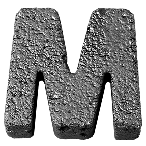
Fall of the Concrete Font. Crumbling Grey Slabs

49.00$ 34.30$

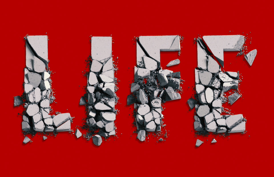
Bold grey capitals caught in the act of falling apart: heavy chunks drifting away from each other, dust spraying off the torn faces and small debris scattering below the baseline. The Fall of the Concrete Font keeps a plain bold sans underneath, so a word stays legible while it disintegrates. Figures and punctuation crumble the same way.

Read more about licensing

Don't forget about our exclusive deal!
  5 Fonts-30% OFF   🔥   10 Fonts-50% OFF  

A Letter Caught Mid-Collapse

In fact, this is not weathered concrete, it is concrete losing the argument. Each capital has split into heavy chunks that drift apart, and dust sprays off the broken faces. Gaps open between the pieces, so the silhouette stays readable while the mass falls away. The grey runs pale and dry too, with aggregate showing wherever the surface tore. Of course, the effect reads as a moment rather than a texture. Because the break happens differently in every glyph, repeated letters never match.

The Fall of the Concrete Font Keeps a Heavy Sans

Underneath the destruction, of course, the drawing is a plain bold sans. Strokes stay wide, corners square, counters generous as well. That simplicity is therefore what keeps a word legible while it disintegrates. Since the fragments stay large, the letters survive at moderate sizes too. In addition, small debris scatters below the baseline for extra weight. Figures, currency signs and punctuation likewise crumble the same way. Meanwhile the palette never leaves grey, which suits stark layouts.

Animated concrete letter of the Fall of the Concrete Font breaking apart

Grit for Posters and Sleeves

For instance, anything about collapse, pressure or endings takes this type immediately. Heavy music covers, skate graphics, dystopian film titles, gym branding and construction campaigns also fit. Because the fragments read as real mass, the Fall of the Concrete Font anchors a layout that would otherwise float. Above all, give it a plain background and let the rubble be the picture. If you want concrete that cracks but stays whole, see Broken Concrete Font.

What the Fall of the Concrete Font Ships

It runs as a standard OTF, so the rubble stays editable right up to print. There are transparent PNG letters too, at high resolution, for a single collapsing initial. The rest of the quarry lives in our Stone Fonts collection, naturally. So the heavy end of the catalogue is covered.

Title card supplied with the Fall of the Concrete Font, the word font in broken slabs
Capital O beside the full alphabet of the Fall of the Concrete Font
Blue book cover carrying a large broken initial from the Fall of the Concrete Font
Short word set in the Fall of the Concrete Font on a red background
Stack of yellow booklets with lettering from the Fall of the Concrete Font
Build your font bundle offer: 2 fonts 20% off, 5 fonts 30% off, 10 fonts 50% off, applied automatically at checkout
Open magazine spread with a short headline in the Fall of the Concrete Font
Magazine cover mockup with a broken initial from the Fall of the Concrete Font
White t-shirt and swing tag printed with the Fall of the Concrete Font
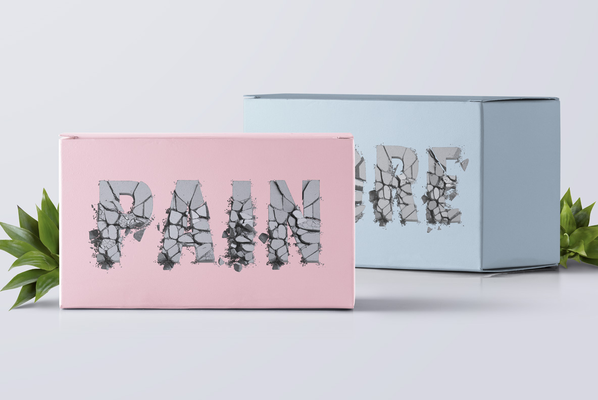
Pink and blue boxes printed with a short word in the Fall of the Concrete Font
Grey sheet of paper showing several letters of the Fall of the Concrete Font
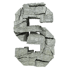
Close view of the broken concrete slabs used to build the Fall of the Concrete Font
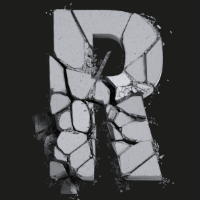
Capital R of the Fall of the Concrete Font splitting into grey fragments
Letters A to D and figures one to four of the Fall of the Concrete Font on a transparent background
Updating
  • No products in the cart.