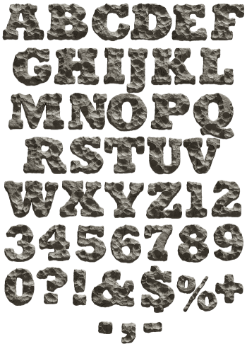
Concrete left outside long enough stops being flat. These letters have holes punched clean through them, corners knocked off and aggregate showing where the cement washed out. The grey shifts as it would on a real wall, since damp never dries evenly. Nothing about it is tidy. Heavy, ruined and still perfectly readable at headline size.
Concrete Erosion Font Is a Slab That Lost to the Weather
Weather did this, and it took years. Each letter reads as a panel that stood outdoors while nobody maintained it. Holes go clean through the strokes, so daylight passes where the mix crumbled away. Corners have broken off in chunks, while the flat faces stay pocked and dusty grey. Aggregate shows through in places, because the cement around it washed out first. Nothing here is tidy, though the underlying shapes still read as a heavy sans.
Damage With a Rhythm to It
Erosion could easily turn into mush, so the Concrete Erosion Font glyphs were eaten away with some care. Each one keeps enough skeleton to read at a glance, since legibility came first. The bites land differently on every character, therefore no two letters wear the same way. Some holes sit dead centre, while others chew in from an outside edge. Grey shifts across the set as well, since damp concrete never dries evenly. Set a whole word and the wear reads as one surface.