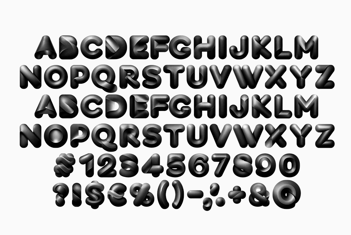
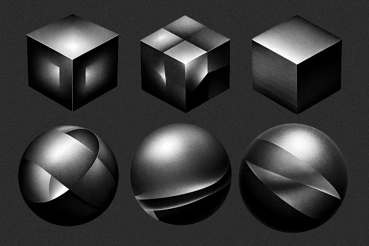
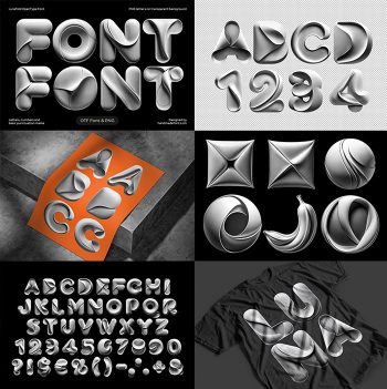
Letters that look pumped full of air and dipped in matte black rubber, with one dull highlight sliding across each swollen stroke. The Darkside Font spaces tightly because the terminals are round, so a short line becomes one solid black mass. Caps, numerals, currency and punctuation are all inflated the same way. Spheres, cubes and twisted knots come with it.
Darkside Font Is Inflated, Not Extruded
First off, the letters look pumped full of air and then dipped in matte black rubber. Edges stay soft, corners round themselves off, and every stroke swells at the middle. A dull sheen slides across the surface, so the shapes read as solid objects rather than flat fills. Because the finish absorbs most of the light, one bright edge does all the describing. And that single highlight is what keeps the Darkside Font legible on black.
Fat Shapes, Tight Spacing
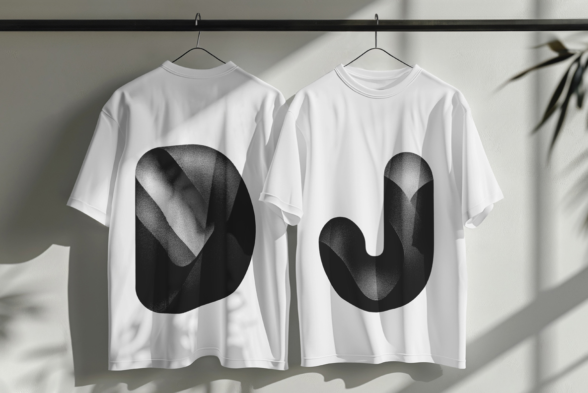
Rounded terminals also let the letters sit unusually close together. So words end up compact, which suits club posters and covers better than long paragraphs. Caps run A to Z, while numerals, currency and punctuation get the same inflated treatment. Even the ampersand puffs up properly. In practice a short line reads as one solid black mass, which is exactly the effect people buy it for.