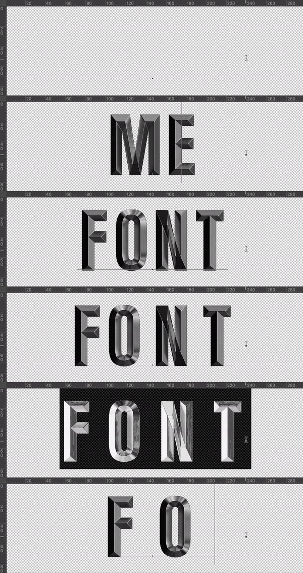
Metal Shine Font cuts dark, brushed chrome into sharp, faceted letterforms, like your alphabet went through a knife sharpener and came out shinier for it. Built for gaming logos, band branding, and any design that needs to look a little dangerous.
The Alphabet That Looks Like It Could Cut Paper
Metal Shine Font takes its cues from something closer to a knife blade than a doorknob. It’s dark, brushed steel with sharp, faceted bevels that catch the light instead of just reflecting it back at you. Every letter looks milled rather than molded, with hard edges where most “metal” fonts go soft and rounded. So if your last metallic font felt more like tinfoil than titanium, we built this one to fix exactly that.
Where Metal Shine Font Gets to Work
We basically made this font for anything that wants to feel a little dangerous: gaming logos, metal and rock band branding, action-movie title cards, or a sports team wordmark that needs some bite. It also holds up well on industrial packaging, since dark and sharp reads as serious rather than flashy. Meanwhile, it’s restrained enough to drop into a single logotype without the whole design screaming for attention.