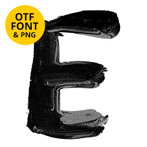
One-pass brush strokes with the ridges still showing, highlights sitting along them so the ink looks wet rather than matte. The Black Swirl Font stays tall and condensed, which is unusual for a painted face and means long words still fit a headline. Caps, numerals, currency and punctuation come in the same hand. Put a flat colour behind it and print it large.
Black Swirl Font Still Looks Wet
Each stroke went down in one pass, and the brush left its ridges behind. Highlights sit along those ridges, so the ink reads glossy instead of matte. Ends taper where the brush lifted, while a few strokes drag out into a thin tail. Because nobody cleaned them up afterwards, the letters keep small wobbles. That is the difference between a real brush and a filter. And the Black Swirl Font never pretends otherwise.
Tall, Narrow and Surprisingly Disciplined
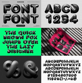
Most brush faces sprawl, yet this one stays condensed. Stems run almost vertical, so long words fit a headline without shrinking. Caps cover A to Z, and numerals, currency and punctuation arrive in the same hand. Even the ampersand keeps its loops clean. So you can set two or three words and still read them from the back of a room.