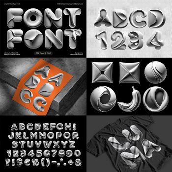
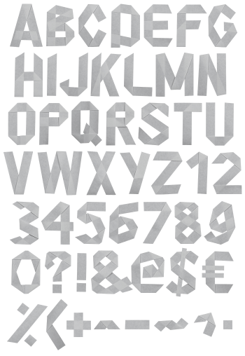
Silver sheet, folded until it turns into an alphabet. Every letter looks like brushed metal that somebody creased, curled and pinched into shape, then shot under one hard studio light. Nothing here is coloured. The range runs from near-white highlight down to deep shadow, so the letters carry their own drama without a single hue.
The MonoFold Font Is One Long Crease
Fold a sheet of brushed silver once and you get a crease. Fold it thirty times and you get this alphabet. Every character in the MonoFold Font reads as one continuous piece of metal, curled over itself, pinched at the waist, then left to catch the light. Because the surface is brushed rather than mirrored, it holds soft grey gradients instead of hard reflections. So the letters stay readable even when they are blown up to poster size. Naturally, the shadows do most of the work.
A Whole Studio in Greyscale
The set goes well past letters and numbers, though. Six round badges also arrive in the same metal, along with a stack of geometric solids, five silver flowers and a sheaf of loose folded forms. Since everything was lit the same way, you can drop a rose beside a Q and nobody spots the seam. Designers who hate hunting for matching assets will find that useful, because the matching is already finished. Above all, it saves an afternoon of colour correction.