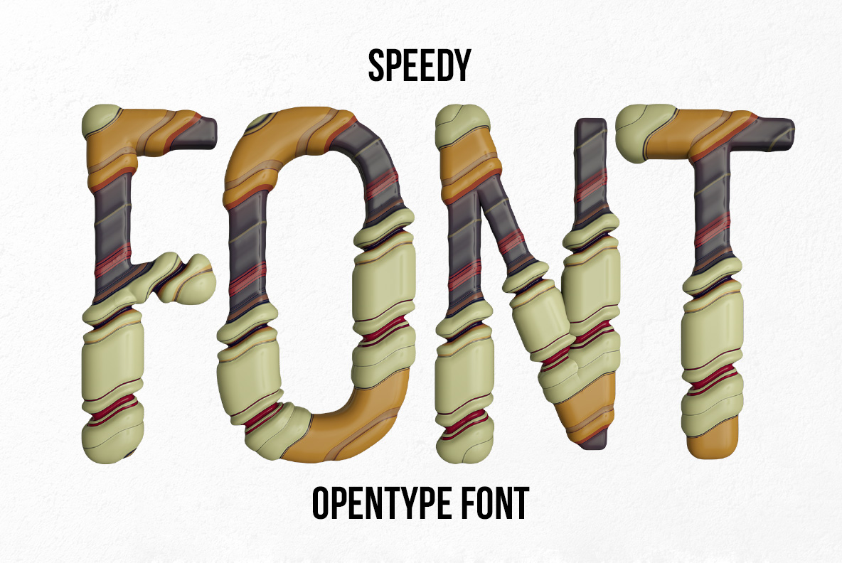
Speedy Font clicks each letter together from separate tubular segments, and a ring joint marks every place two parts meet. Because thin red and blue stripes run round those joints, the alphabet reads like retro racing gear. The palette stays sage green, tan and slate, and OTF plus transparent PNG files ship together.
Speedy Font Clicks Together From Separate Parts
Speedy Font assembles each letter from separate tubular segments, and a raised ring marks every place two parts meet. Because those segments taper and swell along the stroke, the letters look moulded rather than drawn. Meanwhile thin red and blue stripes wrap the joints, which gives the whole alphabet a retro racing-livery feel. So a word reads like a row of machined parts laid out on a bench.
Racing Stripes On Every Joint
The palette runs sage green, warm tan and dark slate, so nothing shouts and everything still separates cleanly. Since the segments are shaded in full three dimensions, each glyph carries real depth without any added drop shadow. Besides, the joints fall in different places letter to letter, so a set word never repeats its rhythm. Meanwhile the counters stay wide, and legibility survives the busy surface.