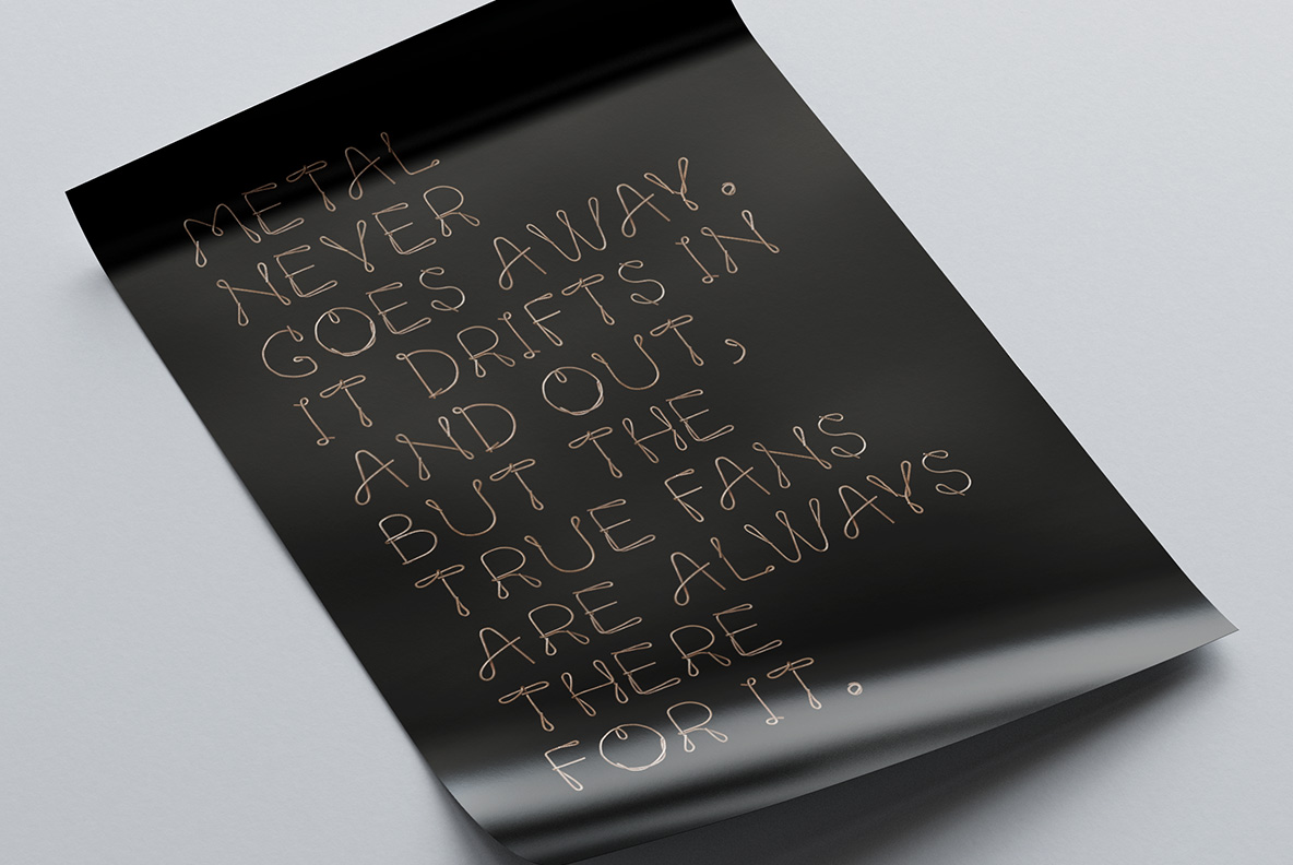
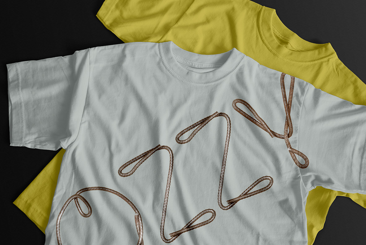
Ribbed steel reinforcing bar, bent by hand into loose cursive letters that finish in big open loops. Reinforcement Font is rust-brown and springy rather than rigid, and the ribbing catches light in short bands. Uppercase, numbers and punctuation, plus separate PNG letters. Suits construction branding, workshop signage and heavy music. Numbers and punctuation are bent from the same bar.
Nobody Welded Reinforcement Font Together
Every letter is one continuous rod, and no one joined or cut anything. So the bar simply curves through the shape, then finishes in a loop exactly where the hand ran out. Because the steel is springy, the curves stay wide and slightly uneven. Meanwhile the ribbed pattern runs the whole length, which catches light in short repeating bands. So each glyph keeps the memory of how it was made.
Thin Lines, Heavy Material
The strokes are narrow, and that keeps the alphabet lighter than most industrial fonts. Since the rod stays uniform, the weight never changes anywhere across a word. Rust-brown and grey run through the metal together, so the tone stays warm rather than cold. Look closely, though, and small pits and scale mark the older sections of the bar.