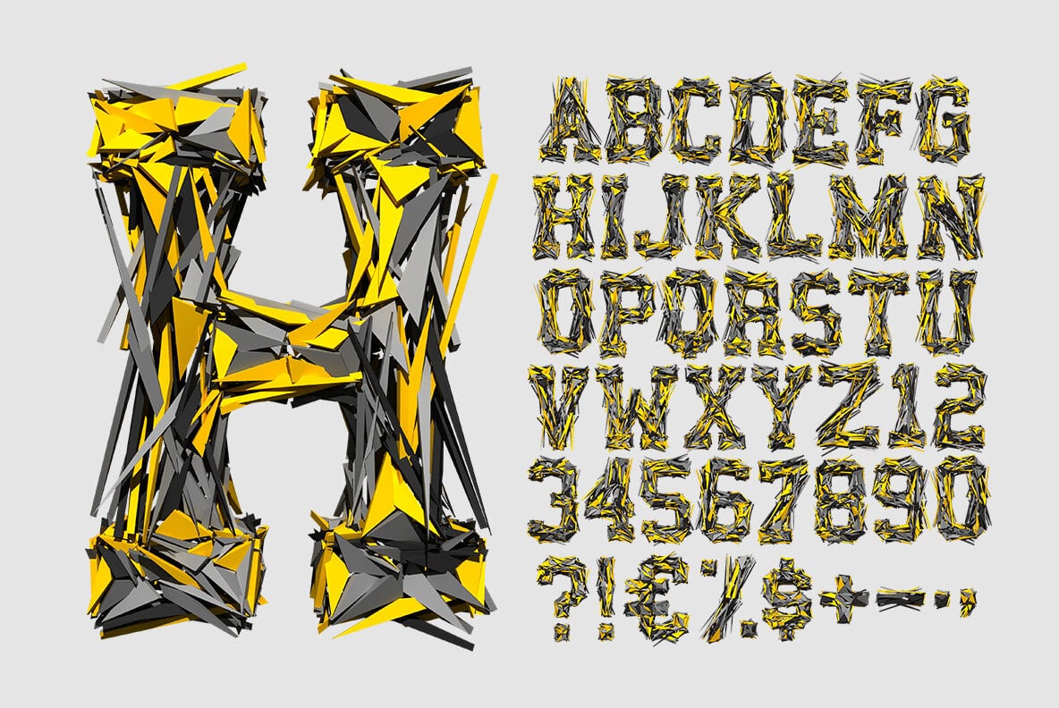
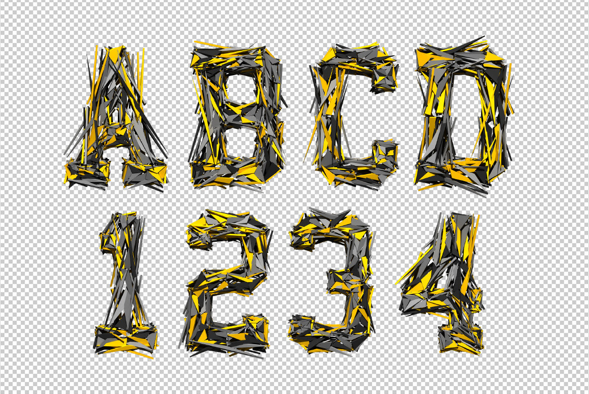
Flat angular shards in bright yellow and gunmetal grey, jammed together until they read as letters. Transformer Font looks like a machine caught mid-explosion, with slivers jutting out past every edge. Uppercase, numbers and punctuation, plus separate PNG letters. Built for tech posters, gaming covers, hard music and anything that should feel loud and unstable.
Transformer Font Is a Controlled Explosion
Each letter looks like it detonated a second ago, and then froze. Long triangular blades shoot out in every direction, while shorter wedges pile up where the strokes cross. Yellow and gunmetal alternate, so the eye keeps finding new planes. Because the shards overlap, every glyph reads as a solid mass from far away. Up close, though, it falls apart into hundreds of separate pieces.
Sharp Everywhere, Yet Still Legible
There is a plain bold sans hiding under Transformer Font’s debris. So the silhouette holds, even when slivers spill past it. Yellow does most of the work, since it marks the edges the eye follows first. Meanwhile the grey shards sink back and read as shadow. Set it on black, and the letters look lit from inside. Zoom right in, and each blade carries its own bevel and highlight.