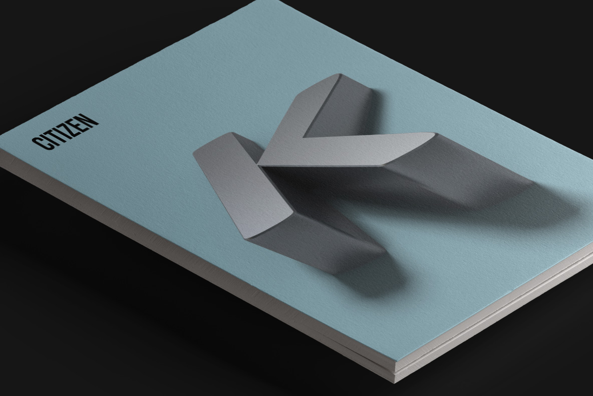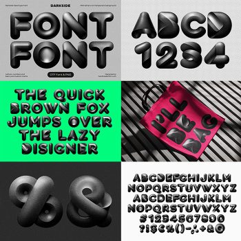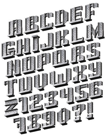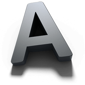
Shadow Font extrudes a clean geometric sans into smooth grey solids, tilts them in perspective and lets each one throw a soft shadow across the surface. Because there is no texture anywhere, the whole effect comes from form and light alone. Faces run light to dark, and the OTF plus transparent PNG files ship together.
Shadow Font Leans Back And Throws A Shadow
Shadow Font extrudes a clean geometric sans into smooth grey solids, then tilts each one so it stands in perspective on the page. Because a soft shadow falls away behind every glyph, the letters look placed on a surface rather than printed onto it. Meanwhile the top faces catch light while the sides fall into charcoal, which builds the depth without any outline. So the alphabet reads three-dimensional at a glance.
Smooth Grey With Nothing To Hide
There is no texture here at all, so the whole effect rests on form and light. Since the letterforms stay geometric and even, the set keeps a calm, architectural feel instead of a showy one. Besides, the neutral grey sits happily on any background colour you choose. Meanwhile the perspective is consistent across the alphabet, so words line up on one imaginary floor.