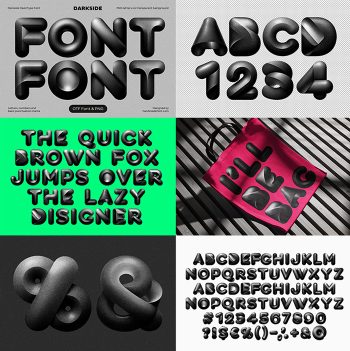
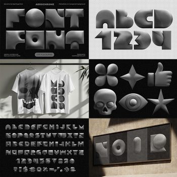
Inflatype Font builds its letters from simple geometric shapes pumped full of air, so every stroke bulges and every corner softens. A fine grain sits over the surface, and one magenta-to-orange gradient runs through the whole set. A large matching icon collection ships with it, which makes posters, sleeves and shirts quick work.
Inflatype Font Pumps Plain Geometry Until It Bulges
Start with a simple kit of shapes: arcs, wedges, quarter-circles and squares. Then pump air into them until the flat sides swell and the corners round off. That is where the alphabet comes from, so every letter reads as one solid puffed volume. Inflatype Font keeps a fine sandy grain across the surface too, which kills any plastic shine. Light lands soft, while the colour slides from hot magenta into orange.
One Gradient, Running Through Absolutely Everything
The gradient is the second half of the idea, since it never falls the same way twice. Purple gathers in the shadowed corners, meanwhile orange grabs whatever faces the light. On black the letters glow, though on pale paper they calm down considerably. Caps and lowercase share the same shape kit, so a word looks built rather than written. Naturally, numbers, currency signs and punctuation get inflated to match.