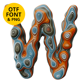
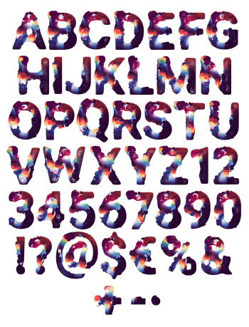
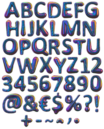
Poured paint that set before it finished moving. Each letter carries concentric rings of red, yellow, blue and cream, the pattern you get when colours are dragged through each other rather than mixed. The surface is high gloss, so every ridge throws a hard highlight. It is the loudest alphabet on the shelf, and it knows it.
Colour Dragged, Not Mixed
Pour two paints into each other and stop stirring halfway, and you get this. Rings of scarlet, mustard, cobalt and cream chase each other across every stroke, sometimes closing into an eye where the flow met itself. The finish is wet-look gloss, so a hard highlight runs along each raised ridge. Because the colour sits in bands rather than blends, the letters keep their edges even at small sizes.
Why the Paint Melt Font Never Repeats
No two glyphs share a pattern, since each one was poured on its own. Some letters run warm and land almost entirely in red and yellow, while others cool off into blue and grey. That variation is the whole appeal, though it does mean a long word turns into a painting. Above all the letterform underneath stays a plain bold sans, which is what keeps it readable. Naturally the counters stay wide open.