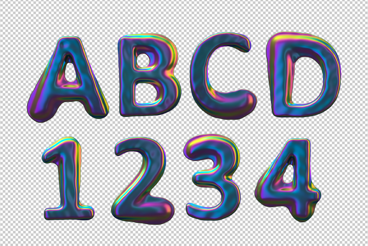
Colorama Font blows every letter up into a fat, rounded shape and wraps it in an oil-slick skin. Magenta, cyan and lime bands sweep across the bulges over a deep indigo base, shifting wherever the surface turns. The forms stay simple and friendly underneath, so all that colour never makes the words hard to read.
Round, Soft and Very Shiny
Every letter in the Colorama Font looks inflated rather than drawn. Corners round off completely, so the strokes swell in the middle and pinch where they meet. Highlights sit high on each bulge, while the shadows drop into a deep blue-black. Because the surface is so glossy, the shapes read as objects instead of type. Of course that is exactly what a headline sometimes needs.
The Colorama Font Runs on Oil-Slick Colour
Indigo carries the base, and everything else arrives as a sheen on top. Bands of magenta, cyan, lime and gold slide across the curves, so no two letters share a colour scheme. Move a glyph and the bands would travel with it, which is why the alphabet feels alive. Naturally the effect works hardest on dark backgrounds, though a flat yellow page also suits it.