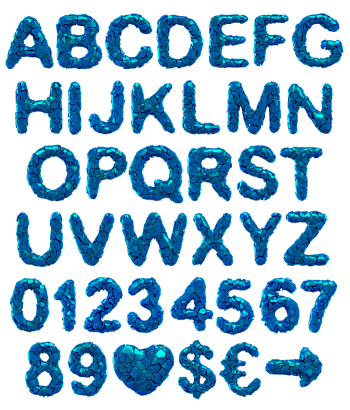
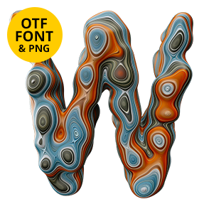
An alphabet caught mid-detonation. Sharp wedges and slivers fly out of every stroke in scarlet, tangerine, olive and cold teal, some still attached and some already gone. Hard faces, flat colour, no softness anywhere. Loud enough for festival bills, single covers, club flyers, esports branding and any poster that needs to hit first and explain later.
A Burst Frozen Halfway
Something detonated and the pieces have not landed yet. Wedges, triangles and thin slivers also fly outward from each stroke, some still touching the letter and others already clear of it. Scarlet, tangerine, olive and a cold teal meanwhile do all the shouting. Because the fragments catch light on different faces, one glyph can read bright on the left and almost black on the right. Nothing sits still, of course. Numerals scatter exactly like the capitals, too.
The Color Explode Font Palette
Four colours carry the whole alphabet, which is why it never turns muddy. Warm tones cluster at the centre of the Color Explode Font while cooler splinters drift to the edges, so each letter keeps a hot core. Shapes stay flat-faced and hard-edged, of course. Nothing here is soft, and nothing apologises. Since the pieces overlap, the density reads as weight rather than noise. Figures and symbols also follow the same blast pattern, so numbers never look borrowed.