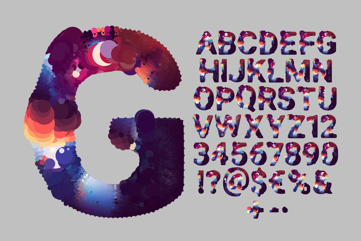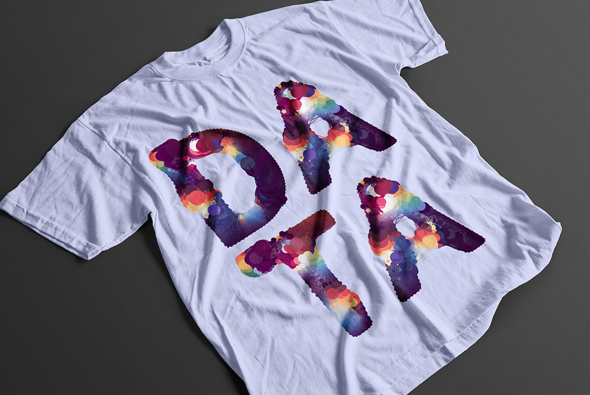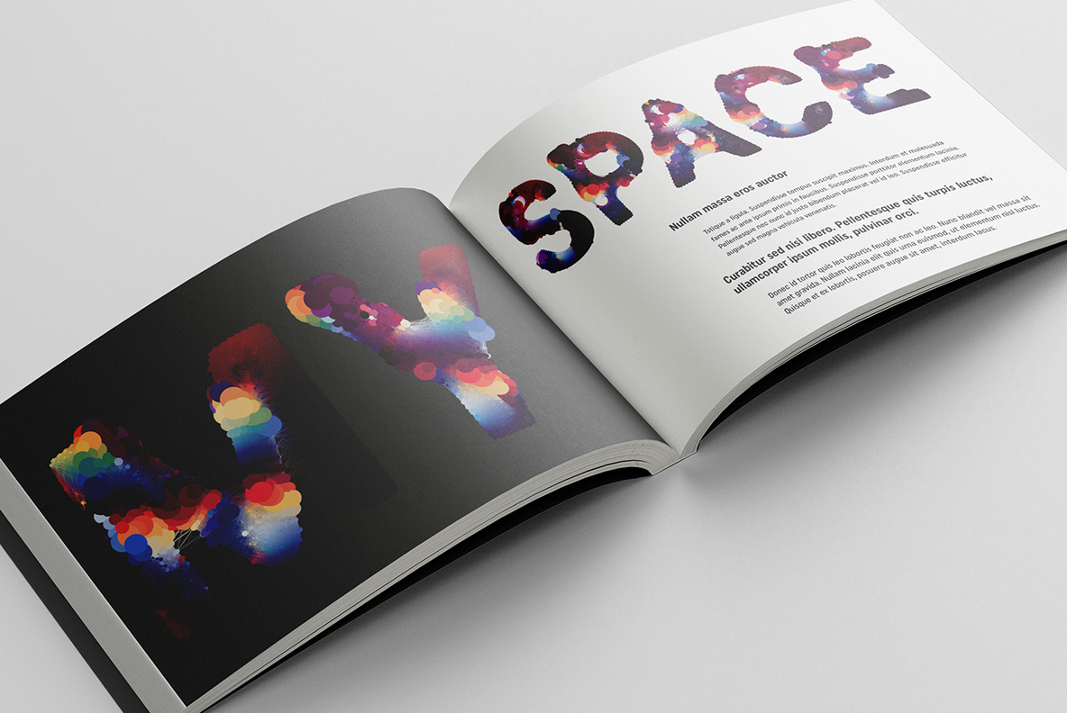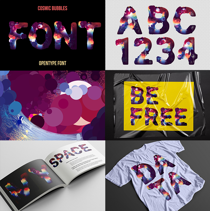
Hundreds of translucent discs layered until a letter appears, deepening in colour wherever two overlap. Plum, indigo, coral and chalky cream drift together without ever blending, and the edges dissolve into loose dots. It reads like a long exposure of somewhere far away, right for ambient sleeves, planetarium posters, science podcasts and dark editorial spreads.
Circles Piled Until a Letter Appears
Hundreds of transparent discs overlap here, and where two cross the colour deepens. Plum, indigo, coral and a chalky cream mix without ever fully blending, so each stroke looks like a long exposure of something far away. Edges dissolve into loose dots instead of stopping cleanly. Naturally that softness costs a little sharpness, though it buys a lot of atmosphere. No two glyphs repeat the same pattern. Numerals and punctuation drift in the same haze.
Reading the Cosmic Bubble Font
Weight comes from density, not from outline. Dark bubbles crowd the spine of every glyph, so the Cosmic Bubble Font still holds its shape when the background goes black. Pale discs sit at the terminals and keep the ends from disappearing. Since no two letters share a pattern, repeated words never look copied. Above all, it rewards large sizes. Small sizes blur the discs together, so headlines beat captions here.