Gold Baroque Font. For When Your Fonts Demand Champagne and Caviar.

57.00

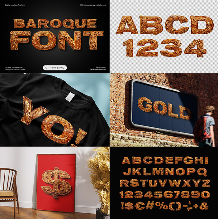
Glamorous and extra, the Gold Baroque Font isn’t just a font—it’s a whole mood. Each letter struts in with over-the-top swirls, leaves, and blossoms like it’s auditioning for a period drama. The gold texture sparkles brighter than your future, and those scattered gold fragments? Pure chaos, in the best way. Perfect for when your text needs to scream “luxury!” but also wink, because it knows it’s being a little too fabulous.

Licenses:

Read more about licensing

Don't forget about our exclusive deal!
  5 Fonts-30% OFF   🔥   10 Fonts-50% OFF  

Like Versailles, But for Text—and Without the Revolution.

Ah, the “Gold Baroque Font”—a typographic marvel, as if someone took the entire Baroque era, melted it down, sprinkled some powdered gold on top, and decided to turn it into letters. It’s like Versailles decided to moonlight as a font. Each letter is dripping—literally and figuratively—with more flair than a Renaissance prince at his own coronation. Floral and ornamental patterns swirl and twist around the characters, creating an intricate maze of leaves, blossoms, and dramatic flourishes that practically scream, “Look at me, I’m fabulous!”

The golden texture? Oh, it’s not just gold; it’s the kind of gold that whispers sweet nothings into your eyes. It glimmers with an obsessive attention to detail, like someone spent their entire life ensuring every microscopic swirl and leaf was perfect. Then, as if that wasn’t enough, the font is generously sprinkled with tiny golden fragments. These fragments—let’s call them golden confetti—dance around the letters, adding a dynamic, almost magical quality. It’s like your words are throwing a tiny, glamorous party just for showing up.

Gold Baroque Alphabet

Make Your Letters Look So Rich They’ll Get Taxed.

This font is pure Baroque energy—dramatic, luxurious, and unapologetically over-the-top. Think chandeliers, gilded mirrors, and the kind of opulence that makes you want to sip champagne while casually dropping phrases like “rococo-inspired embellishments.” It’s elegant but with a wink, like it knows it’s a bit much, but honestly, who cares? This isn’t minimalism—it’s maximalism with a capital M.

Gold Baroque OpenType Font description

The Gold Baroque Font is a high-resolution OpenType typeface that includes uppercase letters, numbers, and basic punctuation, with each character approximately 800 pixels tall. You can view a complete preview of the available letters and glyphs.

This color OpenType font is intended for use in software compatible with color bitmap fonts. To fully access its features, you’ll need applications such as Photoshop CC 2017, Illustrator CC 2018, Procreate 4.3, or later versions. As OpenType is an industry-standard format, this font should also be compatible with many popular tools, including Photoshop, Illustrator, InDesign, QuarkXPress, Keynote, PowerPoint, Word, and others.

In addition, each character is provided as an individual PNG file with a transparent background, in a high resolution of 4000×4000 pixels. The download package contains 52 files, one for each character in the Gold Baroque Font set, allowing you to arrange them manually in any graphic design software for customized text compositions.

Gold Baroque Alphabet

Let Your Letters Live Their Best, Most Dramatic Lives

Let’s talk about the craftsmanship. Each letter is so ornate and intricate that you half expect it to jump off the screen and start reciting poetry about its own beauty. The floral patterns are lush, detailed enough to make a botanist cry, and perfectly arranged to create a harmonious balance of form and function. And yet, despite all the extravagance, it’s still remarkably legible. That’s right—it looks like the Sistine Chapel but still knows how to spell your name.

Now, let’s address the elephant in the room—or rather, the small print. This is a color OpenType file. What does that mean? Basically, this font is so advanced, so sophisticated, that not all apps can handle its brilliance. It’s like trying to run a Ferrari on a dirt track. If your app can’t support color bitmap fonts, well, that’s a you problem, not a font problem. It’s a masterpiece; it’s not going to downgrade itself to fit in with the common crowd.

For the history buffs and Baroque enthusiasts, let’s drop this little quote into the mix: “Baroque art is a world of movement, exuberance, and the pursuit of grandeur.” That’s from some wise soul who clearly would’ve loved this font. The “Gold Baroque Font” doesn’t just capture the spirit of Baroque—it embodies it. It’s a letterpress love letter to an era that never understood the phrase “tone it down.”

Gold Baroque Alphabet

The Font That Says, ‘I Woke Up Like This—Flawless.

And here’s the kicker—this font isn’t just about looking good (although, let’s face it, it does look ridiculously good). It’s about making a statement. You don’t use this font to write your grocery list or slap it on a boring memo. No, this is the font you use when you want to shout from the rooftops, “I have impeccable taste, and I know how to use it!” It’s for wedding invitations, luxury branding, or that manifesto you’ve been meaning to write about why elegance should make a comeback.

In the immortal words of Steve Jobs (probably): “Design isn’t just what it looks like and feels like. Design is how it works.” And let me tell you, this font works. It works so well it could sell gold to Midas. It’s an intersection of art, craftsmanship, and technology that feels like it’s been waiting its whole life to be on your screen.

Of course, there’s a bit of Ricky Gervais in this too. Imagine him looking at this font and saying, “Oh, come on! It’s a bit much, isn’t it?” But secretly, he’d be impressed—because even he can’t argue with the sheer audacity of it all. It’s unapologetic, it’s confident, and it’s got a sense of humor about itself. It’s the kind of font that knows exactly how fabulous it is and doesn’t need your validation (but will graciously accept it anyway).

So, there you have it. The “Gold Baroque Font” isn’t just a typeface—it’s a lifestyle. It’s for those who believe their words deserve to be wrapped in golden glory, those who think the world could use a little more glamour, and those who know that sometimes, more really is more. Go on, give it a spin. Just make sure your app can keep up.

One letter dimensions:

~ 2900 x 2900 px

File Size:

354 Mb (.ZIP)

File Type:

PNG

Technics:

3d render

Updating
  • No products in the cart.