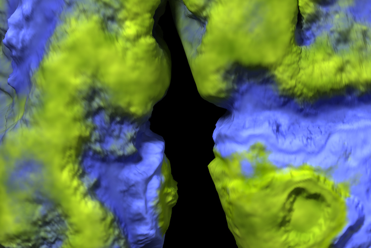
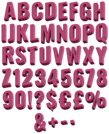
Fat rounded capitals that look lifted straight off a relief globe, green landmasses spreading across each stroke and breaking into deep blue ocean at the coastline. The Geo Font keeps raised mountain ridges and wandering coasts, so no two letters ever share a map. Figures, currency signs and punctuation carry their own geography.
A Globe, Sliced Into Glyphs
At a glance, each capital looks lifted straight off a relief globe. Green landmasses spread across the strokes, then break into deep blue ocean at the coast. Mountain ridges and river valleys sit raised on the surface too, catching light from one side. The coastlines wander, so no two letters share a map. Because the terrain is modelled rather than printed, the edges bulge and dip. Shallow seas show paler blue near the coast too, which adds another layer of depth.
Terrain Doing the Texturing
Underneath the geography a fat rounded sans is doing the work. Wide strokes give the continents somewhere to live, since a thin letter would lose them entirely. Counters stay open too, which keeps words readable at poster size. The palette never leaves green and blue, so a layout stays calm. In addition, figures, currency signs and punctuation carry their own coastlines. Naturally the shape still reads from a distance even when the detail does not.