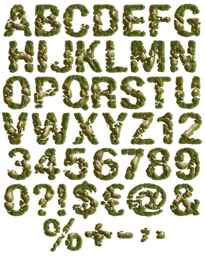


Small wooded islands seen from directly above, clustered until they spell a letter, with pale sandy rims and shallow water around the edges. Sea Island Font is olive green and satisfyingly odd. Uppercase, numbers and punctuation, plus separate PNG letters. Built for travel branding, atlases, festival posters and sailing brands.
Sea Island Font Is a Map, Read Downwards
The view looks straight down from the air, which is what makes the alphabet click. Each letter gathers several small islands, and the gaps between them stay open water. Because the coastlines are ragged, no stroke keeps a clean edge. Meanwhile pale sand rings every island where land meets the shallows. So a word reads like a tiny archipelago.
Green on Top, Sand at the Edge
The tops are dense olive scrub, and the tone shifts as the ground rises. Since the light comes from one side, small shadows fall across every ridge. That single trick is what stops the letters looking flat. Look closely, and you can pick out beaches, inlets and the odd bay. Besides, no two letters share the same coastline.